The OLS Regression Line
Figure 43 shows a scatterplot of the relationship between median age and violent crime rates:
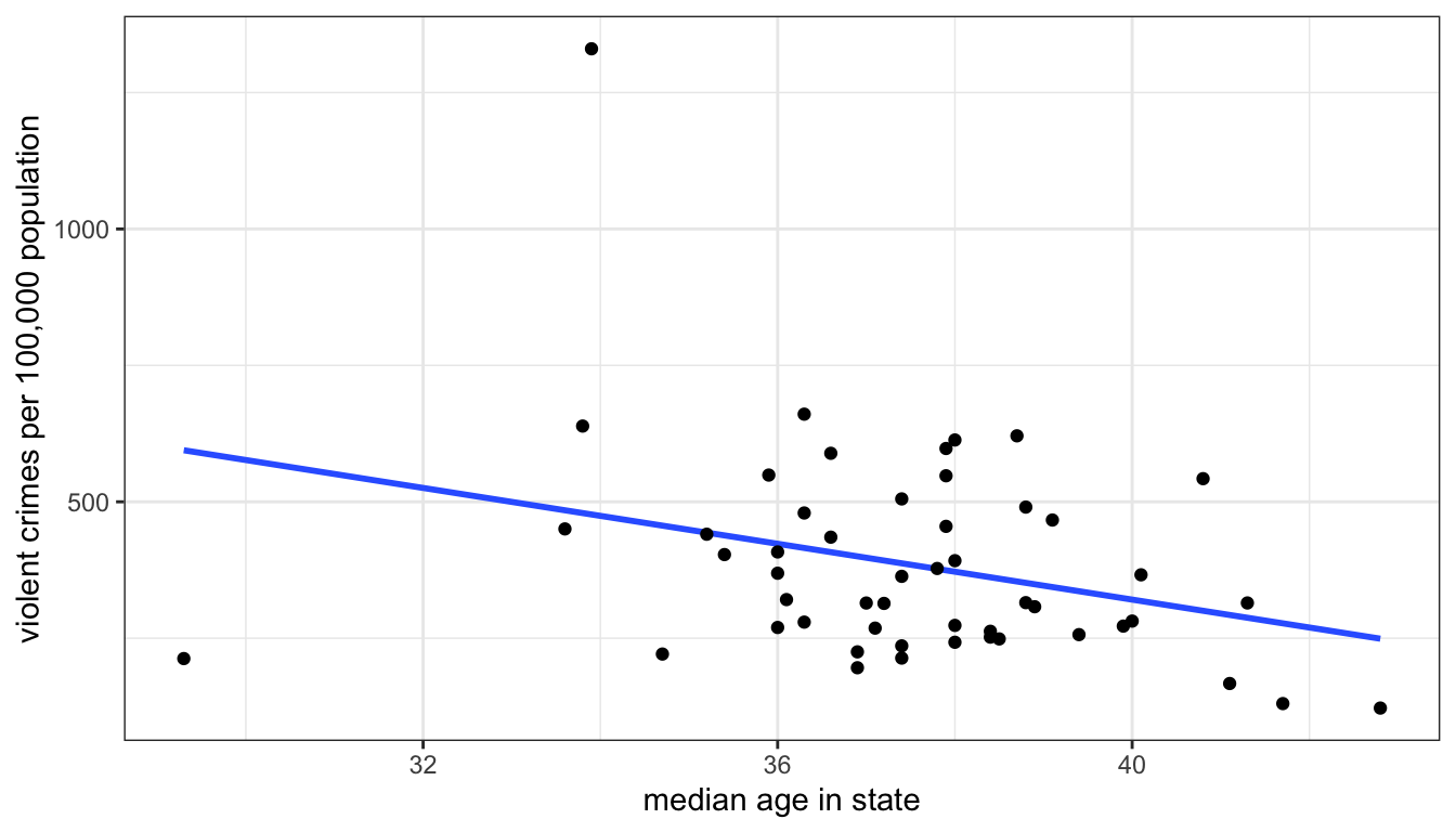
Figure 43: Scatterplot of median age and violent crime rates across US states, with a best-fitting straight line drawn through points
I have also plotted a line through those points. When you were trying to determine the direction of the relationship many of you were probably imagining a line going through the points already. Of course, if we just tried to “eyeball” the best line, we would get many different results. The line I have graphed above, however, is the best fitting line, according to standard statistical criteria. It is the best-fitting line because it minimizes the total distance from all of the points collectively to the line. This line is called the ordinary least squares regression line ( or OLS regression line, for short). This fairly simply concept of fitting the best line to a set of points on a scatterplot is the workhorse of social science statistics and is the basis for most of the models that we will explore in this module.
The Formula for a Line
Remember the basic formula for a line in two-dimensional space? In algebra, you probably learned something like this:
\[y=a+bx\]
The two numbers that relate \(x\) to \(y\) are \(a\) and \(b\). The number \(a\) gives the y-intercept. This is the value of \(y\) when \(x\) is zero. The number \(b\) gives the slope of the line, sometimes referred to as the “rise over the run.” The slope indicates the change in \(y\) for a one-unit increase in \(x\).
The OLS regression line above also has a slope and a y-intercept. But we use a slightly different syntax to describe this line than the equation above. The equation for an OLS regression line is:
\[\hat{y}_i=b_0+b_1x_i\]
On the right-hand side, we have a linear equation (or function) into which we feed a particular value of \(x\) (\(x_i\)). On the left-hand side, we get not the actual value of \(y\) for the \(i\)th observation, but rather a predicted value of \(y\). The little symbol above the \(y\) is called a “hat” and it indicates the “predicted value of \(y\).” We use this terminology to distinguish the actual value of \(y\) (\(y_i\)) from the value predicted by the OLS regression line (\(\hat{y}_i\)).
The y-intercept is given by the symbol \(b_0\). The y-intercept tells us the predicted value of \(y\) when \(x\) is zero. The slope is given by the symbol \(b_1\). The slope tells us the predicted change in \(y\) for a one-unit increase in \(x\). In practice, the slope is the more important number because it tells us about the association between \(x\) and \(y\). Unlike the correlation coefficient, this measure of association is not unitless. We get an estimate of how much we expect \(y\) to change in terms of its units for a one-unit increase in \(x\).
For the scatterplot in Figure 43 above, the slope is -25.6 and the y-intercept is 1343.9. We could therefore write the equation like so:
\[\hat{\texttt{crime rate}_i}=1343.9-25.6(\texttt{median age}_i)\]
We would interpret our numbers as follows:
- The model predicts that a one-year increase in age within a state is associated with 25.6 fewer violent crimes per 100,000 population, on average. (the slope)
- The model predicts that in a state where the median age is zero, the violent crime rate will be 1343.9 crimes per 100,000 population, on average. (the intercept)
There is a lot to digest in these interpretations and I want to return to them in detail, but first I want to address a more basic question. How did I know that these are the right numbers for the best-fitting line?
Calculating the Best-Fitting Line
The slope and intercept of the OLS regression line are determined based on addressing one simple criteria: minimize the distance between the actual points and the line. More formally, we choose the slope and intercept that produce the minimum sum of squared residuals (SSR).
A residual is the vertical distance between an actual value of \(y\) for an observation and its predicted value:
\[residual_i=y_i-\hat{y}_i\]
These residuals are also sometimes called error terms, because the larger they are in absolute value, the worse is our prediction. Take a look at the Figure 44 below which shows the residuals graphically as vertical distances between the actual point and the line.
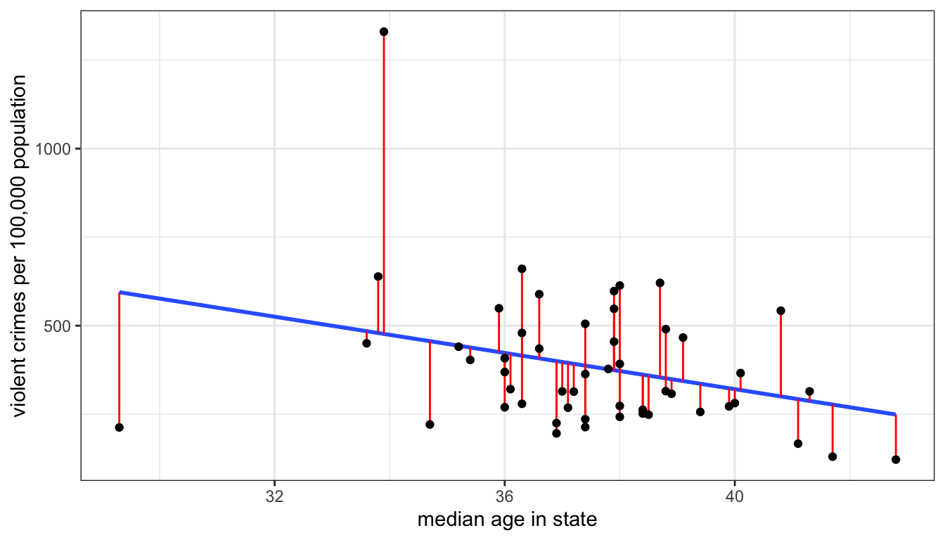
Figure 44: Scatterplot with best-fitting line shown in blue and residuals shown in red
Unless the points all fall along an exact straight line, there is no way for me to eliminate these residuals altogether, but some lines will produce higher residuals than others. What I am aiming to do is minimize the sum of squared residuals which is given by:
\[SSR = \sum_{i=1}^n(y_i-\hat{y}_i)^2\]
I square each residual and then sum them up. By squaring, I eliminate the problem of some residuals being negative and some positive.
To see how this all works, you can play around with the interactive example below which allows you to guess slope and intercept for a scatterplot and then see how well you did in minimizing the sum of squared residuals.
Fortunately, we don’t have to figure out the best slope and intercept by trial and error, as in the exercise above. There are relatively straightforward formulas for calculating the slope and intercept. They are:
\[b_1=r\frac{s_y}{s_x}\]
\[b_0=\bar{y}-b_1*\bar{x}\]
The r here is the correlation coefficient. The slope is really just a re-scaled version of the correlation coefficient. We can calculate this with the example above like so:
## [1] -25.5795I can then use that slope value to get the y-intercept:
## [1] 1343.936Using the lm command to calculate OLS regression lines in R
We could just use the given formulas to calculate the slope and intercept in R, as I showed above. However, the lm command will become particularly useful later in the term when we extend this basic OLS regression line to more advanced techniques.
In order to run the lm command, you need to input a formula. The structure of this formula looks like “dependent~independent” where “dependent” and “independent” should be replaced by your specific variables. The tilde (~) sign indicates the relationship. So, if we wanted to use lm to calculate the OLS regression line we just looked at above, I would do the following:
Please keep in mind that the dependent variable always goes on the left-hand side of this equation. You will get very different answers if you reverse the ordering.
In this case, I have entered in the variable names using the data$variable syntax, but lm also offers you a more streamlined way of specifying variables, by including a data option separately so that you only have to put the variable names in the formula, like so:
Because I have specified data=crimes, R knows that the variables “Violent” and “MedianAge” refer to variables within this dataset. The result will be the same as the previous command, but this approach makes it easier to read the formula itself.
I have saved the output of the lm command into a new object that I have called “model1”. You can call this object whatever you like. This is out first real example of the “object-oriented” nature of R. I can apply a variety of functions to this object in order to extract information about the relationship. If I want to get the most information, I can run a summary on this model.
##
## Call:
## lm(formula = Violent ~ MedianAge, data = crimes)
##
## Residuals:
##     Min      1Q  Median      3Q     Max
## -381.76 -118.02  -36.25   99.28  853.41
##
## Coefficients:
##             Estimate Std. Error t value Pr(>|t|)
## (Intercept)  1343.94     434.21   3.095  0.00325 **
## MedianAge     -25.58      11.56  -2.214  0.03154 *
## ---
## Signif. codes:  0 '***' 0.001 '**' 0.01 '*' 0.05 '.' 0.1 ' ' 1
##
## Residual standard error: 188.1 on 49 degrees of freedom
## Multiple R-squared:  0.09092,    Adjusted R-squared:  0.07236
## F-statistic:   4.9 on 1 and 49 DF,  p-value: 0.03154
There is a lot information here and we actually don’t know what most of it means yet. All we want is the intercept and slope. These numbers are given by the two numbers in the “Estimate” column of the “Coefficients” section. The intercept is 1343.94 and the slope is -25.58.
We could also run the coef command which will give us just the slope and intercept of the model.
## (Intercept)   MedianAge
##   1343.9360    -25.5795
This result is much more compact and will do for our purposes at the moment.
Adding an OLS regression line to a plot
You can easily add an OLS regression line to a scatterplot in ggplot. We can do this using the geom_smooth function. However we also need to specify that our method of smoothing is “lm” (for linear model) with the method="lm" argument. Here is the code for the example earlier:
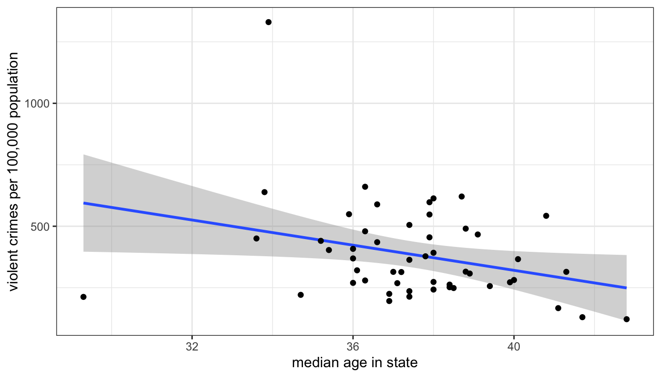
Figure 45: Use geom_smooth to plot an OLS regression line with or without a confidence interval band
You will notice that Figure 45 also adds a band of grey. This is the confidence interval band for my line and is drawn by default. We will discuss issues of inference for the OLS regression line below. If you want to remove this you can change the se argument in geom_smooth to FALSE.
The OLS regression line as a model
You will note that I saved the output of my lm command above as model. The lm command itself stands for “linear model.” What do I mean by this term “model?” When we talk about “models” in statistics, we are talking about modeling the relationship between two or more variables in a formal mathematical way. In the case of the OLS regression line, we are predicting the dependent variable as a linear function of the independent variable.
Just as the general term model is used to describe something that is not realistic but rather an idealized representation, the same is true of our statistical models. We certainly don’t believe that our linear function provides a correct interpretation of the exact relationship between our two variables. Instead we are trying to abstract from the details and fuzziness of the relationship to get a “big picture” of what the relationship looks like.
However, we always have to consider that our model is not a very good representation of the relationship. The most obvious potential problem is if the relationship is non-linear and yet we fit the relationship by a linear model, but there can be other problems as well. I will discuss these more below and the next few sections of this module will give us techniques for building better models. However, we first need to focus on how to interpret the results we just got.
Interpeting Slopes and Intercepts
Learning to properly interpret slopes and intercepts (especially slopes) is the number one most important thing you will learn all term, because of how common the use of OLS regression is in social science statistics. You simply cannot pass the class unless you can interpret these numbers. So take the time to be careful in interpretation here.
Interpreting Slopes
In abstract terms, the slope is always the predicted change in \(y\) for a one unit increase in \(x\). However, this abstract definition will simply not do when you are dealing with specific cases. You need to think about the units of \(x\) and \(y\) and interpret the slope in concrete terms. There are also a few other caveats to consider.
Take the interpretation I used above for the -25.6 slope of median age as a predictor of violent crime rates. My interpretation was:
The model predicts that a one year increase in age within a state is associated with 25.6 fewer violent crimes per 100,000 population, on average.
There are multiple things going on in this sentence that need to be addressed. First, lets address the phrase “model predicts.” The idea of a model is something we will explore more later, but for now I will say that when we fit a line to a set of points to predict \(x\) by \(y\), we are applying a model to the data. In this case, we are applying a model that relates \(y\) to \(x\) by a simple linear function. All of our conclusions are dependent on this being a good model. Prefacing your interpretation with “the model predicts…” highlights this point.
Second, a “one year increase in age” indicates the meaning of a one unit increase in \(x\). Never literally say a “one unit increase in \(x\).” Think about the units of \(x\) and describe the change in \(x\) in these terms.
Third, I use “is associated with” to indicate the relationship. This phrase is intentionally passive. We want to avoid causal language when we describe the relationship. Saying something like “when \(x\) increases by one \(y\) goes up by \(b_1\)” may sound more intuitive, but it also implies causation. The use of “is associated with” here indicates that the two variables are related without implicitly implying that one causes the other. Using causal language is the most common mistake in describing the slope.
Fourth, “25.6 fewer violent crimes per 100,000 population” is the expected change in \(y\). Again, you always have to consider the unit scale of your variables. In this case, \(y\) is measured as the number of crimes per 100,000 population, so a decrease of 25.6 means 25.6 fewer violent crimes per 100,000 population.
Fifth, I append the term “on average” to the end of my interpretation. This is because we know that our points don’t fall on a straight line and so we don’t expect a deterministic relationship between median age and violent crime. Rather, we think that if we were to take a group of states that had one year higher median age than another group of states, the average difference between the groups would be -25.6.
Lets try a couple of other examples to see how this works. I will use the lm command in R to calculate the slopes and intercepts, which I explain in the section below. First, lets look at the association between age and sexual frequency (I will explain the code I use here later in this section).
## (Intercept)        educ
##  49.7295901   0.0266939
The slope here is 0.03. Education is measured in years and sexual frequency is measured as the number of sexual encounters per year. So, the interpretation of the slope should be:
The model predicts that a one year increase in education is associated with 0.03 more sexual encounters per year, on average.
There is a tiny positive effect here, but in real terms the relationship is basically zero. It would take you about 100 years more education to get laid 3 more times. Just think of the student loan debt.
Now, lets take the relationship between movie runtimes and tomato meter ratings:
## (Intercept)     Runtime
##   5.1074601   0.4054953
The slope is 0.41. Runtime is measured in minutes. The tomato meter is the percent of reviews that were judged to be positive.
The model predicts that a one minute increase in movie runtime length is associated with a 0.38 percentage point increase in the movie’s Tomato Meter rating, on average.
Longer movies tend to have higher ratings. We may rightfully question the assumption of linearity for this relationship however. It seems likely that if a movie can become too long, so its possible the relationship here may be non-linear. We will explore ways of modeling that potential non-linearity later in the term.
Interpreting Intercepts
Intercepts give the predicted value of \(y\) when \(x\) is zero. Again you should never interpret an intercept in these abstract terms but rather in concrete terms based on the unit scale of the variables involved. What does it mean to be zero on the \(x\) variable?
In our example of the relationship of median age to violent crime rates, the intercept was 1343.9. Our independent variable is median age and the dependent variable is violent crime rates, so:
The model predicts that in a state where the median age is zero, the violent crime rate would be 1343.9 crimes per 100,000 population, on average.
Note that I use the same “model predicts” and “on average” prefix and suffix for the intercept as I used for the slope. Beyond that I am just stating the predicted value of \(y\) (crime rates) when \(x\) is zero in the concrete terms of those variables.
Is it realistic to have a state with a median age of zero? No, its not. You will never observe a US state with a median age of zero. This is a common situation that often confuses students. In cases when zero falls outside the range of the independent variable, the intercept is not a particular useful number because it does not tell us about a realistic situation. The intercept’s only “job” is to give a number that allows the line to go through the points on the scatterplot at the right level. You can see this in the interactive exercise above if you select the right slope of 148 and then vary the intercept.
In general making predictions for values of \(x\) that fall outside the range of \(x\) in the observed data is problematic. This is often leads to intercepts which don’t make a lot of sense. This problem with zero being outside the range of data is also evident in the other two examples of slopes from the previous section. When looking at the relationship between education and sexual frequency, no respondents are actually at zero years of education and no movies are at zero minutes of runtime.
In truth, to fit the line correctly, we only need the slope and one point along the line. It is convenient to choose the point where \(x=0\) but there is no reason why we could not choose a different point. It is actually quite easy to calculate a different predicted value along the line by re-centering the independent variable.
To re-center the independent variable \(x\), we just need to to subtract some constant value \(a\) from all the values of \(x\), like so:
\[x^*=x-a\] The zero value on our new variable \(x^*\) will indicates that we are at the value of \(a\) on the original variable \(x\). If we then use \(x^*\) in the OLS regression line rather than \(x\), the intercept will give us the predicted value of \(y\) when \(x\) is equal to \(a\).
Lets try this out on the model predicting violent crimes by median age. We will create a new variable where we subtract 35 from the median age variable and use that in the regression model.
##   (Intercept) MedianAge.ctr
##      448.6533      -25.5795
The intercept now gives me the predicted violent crime rate in a state with a median age of 35. In effect, I have moved my y-intercept from zero to thirty-five as is shown in Figure 46 below.
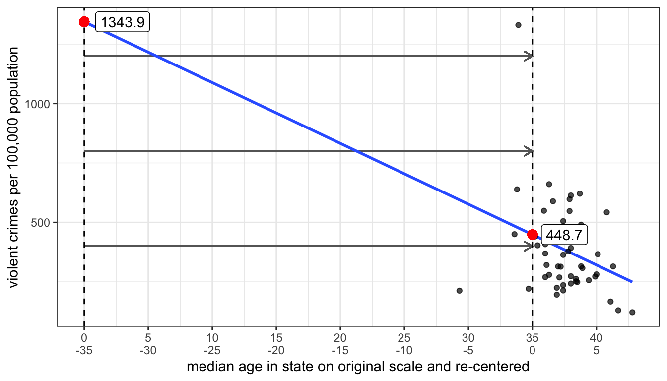
Figure 46: Re-centering the independent variable moves the intercept but does not change the slope
Its also possible to re-center an independent variable in the lm command without creating a whole new variable. If you surround the re-centering in the I() function within the formula, R will interpret the result of whatever is inside the I() function as a new variable. Here is an example based on the previous example:
##       (Intercept) I(MedianAge - 35)
##          448.6533          -25.5795
How good is \(x\) as a predictor of \(y\)?
If I selected a random observation from the dataset and asked you to predict the value of \(y\) for this observation, what value would you guess? Your best guess would be to guess the mean of y because this is the case where your average error would be smallest. This error is defined by the distance between the mean of y and the selected value, \(y_i-\bar{y}\).
Now, lets say instead of making you guess randomly I first told you the value of another variable \(x\) and gave you the slope and intercept predicting \(y\) from \(x\). What is your best guess now? You should guess the predicted value of \(\hat{y}_i\) from the regression line because now you have some additional information. There is no way that having this information could make your guess worse than just guessing the mean. The question is how much better do you do than guessing the mean. Answering this question will give us some idea of how good \(x\) is as a predictor of \(y\).
We can do this by separating, or partitioning the total possible error in our first case when we guessed the mean, into the part accounted for by \(x\) and the part that is unaccounted for by \(x\).
I demonstrate this partitioning for one observation in our crime data (the state of Alaska) with the scatterplot in Figure 47 below.
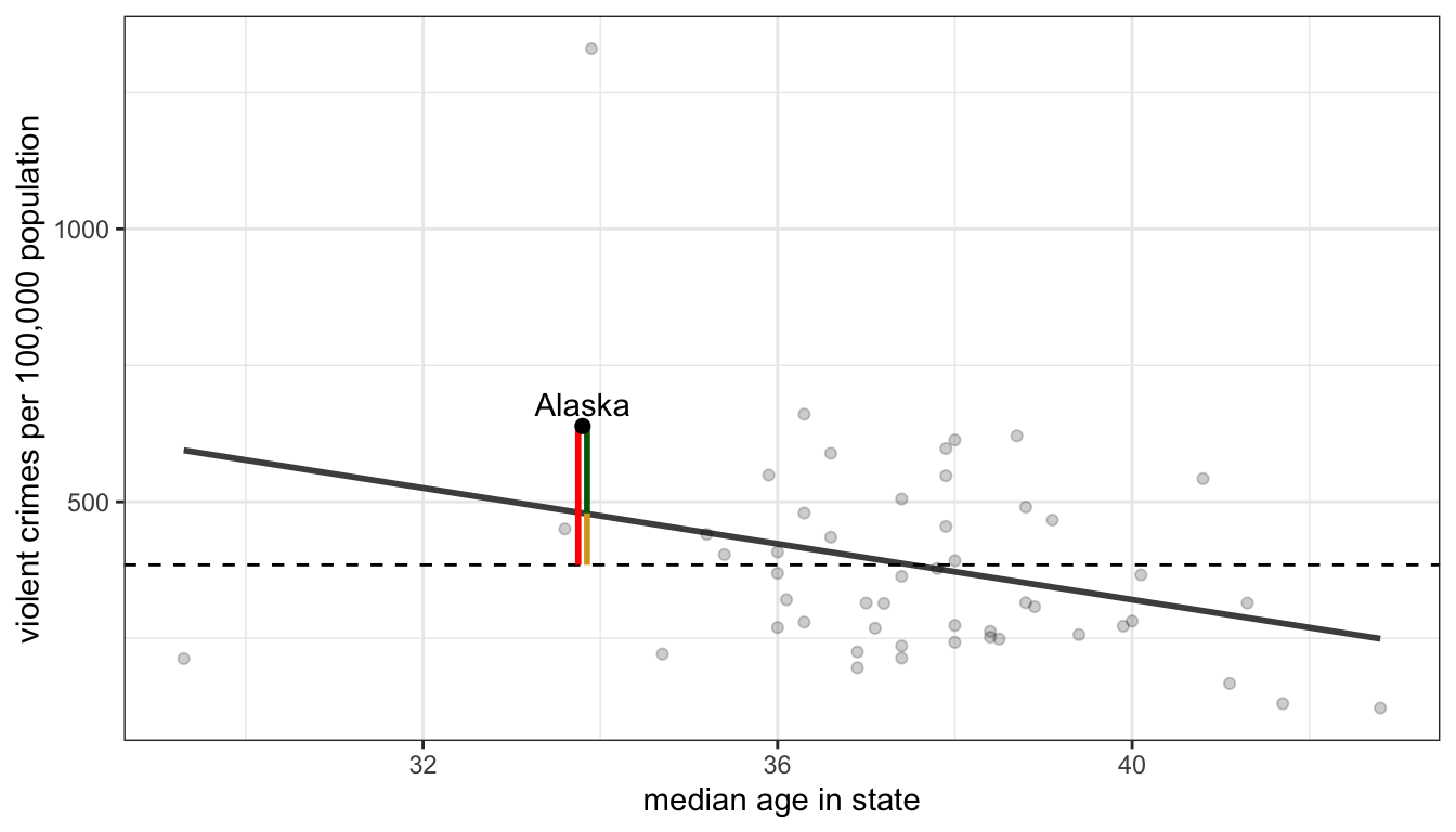
Figure 47: We can parition the total distance (in red) between an observation’s value of the dependent variable and the mean (the dotted horizontal line) into the part accounted for by the model (in gold) and the residual (in green) that is unaccounted for by the model
The distance in red is the total distance between the observed violent crime rate in the state of Alaska and the mean violent crime rate across all states (given by the dotted line). If I were instead to use the OLS regression line predicting the violent crime rate by median age, I would predict a higher violent crime rate than average for Alaska because of its relatively low median age, but I would still predict a crime rate that is too low relative to the actual crime rate. The red line can be partitioned into th gold line which is the improvement in my estimate and the green line which is the error that remains in my prediction from the model. If I could then repeat this process for all of the states, I could calculate the percentage of the total red lines that the gold lines cover. This would give me an estimate of how much I reduce the error in my prediction by using the regression line rather than the mean to predict a state’s violent crime rate.
In practice, we actually need to square those vertical distances because some are negative and some are positive and then we can sum them up over all the observations. So we get the following formulas:
- Total variation: \(SSY=\sum_{i=1}^n (y_i-\bar{y})^2\)
- Explained by model: \(SSM=\sum_{i=1}^n (\hat{y}_i-\bar{y})^2\)
- Unexplained by model: \(SSR=\sum_{i=1}^n (y_i-\hat{y}_i)^2\)
The proportion of the variation in \(y\) that is explainable or accountable by variation in \(x\) is given by \(SSM/SSY\).
This looks like a kind of nasty calculation, but it turns out there is a much simpler way to calculate this proportion. If we just take our correlation coefficient \(r\) and square it. We will get this proportion. This measure is often called “r squared” and can be interpreted as the proportion of the variation in \(y\) that is explainable or accountable by variation in \(x\).
In the example above, we can calculate R squared:
## [1] 0.09091622About 9% of the variation in violent crime rates across states can be accounted for by variation in the median age across states.
Inference for OLS Regression models
When working with sample data, our usual issues of statistical inference apply to regression models. In this case, our primary concern is the estimate of the regression slope because the slope measures the relationship between \(x\) and \(y\). We can think of an underlying OLS regression model in the population:
\[\hat{y}_i=\beta_0+\beta_1x_i\]
We use Greek “beta” values because we are describing unobserved parameters in the population. The null hypothesis in this case would be that the slope is zero indicating no relationship between \(x\) and \(y\):
\[H_0:\beta_1=0\]
In our sample, we have a sample slope \(b_1\) that is an estimate of \(\beta_1\). We can apply the same logic of hypothesis testing and ask whether our \(b_1\) is different enough from zero to reject the null hypothesis. We just need to find the standard error for this sample slope and the degrees of freedom to use for the test and we can do this manually.
However, I have good news for you. You don’t have to do any of this by hand because the lm function does it for you automatically. Lets look at the full output of the model predicting violent crime rates from median age again using the summary command:
##
## Call:
## lm(formula = Violent ~ MedianAge, data = crimes)
##
## Residuals:
##     Min      1Q  Median      3Q     Max
## -381.76 -118.02  -36.25   99.28  853.41
##
## Coefficients:
##             Estimate Std. Error t value Pr(>|t|)
## (Intercept)  1343.94     434.21   3.095  0.00325 **
## MedianAge     -25.58      11.56  -2.214  0.03154 *
## ---
## Signif. codes:  0 '***' 0.001 '**' 0.01 '*' 0.05 '.' 0.1 ' ' 1
##
## Residual standard error: 188.1 on 49 degrees of freedom
## Multiple R-squared:  0.09092,    Adjusted R-squared:  0.07236
## F-statistic:   4.9 on 1 and 49 DF,  p-value: 0.03154
The “Coefficients” table in the middle gives us all the information we need. The first column gives us the sample slope of -25.58. The second column gives us the standard error for this slope of 11.56. The third column gives us the t-statistic derived by dividing the first column by the second column. The final column gives us the p-value for the hypothesis test. In this case, there is about a 3.2% chance of getting a sample slope this large on a sample of 51 cases if the true value in the population is zero. Of course, in this case its nonsensical because we don’t have a sample, but the numbers here will be valuable in cases with real sample data.
Regression Line Cautions
OLS regression models can be very useful for understanding relationships, but they do have some important limitations that you should be aware of when you are doing statistical analysis.
There are three major limitations/cautions to be aware of when using OLS regression:
- OLS regression only works for linear relationships.
- Outliers can sometimes exert heavy influence on estimates of the relationship
- Don’t extrapolate beyond the scope of the data.
Linearity
By definition, an OLS regression line is a straight line. If the underlying relationship between x and y is non-linear, then the OLS regression line will do a poor job of measuring that relationship.
One common case of non-linearity is the case of diminishing returns in which the slope gets weaker at higher values of x. Figure 48 demonstrates a class case of non-linearity in the relationship between a country’s life expectancy and GDP per capita.
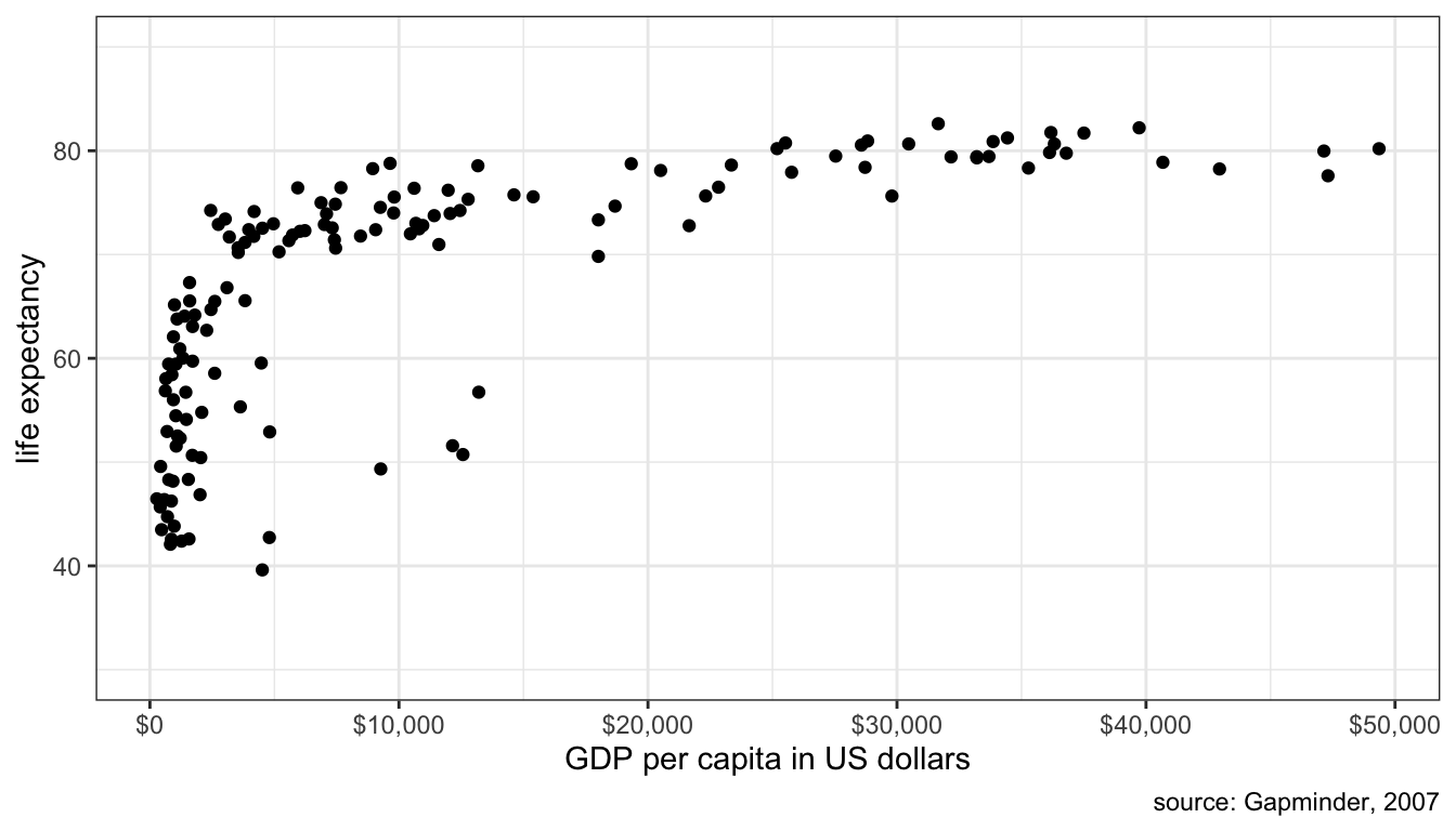
Figure 48: Scatterplot of GDP per capita and life expectancy across countries, 2007
The relationship is clearly a strongly positive one, but also one of diminishing returns where the positive relationship seems to plateau at higher levels of GDP per capita. This makes sense because the same absolute increase in country wealth at low levels of life expectancy can be used to reduce the incidence of well-understood infectious and parasitic diseases, whereas the same absolute increase in country wealth at high levels of life expectancy must try to reduce the risk of less understood and treatable diseases like cancer. You get more bang for your buck when life expectancy is low.
Figure 49 shows what happens if we try to fit a line to this data.
## Warning: Removed 3 rows containing missing values (geom_smooth).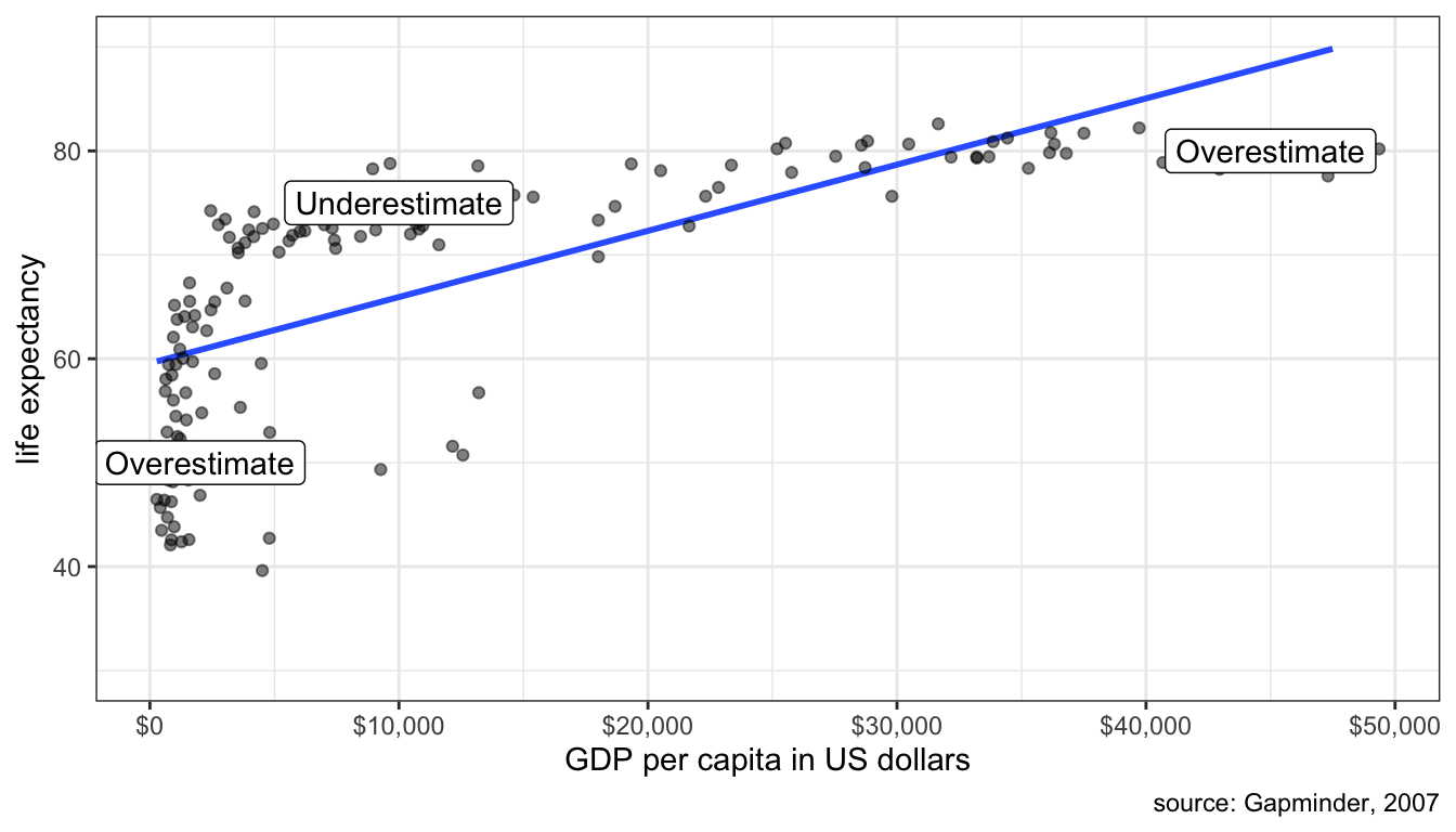
Figure 49: Fitting a line to a non-linear relationship will cause systematic errors in your prediction
Clearly a straight line is a poor fit. We systematically overestimate life expectancy at low and high GDP per capita and underestimate life expectancy in the middle.
Its possible, in some circumstances, to correct for this problem of non-linearity but we will not explore those options in this module. For now, its just important to be aware of the problem and if you see clear non-linearity then you should question the use of an OLS regression line.
Outliers and Influential Points
An outlier is an influential point if removing this observation from the dataset substantially changes the slope of the OLS regression line. You can try the interactive exercise below to see how removing points changes the slope of your line (click on a point a second time to add it back). Can you identify any influential points?
For the case of median age, Utah and DC both have fairly strong influences on the shape of the line. Removing DC makes the relationship weaker, while removing Utah makes the relationship stronger. Outliers will tend to have the strongest influence when their placement is inconsistent with the general pattern. In this case, Utah is very inconsistent with the overall negative effect because it has both low median age and low crime rates.
Lets say that you have identified an influential point. What then? In truth there is only so much you can do. You cannot remove a valid data point just because it is an influential point. There are two cases where it would be legitimate to exclude the point. First, if you have reason to believe that the observation is an outlier because of a data error, then it would be acceptable to remove it. Second, if you have a strong argument that the observation does not belong with the rest of the cases, because it is logically different, then it might be OK to remove it.
In our case, there is no legitimate reason to remove Utah, but there probably is a legitimate reason to remove DC. Washington DC is really a city and the rest of our observations are states that contain a mix of urban and rural population. Because crime rates are higher in urban areas, DC’s crime rates look very exaggerated compared to states. Because of this “apples and oranges” problem, it is probably better to remove DC. If our unit of analysis was cities, on the other hand, then DC should remain.
In large datasets (1000+ observations), its unusual that a single point or even a small cluster of points will exert much influence on the shape of the line. The concern about influential points is mostly a concern in small datasets like the crime dataset.
Thou Doth Extrapolate Too Much
Its dangerous enough to assume that a linear relationship holds for your data (see the first point in this module). Its doubly dangerous to assume that this linear relationship holds beyond the scope of your data. Lets take the relationship between sexual frequency and age. We saw in the previous module that the slope here is -1.3 and the intercept is 108. The intercept itself is outside the scope of the data because we only have data on the population 18 years and older. It would be problematic to make predictions about the sexual frequency of 12 year olds, let alone zero-year olds.
Another trivial example would be to look at the growth rate of children 5-15 years of age by correlating age with height. It would be acceptable to use this model to predict the height of a 14 year old, but not a 40 year old. We expect that this growth will eventually end sometime outside the range of our data when individuals reach their final adult height. If we extrapolated the data, we would predict that 40 year olds would be very tall.