Looking at Distributions
One of the best ways to understand the distribution of a variable is to visualize that distribution with a graph. However, the technique we use to graph the distribution will depend on whether we have a categorical or a quantitative variable. For categorical variables, we will use a barplot, while for quantitative variables, we will use a histogram.
Looking at the distribution of a categorical variable
Calculating the frequency
In order to graph the distribution of a categorical variable, we first need to calculate its frequency. The frequency is just the number of observations that fall into a given category of a categorical variable. We could, for example, count up the number of passengers who were in the various passenger classes on the Titanic. Doing so would give us the following:
| Passenger class | Frequency |
|---|---|
| First | 323 |
| Second | 277 |
| Third | 709 |
| Total | 1309 |
There were 323 first class passengers, 277 second class passengers, and 709 third class passengers. Adding those numbers up gives us 1,309 total passengers. R will calculate these numbers for us easily using the table command:
##
##  First Second  Third
##    323    277    709
Frequency, proportion, and percent
The frequency we just calculated is sometimes called the absolute frequency because it just counts the raw number of observations. However such raw numbers are not usually very helpful because they will vary by the overall number of observations. Instead, we typically want to calculate the proportion of observations that fall within each category. These proportions are sometimes also called the relative frequency. We can calculate the proportion by simply dividing our absolute frequency by the total number of observations:
| Passenger class | Frequency | Proportion |
|---|---|---|
| First | 323 | 323/1309=0.247 |
| Second | 277 | 277/1309=0.212 |
| Third | 709 | 709/1309=0.542 |
| Total | 1309 | 1.0 |
R provides a nice shorthand function titled prop.table to conduct this operation. The prop.table command should be run on the output from a table command.
##
##     First    Second     Third
## 0.2467532 0.2116119 0.5416348
Note that I have “wrapped” the prop.table command around the table command here to do this calculation in a single line.
We often convert proportions to percents which are more familiar to most people. To convert a proportion to a percent, just multiply by 100:
| Passenger class | Frequency | Proportion | Percent |
|---|---|---|---|
| First | 323 | 323/1309=0.247 | 0.247*100=24.7% |
| Second | 277 | 277/1309=0.212 | 0.212*100=21.2% |
| Third | 709 | 709/1309=0.542 | 0.542*100=54.2% |
| Total | 1309 | 1.0 | 100% |
24.7% of passengers were first class, 21.2% of passengers were second class, and 54.2% of passengers were third class. Just over half of passengers were third class and the remaining passengers were fairly evenly split between first and second class.
Don’t make a piechart
Now that we have proportions/percents, we can use these values to construct a graphical display of the distribution. One of the most common techniques for doing this is a piechart. Figure 1 shows a piechart of the distribution of passengers on the Titanic.
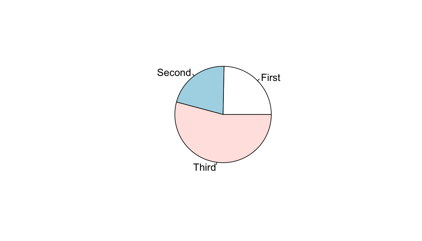
Figure 1: Piechart of passenger class distribution on Titanic
You will notice that I do not show you the code for constructing this piechart. I hid this code because I don’t ever want you to construct a piechart. Despite their popularity, piecharts are a poor tool for visualizing distributions. In order to judge the relative size of the slices on a piechart, your eye has to make judgments in two dimensions and with an unusual pie-shaped slice (\(\pi*r^2\) anyone?). As a result, it can often be difficult to decide which slice is bigger and to properly evaluate the relative sizes of each of the slices. In this case, for example, the relative size of first and second class are quite close and it is not immediately obvious which category is larger.
Make a barplot
A better way to display the distribution is by using a barplot in which vertical or horizontal bars give the proportion or percent. Figure 2 shows a barplot for the distribution of passengers on the Titanic.
ggplot(titanic, aes(x=pclass, y=..prop.., group=1))+
  geom_bar()+
  labs(x="passenger class", y="percent")+
  scale_y_continuous(labels=scales::percent)+
  coord_flip()+
  theme_bw()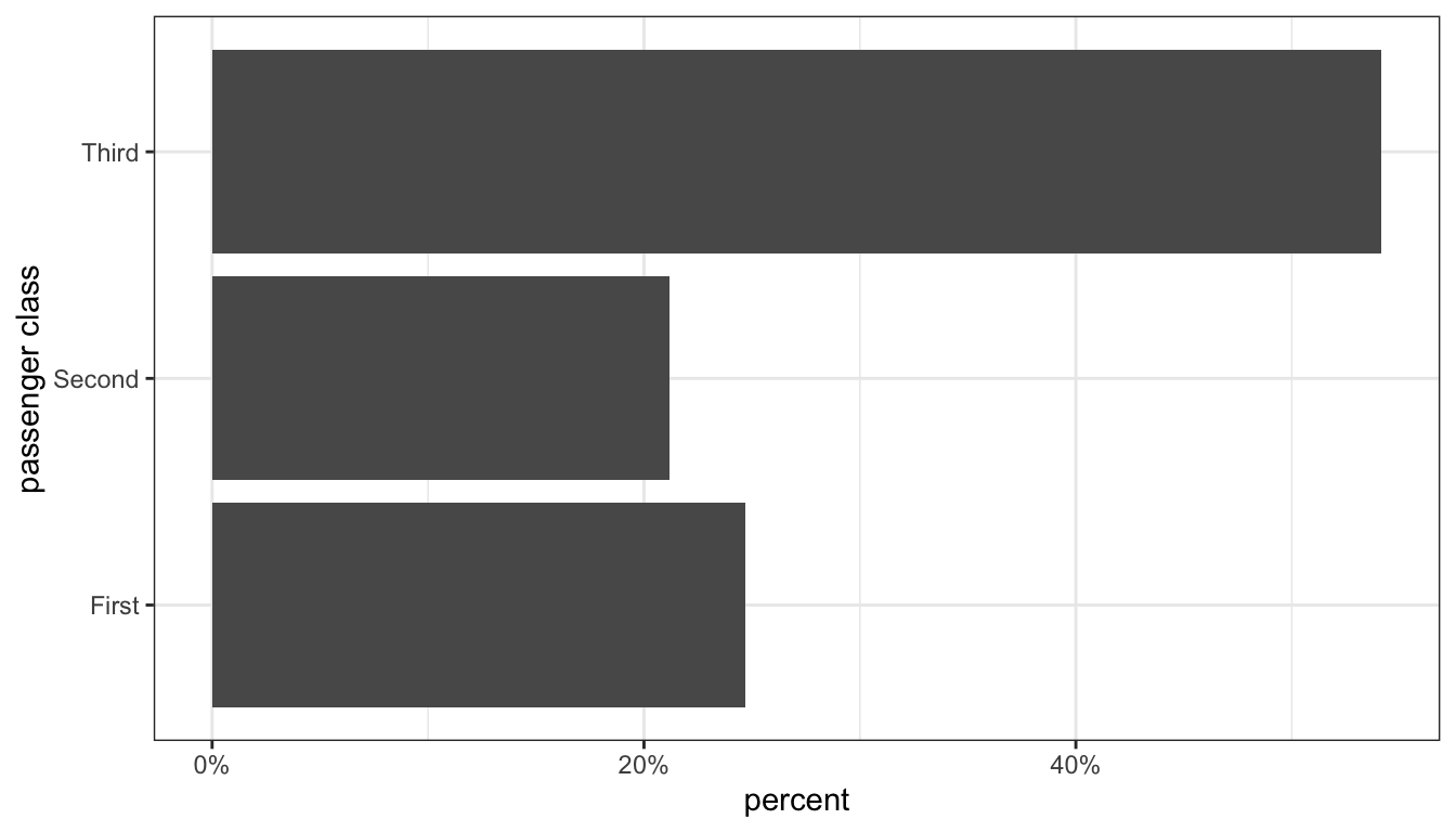
Figure 2: Barplot of passenger class distribution on the Titanic
Figure 2 is our first code example of the ggplot library that we will use to make figures in R. I will discuss how this code works below, but first I want to focus on the figure itself. Unlike the piechart, our eye only has to work in one dimension (in this case, horizontal). We can clearly see that third class is the largest passenger class with slightly more than 50% of all passengers. We also can see easily determine visually that third class passengers are at more than twice as common as either of the other two categories, simply by comparing the height of the bars. We can also see that slightly more passengers were in first class than second class simply by comparing the heights of those two bars.
So how did I create this graph? The ggplot syntax is a little different than most of the other R syntax we will look at this term. With ggplot, we add several commands together with the + sign to create our overall plot. Each command adds a “layer” to our plot. These layers are:
ggplot(titanic, aes(x=pclass, y=..prop.., group=1)): The first command is always theggplotcommand itself which defines the dataset we will use (in this case,titanic) and the “aesthetics” that are listed in theaesargument. In this case, we defined an x (horizontal) variable as thepclassvariable itself and the y (vertical) variable as a proportion (which in ggplot-speak is ..prop..). Thegroup=1argument is a trick for barplots that makes sure our proportions add up to 1 across all categories.geom_bar(): This command defines what geometric shape (in this case a bar) to actually plot. These two layers would be enough for a figure, but I also add four more layers that make for a nicer looking figure. You can try the command above with only the first two elements to see how it is different.labs(x="passenger class", y="percent"): Thelabscommand allows me to add a variety of nice labels to my graph. In this case I labeled my x and y axes.scale_y_continuous(labels=scales::percent): This is not a necessary command but it is useful to get better labels on my y-axis tickmarks. Without this command, the tickmarks would just show proportions (e.g. 0.2, 0.4). This command allows me define custom labels for those tickmarks that show them as percents rather than proportions.coord_flip: This does exactly what it sounds like. It flips the x and y axes of the graph. This causes the bars to display horizontally rather than vertically. This is not necessary, but is often a useful feature to avoid problems with long category names overlapping on the x-axis. Note that even though passenger class looks like it is on the y-axis, ggplot still treats it as the “x” variable for things like defining aesthetics and labeling with thelabslayer.theme_bw(): This last command is for the “theme” layer that just defines a variety of characteristics for the overall look of the figure. I like thetheme_bw(bw for black and white) theme over the default theme that comes withggplot.
Ggplot is a very flexible system that repeats these same basic layer elements in all the graphs it creates. In an appendix to this book, you can see cookbook examples of all the ways we will we use it to create figures throughout the term.
Looking at the distribution of a quantitative variable
Barplots won’t work for quantitative variables because quantitative variables don’t have categories. However, we can do something quite similar with the histogram.
One way to think about the histogram is that we are imposing a set of categories on a quantitative variable by breaking our quantitative variable into a set of equally wide intervals that we call bins. The most important decision with a quantitative variable is how wide to make these bins. As an example, lets take the age variable from our politics dataset. I could break this variable into five-year intervals that go from 0-5, 5-10, 10-15, 15-20, and so on. Alternatively, I could use 10-year intervals from 0-9, 10-19, 20-29, and so on. I could also use any other interval I like such as 1-year, 3-year, and so on. Lets use 10-year intervals for this example. I then just have to count up the number of observations that fall into each 10 year interval.
| Age Group | Frequency |
|---|---|
| 0-9 | 0 |
| 10-19 | 127 |
| 20-29 | 616 |
| 30-39 | 756 |
| 40-49 | 650 |
| 50-59 | 822 |
| 60-69 | 745 |
| 70-79 | 369 |
| 80-89 | 153 |
Because the survey was only administered to adults, I have zero individuals from 0-9 and only a few in the 10-19 age range.
Now that we have the frequencies for each bin, we can plot the histogram. The histogram looks much like a barplot except for two important differences. First, on the x-axis we have a numeric scale for the quantitative variable rather than categories. Second, we don’t put any space between our bars.
Below I show some R code for producing the histogram shown in Figure 3 using ggplot. This code is simpler than the barplot code. We only need to define an x aesthetic in our ggplot command. Instead of a geom_bar we use a geom_histogram. I can specify different bin widths in this command with the binwidth argument. Here I have specified a binwidth of ten years. I have also specified two different colors. The col argument is the color of the border for each bar and the fill argument is the color of the bars themselves.
ggplot(politics, aes(x=age))+
  geom_histogram(binwidth=10, col="black", fill="grey")+
  labs(x="age")+
  theme_bw()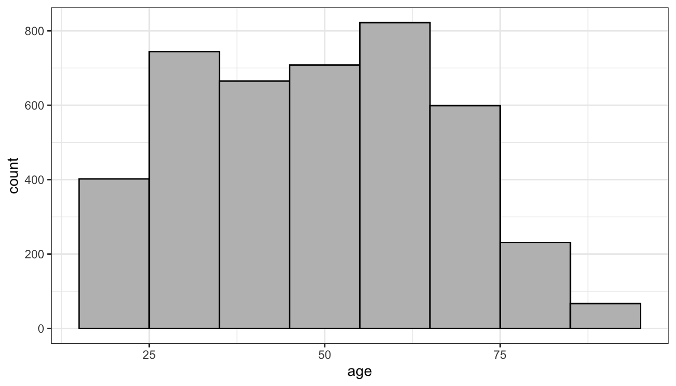
Figure 3: Histogram of age in the politics data
Looking at Figure 3, I can see the peak in the distribution in the 50’s (the baby boomers) with a long fat tail to the right and a steeper drop off at older ages, due to smaller cohorts and old age mortality.I can also sort of see a smaller peak in the 25-34 range which is largely the children of the baby boomers.
What would this histogram look like if I had used 5-year bin widths instead of 10-year bins? Lets try it:
ggplot(politics, aes(x=age))+
  geom_histogram(binwidth=5, col="black", fill="grey")+
  labs(x="age")+
  theme_bw()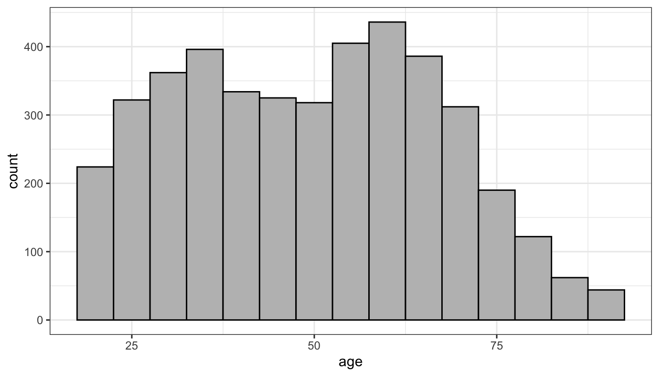
Figure 4: Histogram of age in the politics data with five year bins
As Figure 4 shows, I get more or less the same overall impression but a more fine-grained view. I can more easily pick out the two distinct “humps” in the distribution that correspond to the baby boomers and their children. Sometimes adjusting bin width can reveal or hide important trends and sometimes it can just make it more difficult to visualize the distribution. As an exercise, you can play around with the interactive example below.
What kinds of things should you be looking for in your histogram? There are four general things to be on the lookout for when you examine a histogram.
Center
Where is the center of the distribution? Loosely we can think of the center as the peak in the data, although we will develop some more technical terms for center in the next section. Some distributions might have more than one distinct peak. When a distribution has one peak, we call it a unimodal distribution. Figure 5 shows a clear unimodal distribution for the runtime of movies. We can clearly see that the peak is somewhere between 90 and 100 minutes. When a distribution has two distinct peaks, we call it a bimodal distribution. Figure 6 shows that the distribution of violent crime rates across states is bimodal. The first peak is around 2200-2700 crimes per 100,000 and the second is around 3500 crimes per 100,000. This suggests that there are two distinctive clusters of states: in the first cluster are states with a moderate crime rate and in the second cluster, states with high crime rate states. You can probably guess what we call a distribution with three peaks (and so on), but its fairly rare to see more than two distinct peaks in a distribution.
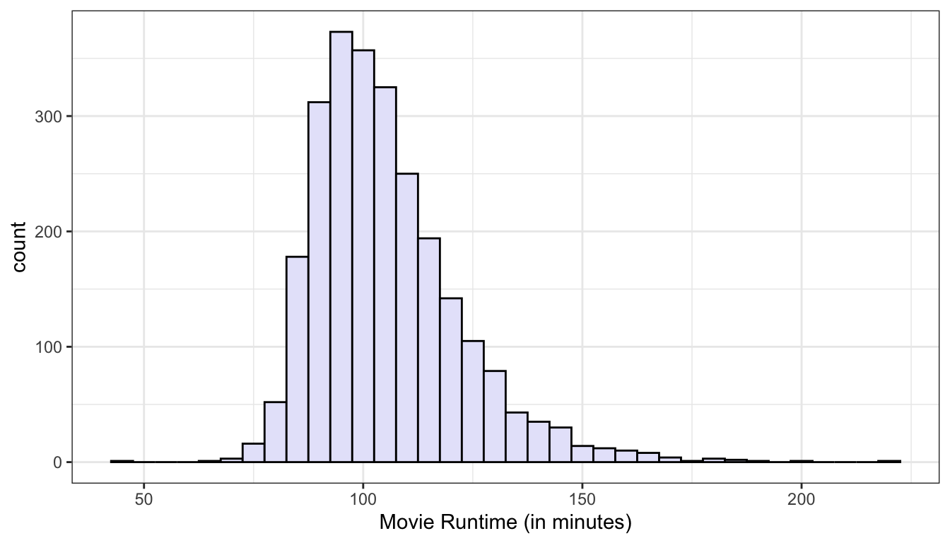
Figure 5: The distribution of movie runtimes is unimodal with one clear peak around 90-100 minutes
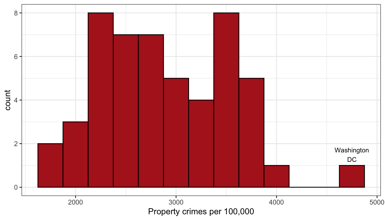
Figure 6: The distribution of property crimes by states is bimodal with a two separate peaks.
Shape
Is the shape symmetric or is one of the tails longer than the other? When the long tail is on the right, we refer to this distribution as right skewed. When the long tail is on the left, we refer to the distribution as left skewed. Figures 7 and 8 show examples of roughly symmetric and heavily right-skewed distributions, respectively, from the movies dataset. The Tomato Rating that movies receive (a score from 1-10) is roughly symmetric with about equal numbers of movies above and below the peak. Box office returns on the other hand are heavily right-skewed. Most movies make less than $100 million at the box office but there are few “blockbusters” that rake in far more. Right-skewness to some degree or another is common in social science data, partially because many variables can’t logically have values below zero and thus the left tail of the distribution is truncated. Left-skewed distributions are rare. In fact, they are so rare that I don’t really have a very good example to show you from our datasets.
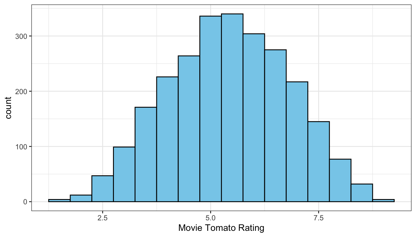
Figure 7: The distribution of movie tomato ratings is roughly symmetric
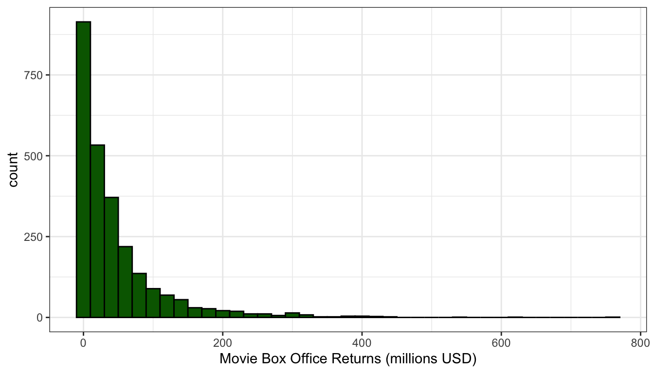
Figure 8: The distribution of movie box office returns is heavily right skewed
Spread
How spread out are the values around the center? Do they cluster tightly around the center or are they spread out more widely? Typically this is a question that can only be asked in relative terms. We can only say that the spread of a distribution is larger or smaller than some comparable distribution. We might be interested for example in the spread of the income distribution in the US compared to Sweden, because this spread is one measure of income inequality.
Figure 9 compares the distribution of movie runtime for comedy movies and sci-fi/fantasy movies. The figure clearly shows that the spread of movie runtime is much greater for sci-fi/fantasy movies. Comedy movies are all tightly clustered between 90 and 120 minutes while longer movies are more common for sci-fi/fantasy movies leading to a longer right tail and a correspondingly higher spread.
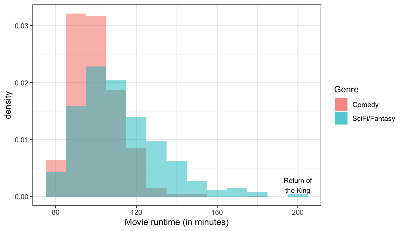
Figure 9: The distribution of movie runtime is much more spread out for sci-fi/fantasy films than it is for comedies.
Outliers
Are there extreme values which fall outside the range of the rest of the data? We want to pay attention to these values because they may have a strong influence on the statistics that we will learn to calculate to summarize a distribution. They might also influence some of the measures of association that we will learn later. Finally, extreme outliers may help identify data coding errors.
In Figure 6 above, we can see a clear outlier in the violent crime rate for Washington DC. Washington DC’s crime rate is such an outlier relative to the other states that we will pay attention to it throughout this term as we conduct our analysis. Figure 9 above shows that Peter Jackson’s Return of the King was an outlier for the runtime of sci-fi/fantasy movies, although it doesn’t seem quite as extreme as for the case of Washington DC.
In large datasets, it can sometimes be very difficult to detect a single outlier on a histogram because the height of its bar will be so small. Later in this chapter, we will learn another graphical technique called the boxplot that can be more useful for detecting outliers in a quantitative variable.