Plotting Cookbook
This appendix will provide ggplot example R code and output for of all the graphs that we might use this term. For further information, I highly recommend Kieran Healy’s Data Visualization book and Hadley Wikham’s ggplot2 book.
All the examples provided will use the standard example datasets that we have been working with throughout the term.
Barplots
Oddly, barplots are one of the trickiest graphs in ggplotif you want proportions rather than absolute frequencies for each category. To make proportions, I need to specify y=..prop.. in the aesthetics, and then use group=1 to ensure that all categories are part of a single group and thus have proportions that sum up to one. In the code below, I am also using the scale_y_continuous command and the scales::percent command to label the tickmarks on the y-axis as percents rather than proportions.
ggplot(titanic, aes(x=pclass, y=..prop.., group=1))+
  geom_bar()+
  scale_y_continuous(labels=scales::percent)+
  labs(x="passenger class", y=NULL,
       title="Distribution of passenger class on Titanic")+
  theme_bw()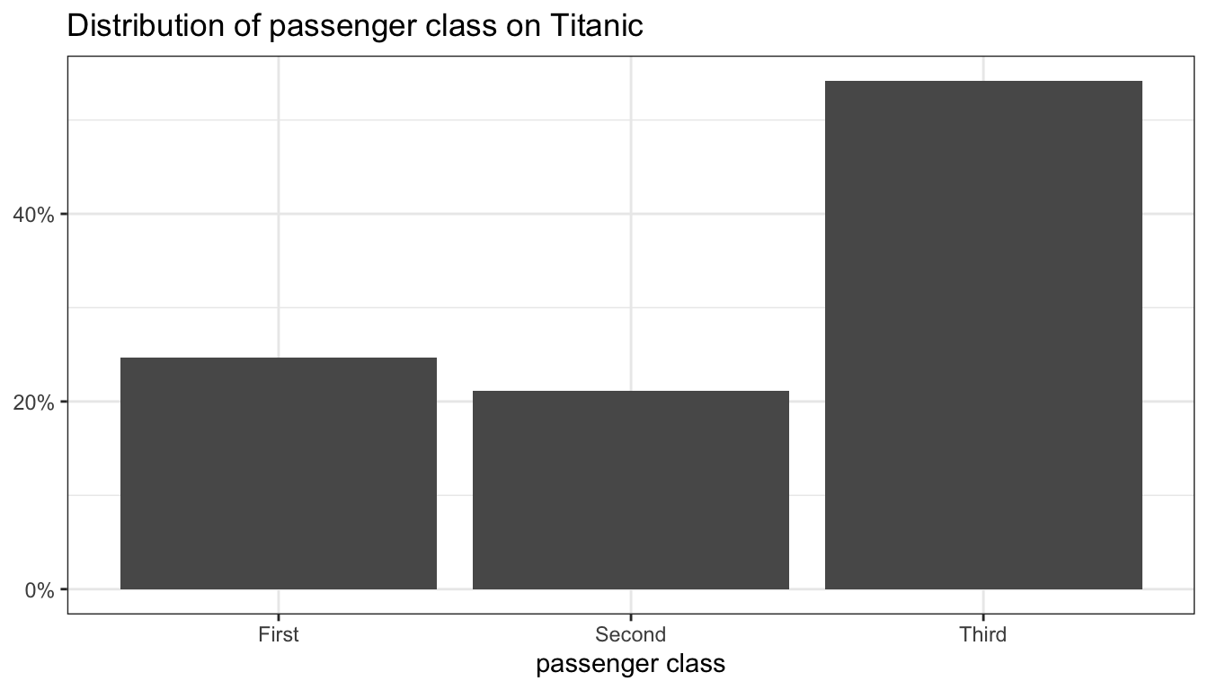
Figure 91: A barplot
The result of this code is shown in Figure 91. Because the tickmark labels are self-explanatory I use a value of NULL for the y-axis label.
Histograms
Histograms are a snap in ggplot. The binwidth argument will allow you to easily resize bin widths without having to provide every break as base plot does.
ggplot(movies, aes(x=Runtime))+
  geom_histogram(binwidth = 5, col="black")+
  labs(x="movie runtime (minutes)",
       title="Histogram of movie runtime")+
  theme_bw()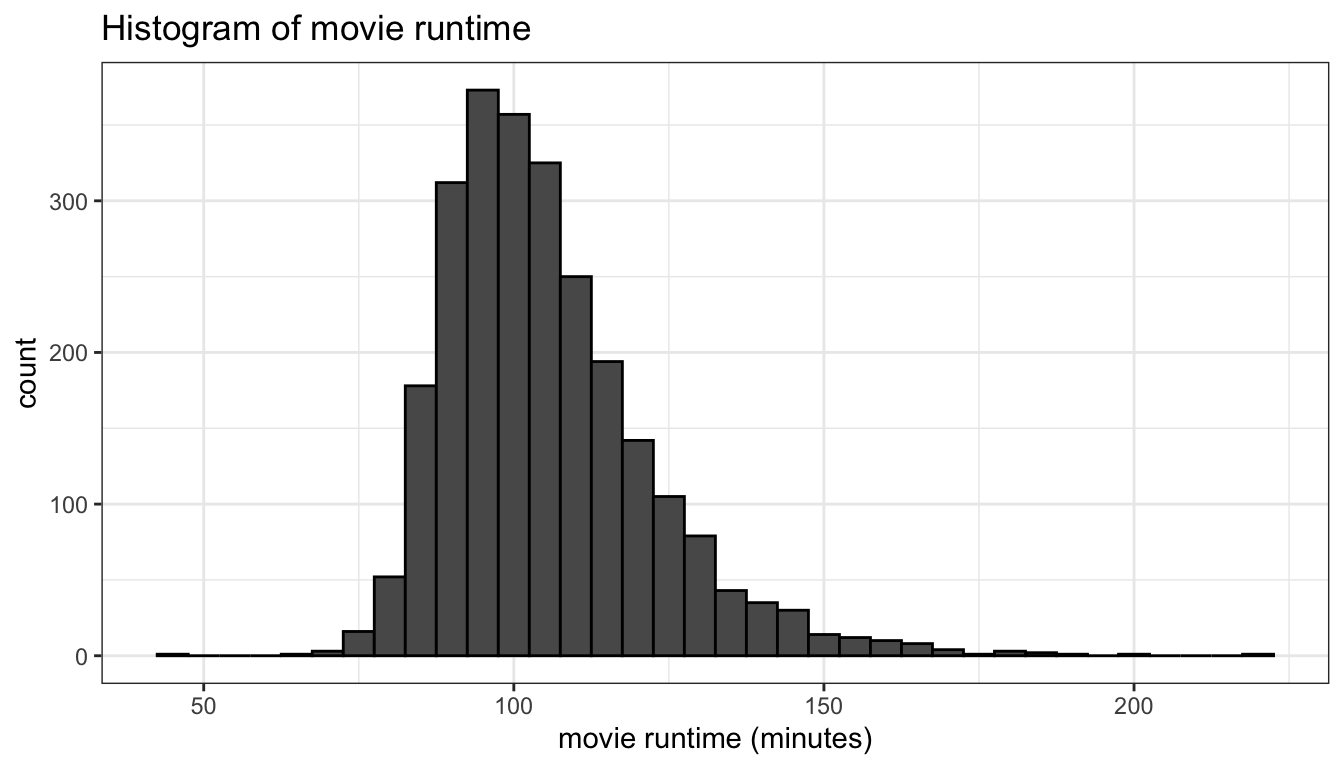
Figure 92: A basic histogram
Figure 92 shows the basic histogram from the code above. By default, ggplot will not place a border around bars, but I like to make the border a slightly different color (e.g. col="black") to provide better visual definition.
You can also calculate density instead of count, if you prefer, by adding the y=..density.. option to the aesthetics. Density is the proportion of cases in a bin, divided by bin width. If you plot a histogram with density, you can also overlay this figure with a smoothed line approximating the distribution called a kernel density. These results are shown in Figure 93.
ggplot(movies, aes(x=Runtime, y=..density..))+
  geom_histogram(binwidth = 5, col="black")+
  geom_density(col="red", fill="grey", alpha=0.5)+
  labs(x="movie runtime (minutes)",
       title="Histogram of movie runtime")+
  theme_bw()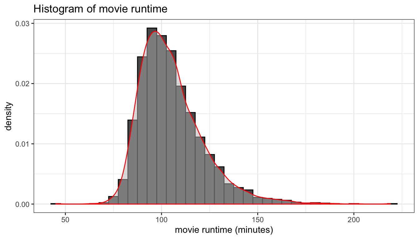
Figure 93: A histogram with kernel density smoother
Boxplots
The only tricky thing to a boxplot in ggplot is to remember that the aesthetic is y not x. Its not required, but setting x="" in the aesthetics and then setting the x label to NULL will also create a cleaner display with no x-axis. I also apply a geom_boxplot only argument here that colors outliers a different color.
ggplot(movies, aes(x="", y=Runtime))+
  geom_boxplot(fill="grey", outlier.color = "red")+
  labs(y="movie runtime (minutes)", x=NULL,
       title="Boxplot of movie runtime")+
  theme_bw()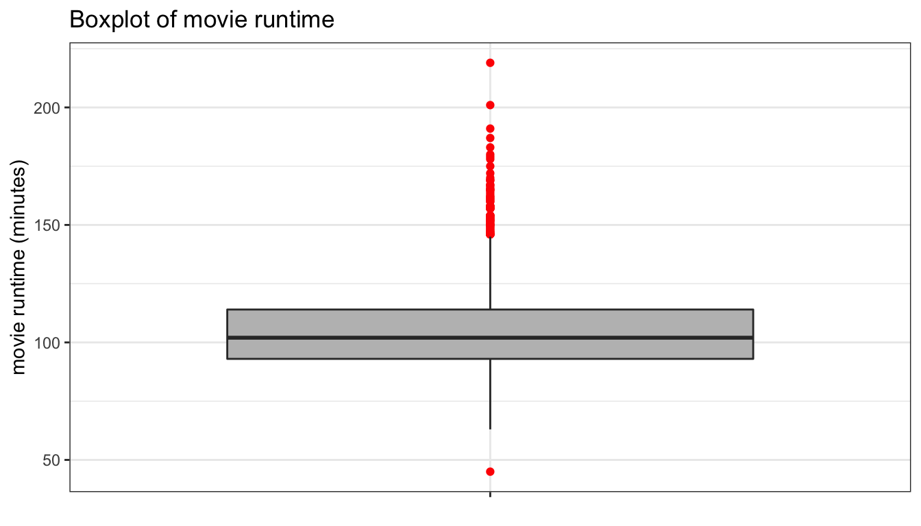
Figure 94: A basic boxplot
You can also try a geom_violin instead which basically gives you a mirrored kernel density plot. For a single variable, use x=1 because geom_violin requires an x aesthetic. Below, I show how you can extend this into a comparative violin plot.
ggplot(movies, aes(x=1, y=Runtime))+
  geom_violin(fill="grey")+
  scale_x_continuous(labels=NULL)+
  labs(x=NULL, y="movie runtime (minutes)",
       title="Violin plot of movie runtime")+
  theme_bw()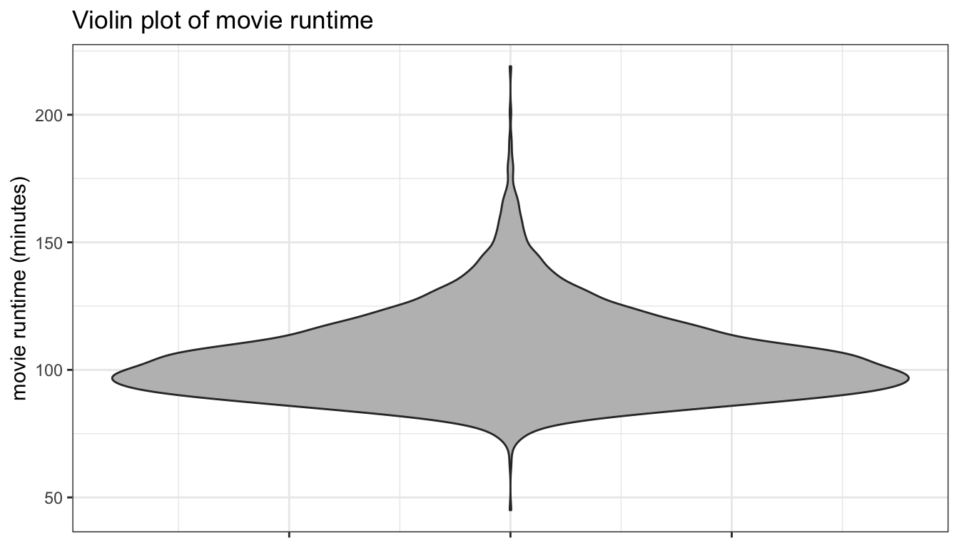
Figure 95: A violin plot
Comparative Barplots
Comparative barplots are definitely one of the most difficult cases to graph properly in ggplot because grouping causes all kinds of issues with calculating proportions correctly. The best approach that I have found is to use faceting to separate out the barplots of one variable by the categories of the other variable. The basic code is then identical to that for a single barplot above with the addition of a facet_wrap command to identify the second categorical variable to use for faceting.
ggplot(titanic, aes(x=survival, y=..prop.., group=1))+
  geom_bar()+
  facet_wrap(~pclass)+
  scale_y_continuous(labels = scales::percent)+
  labs(x=NULL, y=NULL,
       title="Survival on the Titanic by class")+
  theme_bw()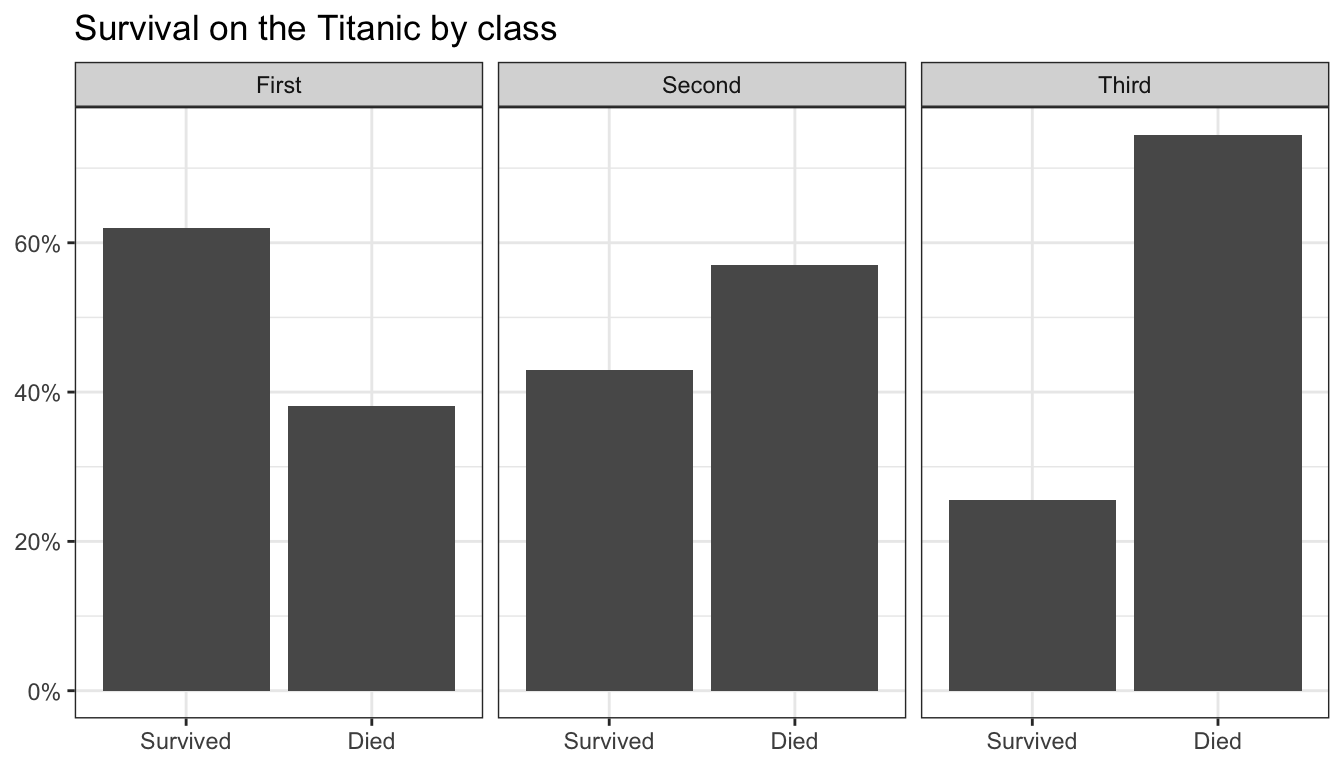
Figure 96: A comparative barplot made by faceting
Figure 96 shows the result. In this case, since survival and death are mirror images, we could convey the same information, but with much less ink by a simple dotplot of the percent surviving by passenger class. However, this would require some preparatory work to prepare the data in the way we want to display it. For the undergraduate class, you are not required to understand how to prepare this data.
tab <- prop.table(table(titanic$survival, titanic$pclass),2)
tab <- subset(as.data.frame.table(tab),
             Var1=="Survived",
             select=c("Var2","Freq"))
colnames(tab) <- c("pclass","prop_surv")
ggplot(tab, aes(x=pclass, y=prop_surv))+
  geom_point()+
  scale_y_continuous(labels=scales::percent, limits=c(0,0.8))+
  labs(x=NULL, y=NULL,
       title="Percent surviving Titanic by class")+
  coord_flip()+
  theme_bw()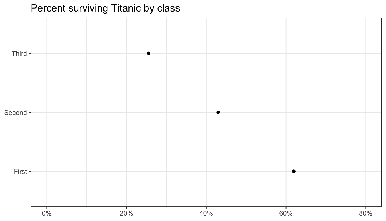
Figure 97: A simple dotplot
Figure 97 shows the resulting dotplot. If that is a little too spartan for you, you could try a lollipop graph, shown in Figure 98. The geom_lollipop is in the ggalt library.
ggplot(tab, aes(x=pclass, y=prop_surv))+
  geom_lollipop()+
  scale_y_continuous(labels=scales::percent, limits=c(0,0.7))+
  labs(x=NULL, y=NULL,
       title="Percent surviving Titanic by class")+
  coord_flip()+
  theme_bw()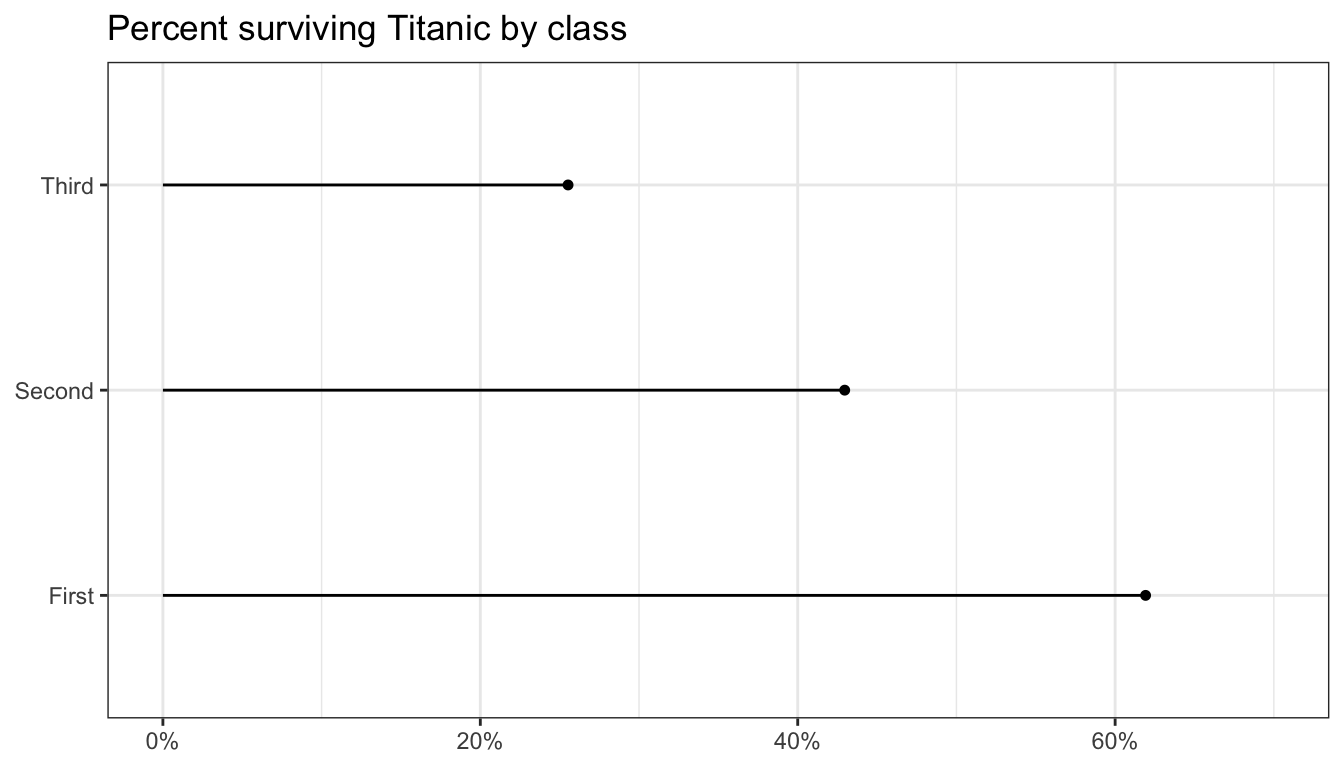
Figure 98: A lollipop plot
Comparative Boxplots
To construct comparative boxplots, we just need to add an x to the aesthetic of a boxplot.
ggplot(movies, aes(x=Genre, y=Runtime))+
  geom_boxplot(fill="grey", outlier.color = "red")+
  labs(y="movie runtime (minutes)",
       title="Boxplot of movie runtime by genre")+
  theme_bw()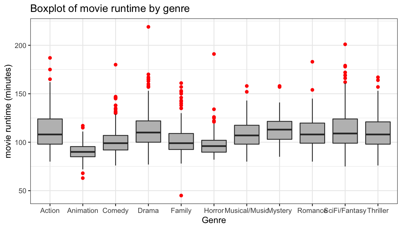
Figure 99: A basic comparative boxplot
The mediocre results are shown in Figure 99. The labels on the x-axis often run into one another, so coord_flip is a good option to avoid that. In addition, I can also use the varwidth argument in geom_boxplot to scale the width of boxplots relative to the number of observations.
ggplot(movies, aes(x=Genre, y=Runtime))+
  geom_boxplot(fill="grey", outlier.color = "red",
               varwidth=TRUE)+
  labs(y="movie runtime (minutes)",
       title="Boxplot of movie runtime by genre")+
  coord_flip()+
  theme_bw()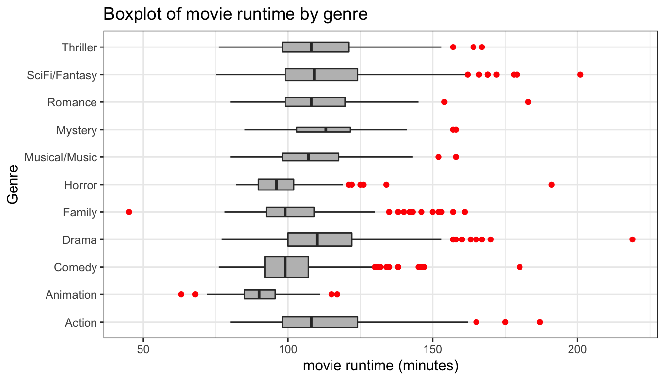
Figure 100: Flipping coordinates for better display
My improved comparative boxplot is shown in Figure 100. However, Its also often useful to re-order the categories by the mean or median of the quantitative variable. We can do this with the reorder command:
ggplot(movies, aes(x=reorder(Genre, Runtime, median), y=Runtime))+
  geom_boxplot(fill="grey", outlier.color = "red",
               varwidth=TRUE)+
  labs(y="movie runtime (minutes)", x=NULL,
       title="Boxplot of movie runtime by genre")+
  coord_flip()+
  theme_bw()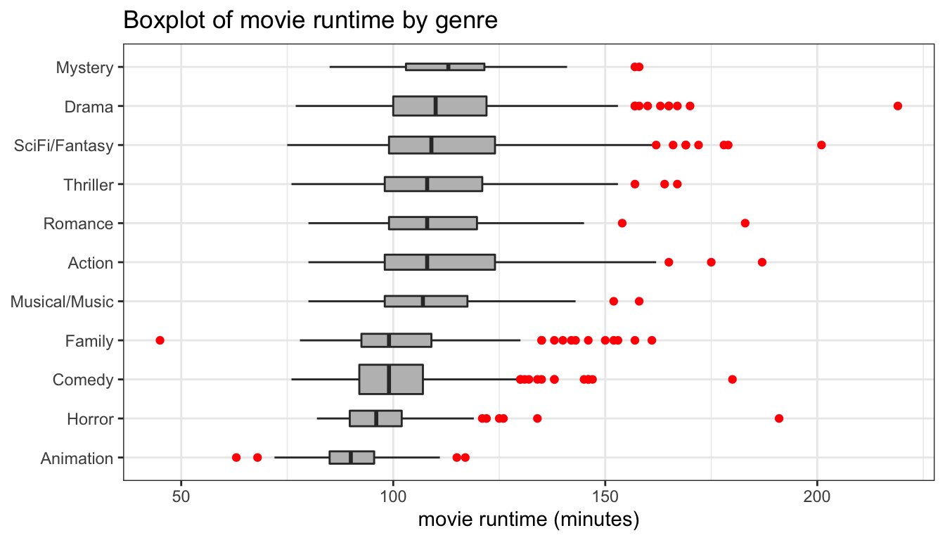
Figure 101: Re-order categories by median
The results are shown in Figure 101. In this case, we used the reorder command to reorder the categories of Genre by the median value of Runtime.
We could also try a comparative violin plot as shown in Figure 102.
ggplot(movies, aes(x=reorder(Genre, Runtime, median), y=Runtime))+
  geom_violin(fill="grey")+
  labs(y="movie runtime (minutes)", x=NULL,
       title="Boxplot of movie runtime by genre")+
  coord_flip()+
  theme_bw()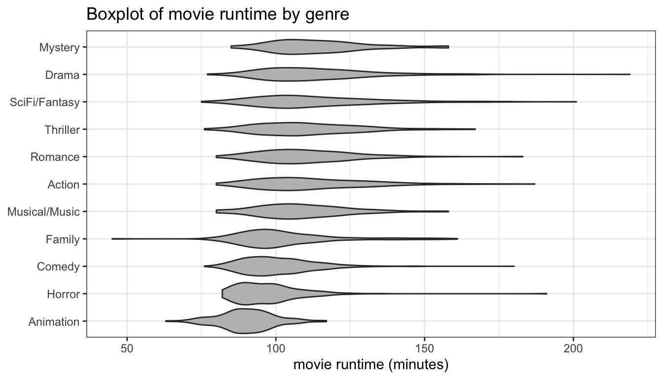
Figure 102: A comparative violin plot
Scatterplots
The geom_point command gives us the the geom we want for scatterplots. We can also use geom_smooth to graph a variety of lines to our data. Setting an alpha value can help with overplotting as well by providing semi-transparency.
ggplot(politics, aes(x=age, y=income))+
  geom_point(alpha=0.5)+
  scale_y_continuous(labels=scales::dollar)+
  labs(x="age",
       y="family income (in thousands USD)",
       title="Scatterplot between age and family income",
       caption="ANES 2016")+
  theme_bw()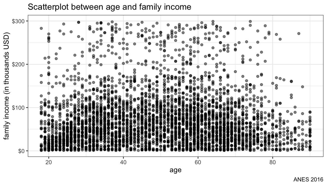
Figure 103: Basic Scatterplot
The results are shown in Figure 103. As more points are plotted in the same position, the overall plot darkens. However, there is still a lot of overplotting because age is only recorded in whole numbers. In cases like this, we can use geom_jitter rather than geom_point to randomly perturb each value pair a little bit, as shown in Figure 14.
ggplot(politics, aes(x=age, y=income))+
  geom_jitter(alpha=0.5)+
  scale_y_continuous(labels=scales::dollar)+
  labs(x="age",
       y="family income (in thousands USD)",
       title="Scatterplot between age and family income",
       caption="ANES 2016")+
  theme_bw()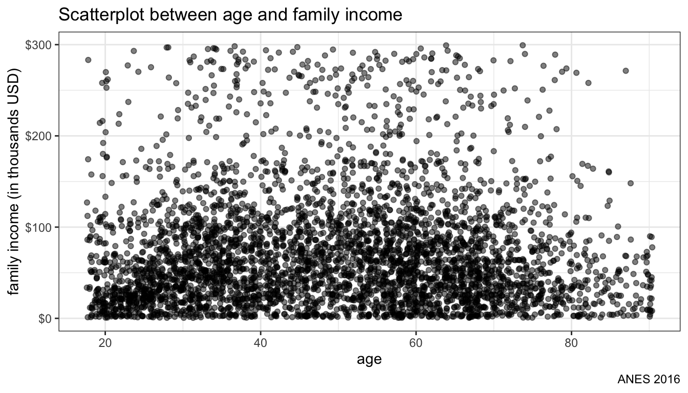
Figure 104: Jittering points to deal with overplotting
It is often useful to apply some model to the data to draw a best-fitting line through the points. The geom_smooth function will do this for us and we can use the method argument to specify what kind of model we want to fit. You an apply non-parametric smoothers like LOESS as well as an OLS regression line. Lets first try a LOESS smoother.
ggplot(politics, aes(x=age, y=income))+
  geom_jitter(alpha=0.5)+
  geom_smooth(method="loess")+
  scale_y_continuous(labels=scales::dollar)+
  labs(x="age",
       y="family income (in thousands USD)",
       title="Scatterplot between age and family income",
       caption="ANES 2016")+
  theme_bw()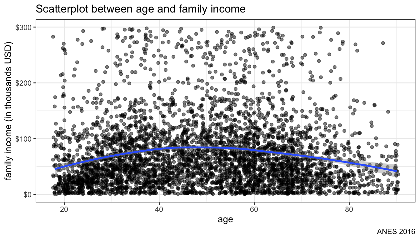
Figure 105: Plotting loess smoother to data
Figure 105 shows us the smoothed line. It looks like an inverted U-shaped distribution. Family income is also highly right skewed. Lets try scale_y_log10 to put income on a log-scale (advanced).
ggplot(politics, aes(x=age, y=income))+
  geom_jitter(alpha=0.5)+
  geom_smooth(method="loess")+
  scale_y_log10(labels=scales::dollar)+
  labs(x="age",
       y="family income (in thousands USD)",
       title="Scatterplot between age and family income",
       caption="ANES 2016")+
  theme_bw()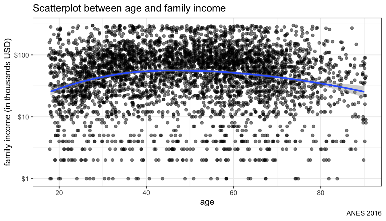
Figure 106: Changing scale of y-axis to logarithmic
Figure 106 shows the scatterplot with an exponential scale for the y-axis. Note how the values go from $1K to $10K to $100K at even intervals.
Now lets try switch the smoothing to a linear model, by simply changing the method in geom_smooth:
ggplot(politics, aes(x=age, y=income))+
  geom_jitter(alpha=0.5)+
  geom_smooth(method="lm")+
  scale_y_log10(labels=scales::dollar)+
  labs(x="age",
       y="family income (in thousands USD)",
       title="Scatterplot between age and family income",
       caption="ANES 2016")+
  theme_bw()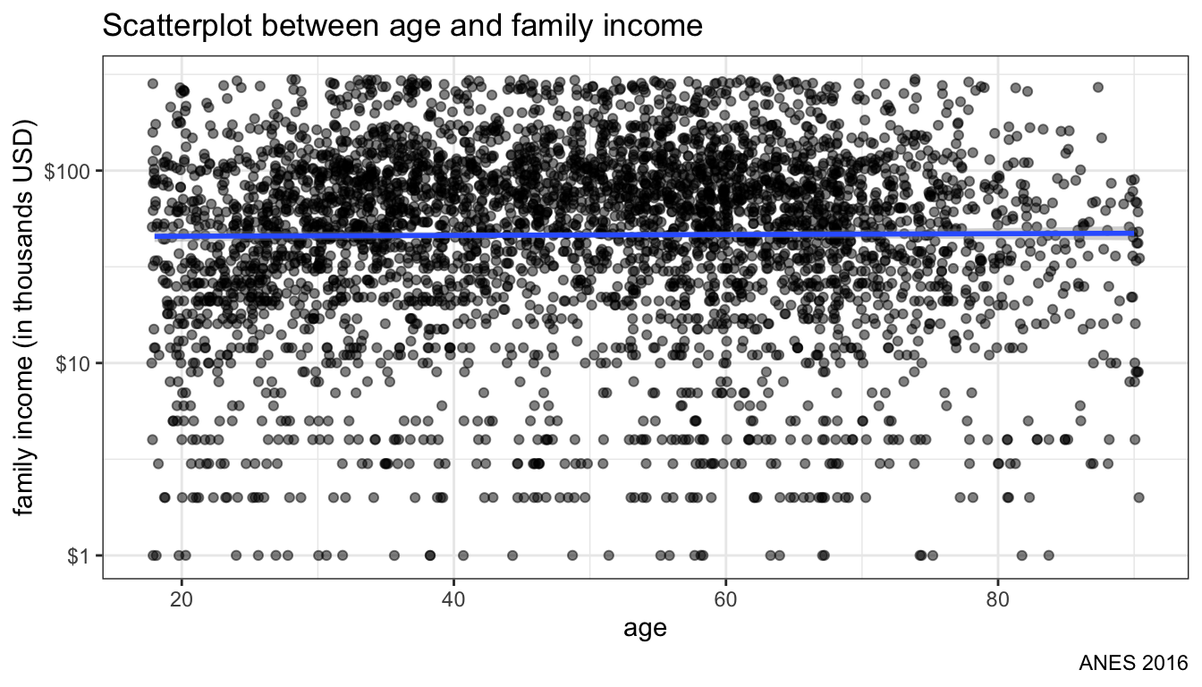
Figure 107: Fitting an OLS regression line
Figure 107 shows the OLS line predicting income. Its pretty flat which to some extent hides the underlying curvilinear relationship. In practice, I would probably want to apply a quadratic term on age to any regression model.
Finally, we can add add in an aesthetic for a third categorical variable by applying color to the plots. In this case, I will color the plots by highest degree received.
ggplot(politics, aes(x=age, y=income))+
  geom_jitter(alpha=0.5, aes(color=educ))+
  geom_smooth(method="lm")+
  scale_color_brewer(palette = "YlOrRd")+
  scale_y_log10(labels=scales::dollar)+
  labs(x="age",
       y="family income (in thousands USD)",
       title="Scatterplot between age and family income",
       caption="ANES 2016",
       color="Highest degree")+
  theme_bw()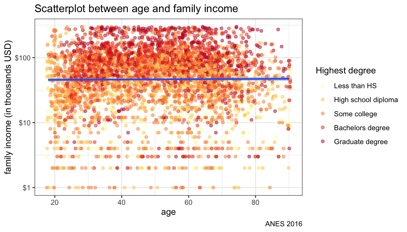
Figure 108: Adding color aesthetic
Figure 108 shows the result. Because I defined the color aesthetic in geom_jitter rather than the base ggplot command, I still only get one smoothed OLS regression line for the whole dataset. If I wanted separate lines by educational level, I could add the color aesthetic to ggplot instead.
ggplot(politics, aes(x=age, y=income, color=educ))+
  geom_jitter(alpha=0.5)+
  geom_smooth(method="lm")+
  scale_color_brewer(palette = "YlOrRd")+
  scale_y_log10(labels=scales::dollar)+
  labs(x="age",
       y="family income (in thousands USD)",
       title="Scatterplot between age and family income",
       caption="ANES 2016",
       color="Highest degree")+
  theme_bw()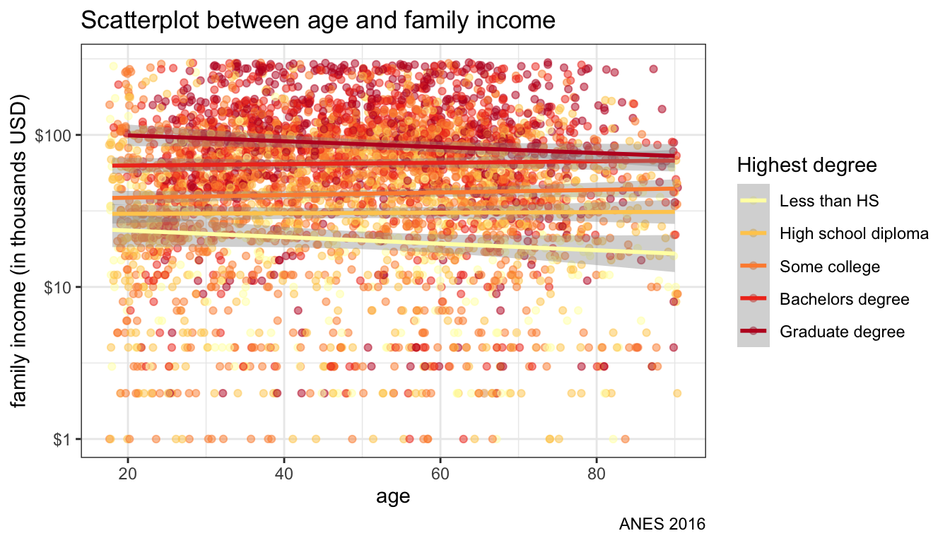
Figure 109: Separate OLS lines by color aesthetic
Figure 109 shows the same plot but now with separate lines for each educational level. We are basically plotting interaction terms here between age and educational level.
Instead of coloration, I could have used faceting to try to separate out differences by education. Figure 110 shows the results using this approach. For this graph, I use two separate geom_smooth commands to get the LOESS and linear fit for each panel.
ggplot(politics, aes(x=age, y=income))+
  geom_jitter(alpha=0.3)+
  geom_smooth(method="lm")+
  geom_smooth(method="loess", color="red")+
  facet_wrap(~educ)+
  scale_y_log10(labels=scales::dollar)+
  labs(x="age",
       y="family income (in thousands USD)",
       title="Scatterplot between age and family income",
       caption="ANES 2016")+
  theme_bw()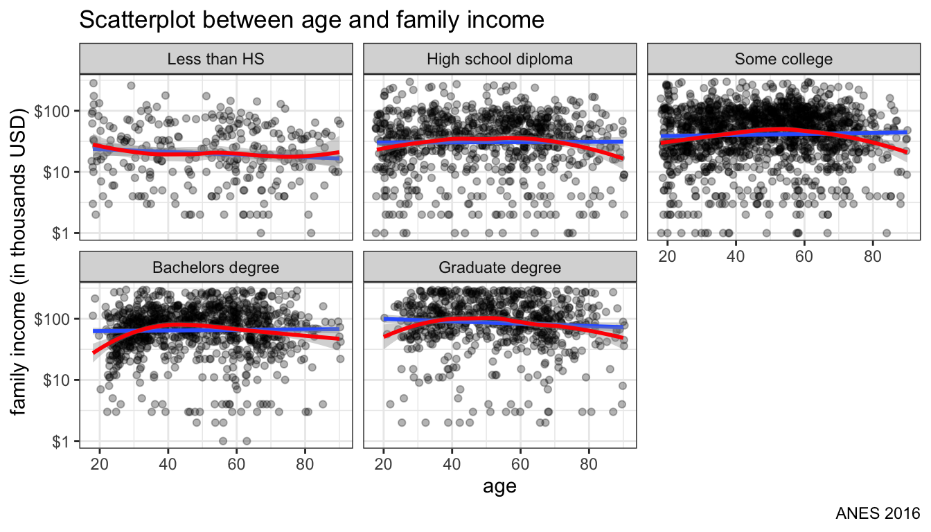
Figure 110: facet by education instead of color
If you have a small number of cases, it might make sense to label your values. You can label values with geom_text but you can often run into problems with labels being truncated or overlapping.
ggplot(crimes, aes(x=Unemployment, y=Property))+
  geom_point(alpha=0.7)+
  geom_smooth(method="lm", se=FALSE)+
  geom_text(aes(label=State), size=2)+
  labs(x="Unemployment rate",
       y="Property crimes per 100,000 population",
       title="Scatterplot of unemployment and property crime")+
  theme_bw()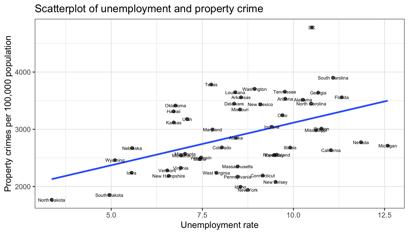
Figure 111: labeling points can look really bad
Figure 111 shows labeling with the default geom_text approach. You can fiddle with a variety of arguments here that let you offset the labels but it rarely produces clean labels. The library ggrepel has a function geom_text_repel that will work harder to place labels in a readable position:
ggplot(crimes, aes(x=Unemployment, y=Property))+
  geom_point(alpha=0.7)+
  geom_smooth(method="lm", se=FALSE)+
  geom_text_repel(aes(label=State), size=2)+
  labs(x="Unemployment rate", y="Property crimes per 100,000 population",
       title="Scatterplot of unemployment rate and property crime rate")+
  theme_bw()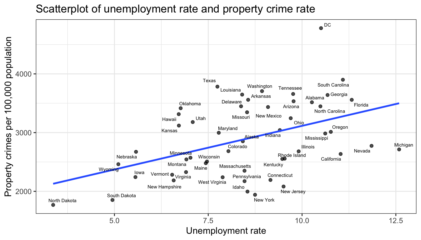
Figure 112: repel works better for labeling points, but still can get too busy