Percentiles and the Five Number Summary
In this section, we will learn about the concept of percentiles. Percentiles will allow us to calculate a five number summary of a distribution and introduce a new kind of graph for describing a distribution called the boxplot.
Percentiles
We have already seen one example of a percentile. The median is the 50th percentile of the distribution. It is the point at which 50% of the observations are lower and 50% are higher. We can actually use this same logic to calculate other percentiles. We could calculate the 25th percentile of the distribution by finding the point where 25% of the observations are below and 75% are above. We could even calculate something like the 43rd percentile if we were so inclined.
We calculate percentiles in a fashion similar to the median. First, sort the data from lowest to highest. Then, find the exact observation where X% of the observations fall below to find the Xth percentile. In some cases, there might not be an exact observation that fits this description and so you may have to take the mean across the two closest numbers.
The quantile command in R will calculate percentiles for us in this fashion (quantile is a synonym for percentile). In addition to telling the quantile command which variable we want the percentiles of, we need to tell it which percentiles we want. In the command below, I ask for the 27th and 57th percentile of age in our sexual frequency data.
## 27% 57%
##  32  46
27% of the sample were younger than 32 years of age and 57% of the sample were younger than 46 years of age.
The five number summary
We can split our distribution into quarters by calculating the minimum(0th percentile), the 25th percentile, the 50th percentile (the median), the 75th percentile, and the maximum (100th percentile). Collectively, these percentiles are known at the quartiles of the distribution (not to be confused with quantile) and are also described as the five number summary of the distribution.
We can calculate these quartiles with the quantile command. If I don’t enter in specific percentiles, the quantile command will give me the quartiles by default:
##   0%  25%  50%  75% 100%
##   18   31   43   56   89
The bottom 25% of respondents are between the ages of 18-31. The next 25% are between the ages of 31-43. The next 25% are between the ages of 43-56. The top 25% are between the ages of 56-89.
We can also use this five number summary to calculate the interquartile range (IQR) which is just the difference between the 25th and 75th percentile. This gives us a sense of how spread out observations are. In this data:
\[IQR=56-31=25\]
So, the 25th and 75th percentile of age are separated by 25 years.
Boxplots
We can also use this five number summary to create another graphical representation of the distribution called the boxplot. Figure 13 below shows a boxplot for the age variable from the sexual frequency data.
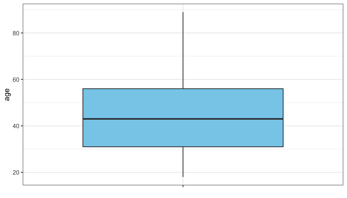
Figure 13: Boxplot of respondent’s age in sexual frequency data
The “box” in the boxplot is drawn from the 25th to the 75th percentile. The height of this box is equal to the interquartile range. The median is drawn as a thick bar within the box. Finally, “whiskers” are then drawn to the minimum and maximum of the data. Sometimes, the whiskers are drawn to less than the minimum and maximum if these values are very extreme and instead the whiskers are drawn out to 1.5xIQR in length and then individual points are plotted. In this case there were no extreme values, so the whiskers were drawn all the way out to the actual maximum and minimum.
The boxplot provides many pieces of information. It shows the center of the distribution as measured by the median. It also gives a sense of the spread of the distribution and extreme values by the height of the box and whiskers. It can also show skewness in the distribution depending on where the median is drawn within the box and the size of the whiskers. If the median is in the center of the box, then that indicates a symmetric distribution. If the median is towards the bottom of the box, then the distribution is right-skewed. If the median is towards the top of the box, then the distribution is left-skewed.
I have not yet shown you how to make a boxplot using ggplot. The code for Figure 13 is shown below.
Most of this code is straightforward. We use the y aesthetic to indicate the variable we want the boxplot for and we use the geom_boxplot command to graph the boxplot (in this case the fill argument can be used to specify a color choice for the box of the boxplot). The only unusual thing here is the use of x="" in the top-level aesthetics and the use of x=NULL in the labs command. These additions are not strictly necessary but they do cause the horizontal x-scale on the graph to be suppressed. Otherwise we would see some non-intuitive numbers here.
The exercise below allows you to adjust a slider to see different percentiles on both a histogram and a boxplot.
In general, boxplots for a single variable do not contain as much information as a histogram and so are generally inferior for understanding the full shape of the distribution. The real advantage of boxplots will come in the next module when we learn to use comparative boxplots to make comparisons of the distribution of a quantitative variable across different categories of a categorical variable.