Mean Differences
Measuring association between a quantitative and categorical variable is fairly straightforward. We want to look for differences in the distribution of the quantitative variable at different categories of the categorical variables. For example, if we were interested in the gender wage gap, we would want to compare the distribution of wages for women to the distribution of wages for men. There are two ways we can do this. First, we can graphically examine the distributions using the techniques we have already developed, particularly the boxplot. Second, we can compare summary measures like the mean across categories.
Graphically examining differences in distributions
We could compare entire histograms of the quantitative variable across different categories of the categorical variable, but this is often too much information. A cleaner method is to use comparative boxplots. Comparative boxplots construct boxplots of the quantitative variable across all categories of the categorical variable and plot them next to each other for easier comparison. We can easily construct a comparative boxplot in ggplot by adding an x aesthetic to our existing boxplot code. Lets try an example looking at differences in the distribution of movie runtime across different movie genres.
ggplot(movies, aes(x=Genre, y=Runtime))+
  geom_boxplot(fill="seagreen", outlier.color = "red")+
  labs(x=NULL, y="movie runtime in minutes")+
  theme_bw()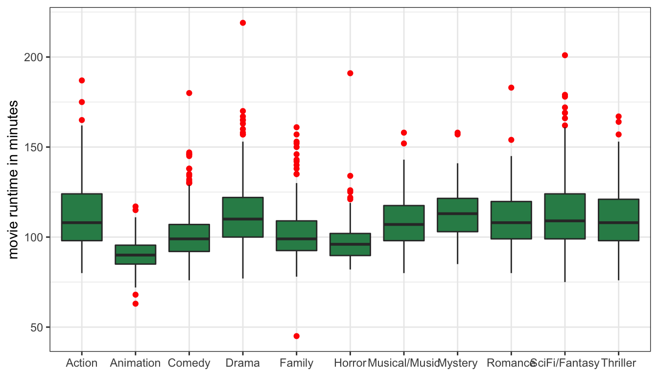
Figure 18: Boxplots of movie runtime by genre
This plot is a good start, but I am running into a problem where the genre labels are running into each other on the x-axis because they are too long. We can solve this problem very easily by using the coord_flip command to flip the axis:
ggplot(movies, aes(x=Genre, y=Runtime))+
  geom_boxplot(fill="seagreen", outlier.color = "red")+
  labs(x=NULL, y="movie runtime in minutes")+
  coord_flip()+
  theme_bw()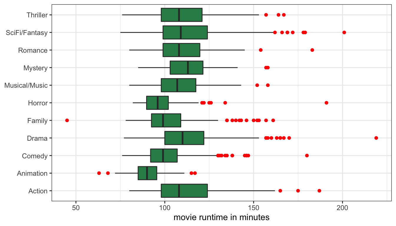
Figure 19: Boxplots of movie runtime by genre, with coordinates flipped
Now my genre labels are much easier to read. However, there is one more addition I can make to this graph in order to improve its readability. I want to order my genre categories so that they are ordered from largest to smallest median runtime on the graph. I can do this by applying the reorder command directly within ggplot. The reorder command takes three arguments. The first argument is the categorical variable to be reordered (genre in my case). The second variable is the variable that reordering should be based upon (runtime in my case). The third argument is the mathematical function that will be used for sorting (median in my case). The full command looks like:
ggplot(movies, aes(x=reorder(Genre, Runtime, median), y=Runtime))+
  geom_boxplot(fill="seagreen", outlier.color = "red")+
  labs(x=NULL, y="movie runtime in minutes")+
  coord_flip()+
  theme_bw()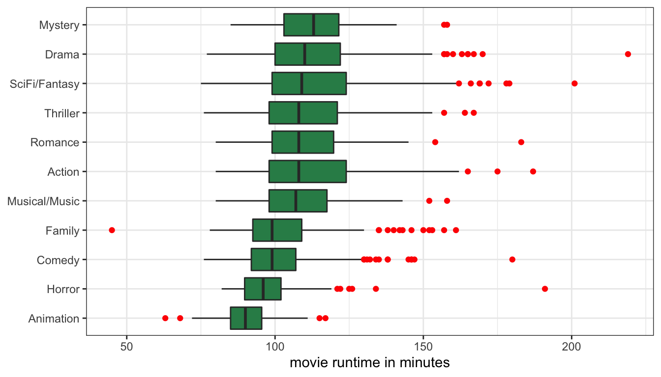
Figure 20: Boxplots of movie runtime by genre, with coordinates flipped
Figure 20 now contains a lot of information. At a glance, I can see which genres had the longest median runtime and which had the shortest. But I can also see how much variation in runtime there is within movies by comparing the width of the boxes. For example, I can see that there is relatively little variation in runtime for animation movies, and the most variation in runtime among sci-fi/fantasy and action movies. I can also see some of the extreme outliers by genre. Most of these outliers are for extremely long movies, relative to the genre norm, but in a couple of cases, I can see movies that were remarkably short for their genre.
Comparing differences in the mean
We can also establish a relationship by looking at differences in summary measures. Implicitly, we are already doing this in the comparative boxplot when we look at the median bars across categories. However, in practice it is more common to compare the mean of the quantitative variable across different categories of the categorical variable. In R, you can get the mean of one variable at different levels of a categorical variable using the tapply command like so:
##        Action     Animation        Comedy         Drama        Family
##     111.91304      90.06475     100.45711     112.65060     102.60000
##        Horror Musical/Music       Mystery       Romance SciFi/Fantasy
##      97.39545     108.46602     114.25641     109.89855     112.56202
##      Thriller
##     110.13260
The tapply command takes three arguments. The first argument is the quantitative variable for which we want means. The second argument is the categorical variable. The third argument is the method we want to run on the quantitative variable, in this case the mean. The output is the mean movie runtime by genre.
If we want a quantitative measure of how genre and runtime are related we can calculate a mean difference. This number is simply the difference in means between any two categories. For example, action movies are 111.9 minutes long, on average, while horror movies are 97.4 minutes long, on average. The difference is \(111.9-97.4=14.5\). Thus, we can say that, on average, action movies are 14.5 minutes longer than horror movies.
We could have reversed that subtraction to get \(97.4-111.9=-14.5\). In this case, we would say that horror movies are 14.5 minutes shorter than action movies. Either way, we get the same information. However, its important to keep track of which number applies to which category when you take the difference, so that you get the interpretation correct.
We can also display these results graphically using a barplot, although this will take a little more processing for ggplot because ggplot expects data to be in a “data.frame” object and the output of tapply is a single vector of numbers. To make this work, we have to use the as.data.frame.table command to convert our object and then rename the variables. Also, to make this prettier, I am first going to sort the output from largest to smallest mean runtime:
mruntime <- tapply(movies$Runtime, movies$Genre, mean)
#sort highest to lowest
mruntime <- sort(mruntime, decreasing=FALSE)
#convert to data.frame
mruntime <- as.data.frame.table(mruntime)
#rename variables
colnames(mruntime) <- c("genre","runtime")
ggplot(mruntime, aes(x=genre, y=runtime))+
  geom_col()+
  coord_flip()+
  labs(x=NULL, y="runtime in minutes")+
  theme_bw()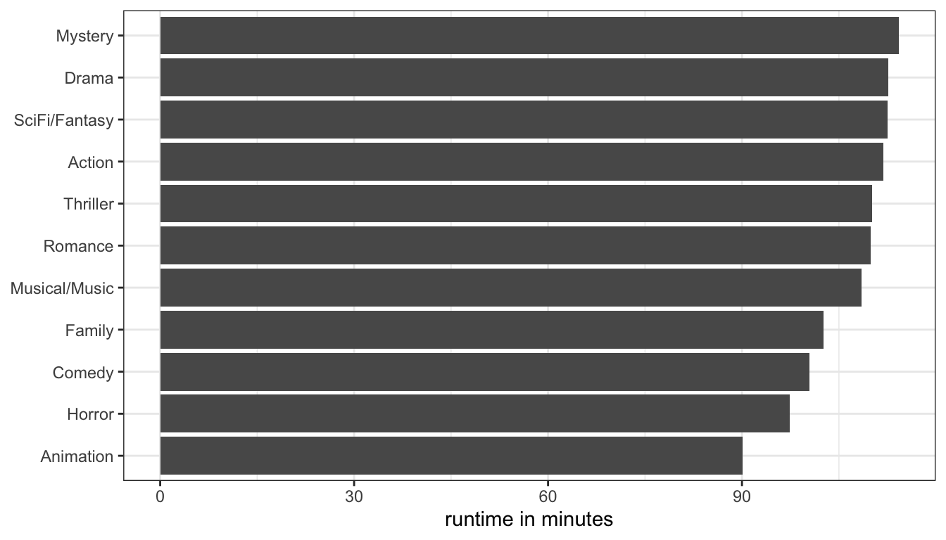
Figure 21: Mean runtime by movie genre
This is is one of the few examples this term where we have to process a dataset into something else prior to feeding it into ggplot. The result is shown in Figure 21. While this information is useful, it doesn’t really tell us anything that we haven’t already seen in the comparative boxplot from Figure 20. The only real difference is that the boxplots showed us medians while this figure shows us means. However, the comparative boxplots also showed us additional information about spread and outliers and so are generally preferable.
Figure 21 also breaks a common stylistic rule in data visualization. The big thick bars take up a lot of ink but carry relatively little information. This is called the “ink to information ratio” made famous by Edward Tufte. An alternative way to display this information would be to use “lollipops” rather than bars:
ggplot(mruntime, aes(x=genre, y=runtime))+
  geom_lollipop()+
  coord_flip()+
  labs(x=NULL, y="runtime in minutes")+
  theme_bw()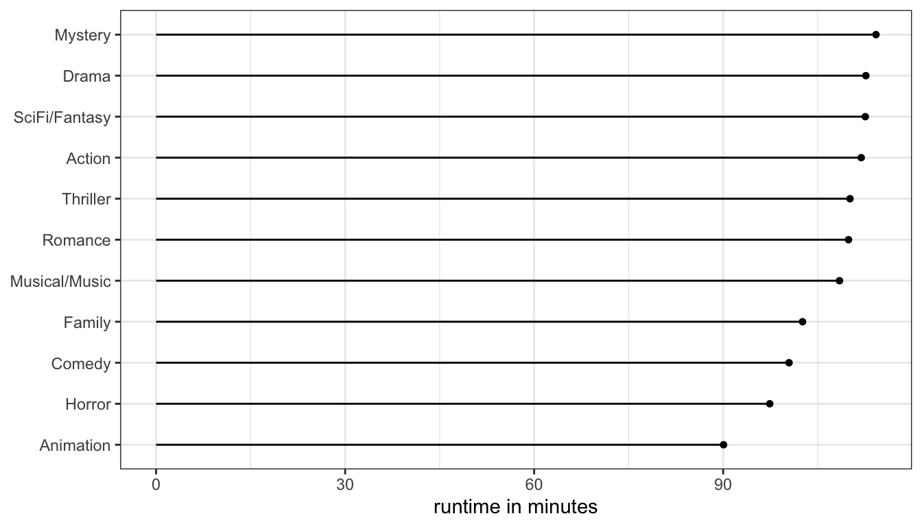
Figure 22: Using a lollipop graph to display ean runtime by movie genre is a lot easier on the eye and the ink cartridge