Modeling Non-Linearity
By definition, a linear model is only appropriate if the underlying relationship being modeled can accurately be described as linear. To begin, lets revisit a very clear example of non-linearity introduced in an earlier chapter. The example is the relationship between GDP per capita in a country and that country’s life expectancy. We use data from Gapminder to show this relationship with 2007 data.
library(gapminder)
library(ggrepel)
ggplot(subset(gapminder, year==2007), aes(x=gdpPercap, y=lifeExp))+
  geom_point(alpha=0.7)+
  geom_smooth(method="lm", se=FALSE)+
  geom_text_repel(data=subset(gapminder, year==2007 & gdpPercap>5000 & lifeExp<60),
                  aes(label=country), size=2)+
  labs(x="GDP per capita", y="Life expectancy at birth", subtitle = "2007 data from Gapminder")+
  scale_x_continuous(labels=scales::dollar)+
  theme_bw()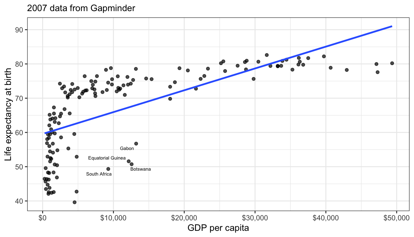
Figure 57: The scatterplot of life expectancy and GDP per capita from 2007 shows a clear non-linear diminishing returns relationship
Figure 57 shows a scatterplot of this relationship. The relationship is so strong that its non-linearity is readily apparent. Although GDP per capita is positively related to life expectancy, the strength of this relationship diminishes substantial at higher levels of GDP. This is a particular form of non-linearity that is often called a “diminishing returns” relationship. The greater the level of GDP already, the less return you get on life expectancy for an additional dollar.
Figure 57 also shows the best fitting line for this scatterplot in blue. This line is added with the geom_smooth(method="lm") argument in ggplot. We can see that this line does not represent the relationship very well. How could it really, given that the underlying relationship clearly curves in a way that a straight line cannot? Even more problematic, the linear fit will produce systematic patterns in the error terms for the linear model. for countries in the middle range of GDP per capita, the line will consistently underestimate life expectancy. At the low and high ends of GDP per capita, the line will consistently overestimate life expectancy. This identifiable pattern in the residuals is an important consequence of fitting a non-linear relationship with a linear model and is in fact one of the ways we will learn to diagnose non-linearity below.
Non-linearity is not always this obvious. One of the reasons that it is so clear in Figure 57 is that the relationship between GDP per capita and life expectancy is so strong. When the relationship is weaker, then points tend to be more dispersed and non-linearity might not be so easily diagnosed from the scatterplot. Figure 58 and Figure 59 show two examples that are a bit more difficult to diagnose.
ggplot(movies, aes(x=TomatoRating, y=BoxOffice))+
  geom_jitter(alpha=0.2)+
  scale_y_continuous(labels = scales::dollar)+
  labs(x="Rotten Tomatoes Rating", y="Box Office Returns (millions)")+
  theme_bw()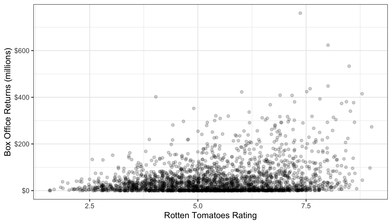
Figure 58: Is this scatterplot of tomato rating by box office returns non-linear?
Figure 58 shows a scatterplot of the relationship between tomato rating and box office returns in the movies dataset. I have already made a few additions to this plot to help with the visual display. The tomato rating only comes rounded to the first decimal place, so I use geom_jitter rather than geom_point to perturb the points slightly and reduce overplotting. I also use alpha=0.2 to set the planets as semi-transparent. This is also helps with identifying areas of the scatterplot that are dense with points because they turn darker.
The linearity of this plot is hard to determine. This is partially because of the heavy right-skew of the box office returns. Many of the points are densely packed along the x-axis because the scale of the y-axis is so large to deal with outliers. Nonetheless, visually it appears there might be some evidence of an increasing slope as tomato rating gets higher - this is an exponential relationship which is the inverse of the diminishing returns relationship we saw earlier. Still, its hard to know if we are really seeing it or not with the data in this form.
ggplot(earnings, aes(x=age, y=wages))+
  geom_jitter(alpha=0.01, width=1)+
  scale_y_continuous(labels = scales::dollar)+
  labs(x="age", y="hourly wages")+
  theme_bw()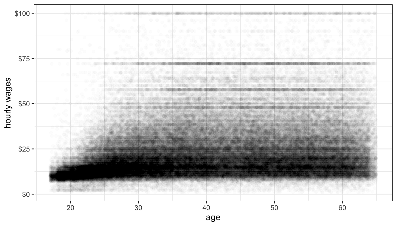
Figure 59: Is the relationship between age and hourly wage non-linear?
Figure 59 shows the relationship between a respondent’s age and their hourly wages from the earnings data. There are so many observations here that I reduce alpha all the way to 0.01 to address overplotting. We also have a problem of a right-skewed dependent variable here. Nonetheless, you can make out a fairly clear dark band across the plot that seems to show a positive relationship. It also appears that this relationship may be of a diminishing returns type with a lower return to age after age 30 or so. However, with the wide dispersion of the data, it is difficult to feel very confident about the results.
The kind of uncertainty inherent in Figures 58 and 59 is far more common in practice than the clarity in Figure 57. Scatterplots can be a first step to detecting non-linearity, but usually we need some additional diagnostics. In the next two sections, I will cover two diagnostic approaches to identifying non-linearity: smoothing and residual plots.
Smoothing
Smoothing is a technique for estimating the relationship in a scatterplot without the assumption that this relationship be linear. In order to understand what smoothing does, it will be first helpful to draw a non-smoothed line between all the points in a scatterplot, starting with the smallest value of the independent variable to the largest value. I do that in Figure 60. As you can see this produces a very jagged line that does not give us much sense of the relationship because it bounces around so much.
movies <- movies[order(movies$TomatoRating),]
ggplot(movies, aes(x=TomatoRating, y=BoxOffice))+
  geom_point(alpha=0.05)+
  geom_line()+
  scale_y_continuous(labels = scales::dollar)+
  labs(x="Rotten Tomatoes Rating", y="Box Office Returns (millions)")+
  theme_bw()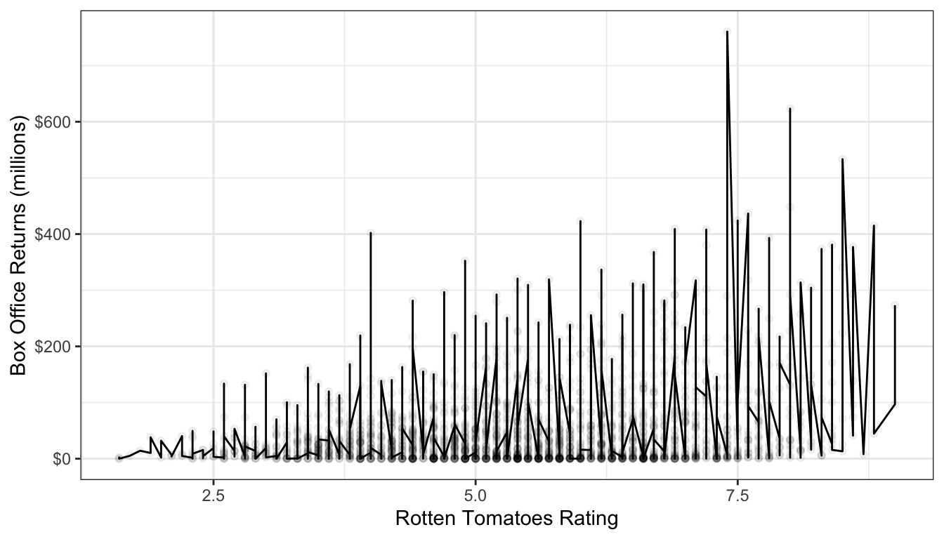
Figure 60: Connecting the dots in our scatterplot leads to a very jagged line
The basic idea of smoothing is to smooth out that jagged line. This is done by replacing each actual value of \(y\) with a predicted value \(\hat{y}\) that is determined by that point and its nearby neighbors. The simplest kind of smoother is often called a “running average.” In this type of smoother, you simply take \(k\) observations above and below the given point and calculate the mean or median. For example, lets say we wanted to smooth the box office return value for the movie Rush Hour 3. We want to do this by reaching out to the two neighbors above and below this movie in terms of the tomato rating. After sorting movies by tomato rating, here are the values for Rush Hour 3 and the two movies closest to it:
| Title | TomatoRating | BoxOffice |
|---|---|---|
| Awake | 4.2 | 14.3 |
| Ghost Rider | 4.2 | 115.8 |
| Rush Hour 3 | 4.2 | 140.1 |
| Balls of Fury | 4.2 | 32.8 |
| Nobel Son | 4.2 | 0.3 |
To smooth the value for Rush Hour 3, we can take either the median or the mean of the box office returns for these five values:
## [1] 60.66## [1] 32.8The mean smoother would give us a value of $60.66 million and the median smoother a value of $32.8 million. In either case, the value for Rush Hour 3 is pulled far away from its outlier position at $140.1 million, thus smoothing the display.
To get a smoothed line, we need to repeat this process for every point in the dataset. The runmed command will do this for us once we have the data sorted correctly by the independent variable. Figure 61 shows two different smoothed lines applied to the movie scatterplot, with different windows.
movies$BoxOffice.smooth1 <- runmed(movies$BoxOffice, 5)
movies$BoxOffice.smooth2 <- runmed(movies$BoxOffice, 501)
ggplot(movies, aes(x=TomatoRating, y=BoxOffice))+
  geom_point(alpha=0.2)+
  geom_line(col="grey", size=1, alpha=0.7)+
  geom_line(aes(y=BoxOffice.smooth1), col="blue", size=1, alpha=0.7)+
  geom_line(aes(y=BoxOffice.smooth2), col="red", size=1, alpha=0.7)+
  scale_y_continuous(labels = scales::dollar)+
  labs(x="Rotten Tomatoes Rating", y="Box Office Returns (millions)")+
  theme_bw()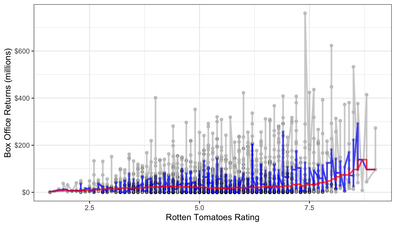
Figure 61: Two different median smoothers are shown. The one in blue uses a window of two neighbors to each side while the one one in red uses a window of 250 neighbors on each side.
It is clear here that using two neighbors on each side is not sufficient in a dataset of this size. With 250 neighbors on each side, we get something much smoother, but it also reveals a sharp uptick at the high end of the dataset, which suggests some possible non-linearity.
A more sophisticated smoothing procedure is available via the LOESS (locally estimated scatterplot smoothing) smoother. The LOESS smoother uses a regression model with polynomial terms (discussed below) on a local subset of the data to estimate a predicted value for each observation. The regression model also typically weights values so that observations closer to the index observation count more in the estimation. This technique tends to produce better results than median or mean smoothing.
You can easily fit a LOESS smoother to a scatterplot in ggplot by specifying method="loess" in the geom_smooth function. In fact, this is the default method for geom_smooth for datasets smaller than a thousand observations. Figure 62 plots this LOESS smoother as well as a linear fit for comparison.
ggplot(movies, aes(x=TomatoRating, y=BoxOffice))+
  geom_jitter(alpha=0.2)+
  geom_smooth(method="lm", color="red", se=FALSE)+
  geom_smooth(se=FALSE, method="loess")+
  scale_y_continuous(labels = scales::dollar)+
  labs(x="Rotten Tomatoes Rating", y="Box Office Returns (millions)")+
  theme_bw()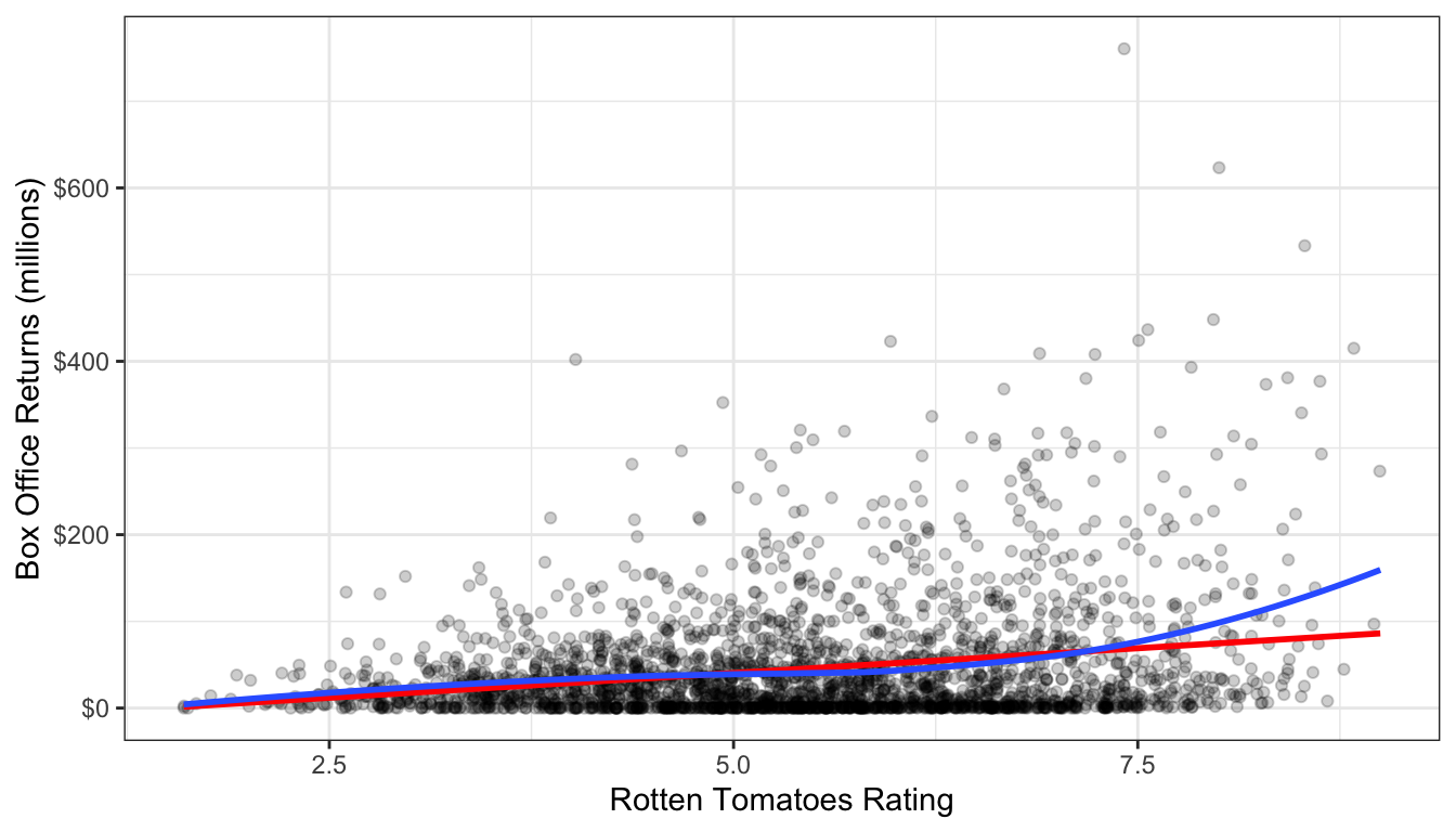
Figure 62: A LOESS smoother to the data is shown in blue while a linear fit is shown in red.
Again we see the exponential relationship in the LOESS smoother. The LOESS smoother is also much smoother than the median smoothers we calculated before.
By default the LOESS smoother in geom_smooth will use 75% of the full data in its subset for calculating the smoothed value of each point. This may seem like a lot, but remember that it weights values closer to the index point. You can adjust this percentage using the span argument in geom_smooth.
SHINY APP
The main disadvantage of the LOESS smoother is that it becomes computationally inefficient as the number of observations increases. If I were to apply the LOESS smoother to the 145,647 observations in the earnings data, it would kill R before producing a result. For larger dataset, another option for smoothing is the general additive model (GAM). This model is complex and I won’t go into the details here, but it provides the same kinds of smoothing as LOESS but is much less computationally expensive. GAM smoothing is the default in geom_smooth for datasets larger than a thousand observations, so you do not need to include a method. Figure 63 shows A GAM smoother applied to the relationship between wages and age. The non-linear diminishing returns relationship is clearly visible in the data.
ggplot(earnings, aes(x=age, y=wages))+
  geom_jitter(alpha=0.01, width=1)+
  geom_smooth(method="lm", color="red", se=FALSE)+
  geom_smooth(se=FALSE)+
  scale_y_continuous(labels = scales::dollar)+
  labs(x="age", y="hourly wages")+
  theme_bw()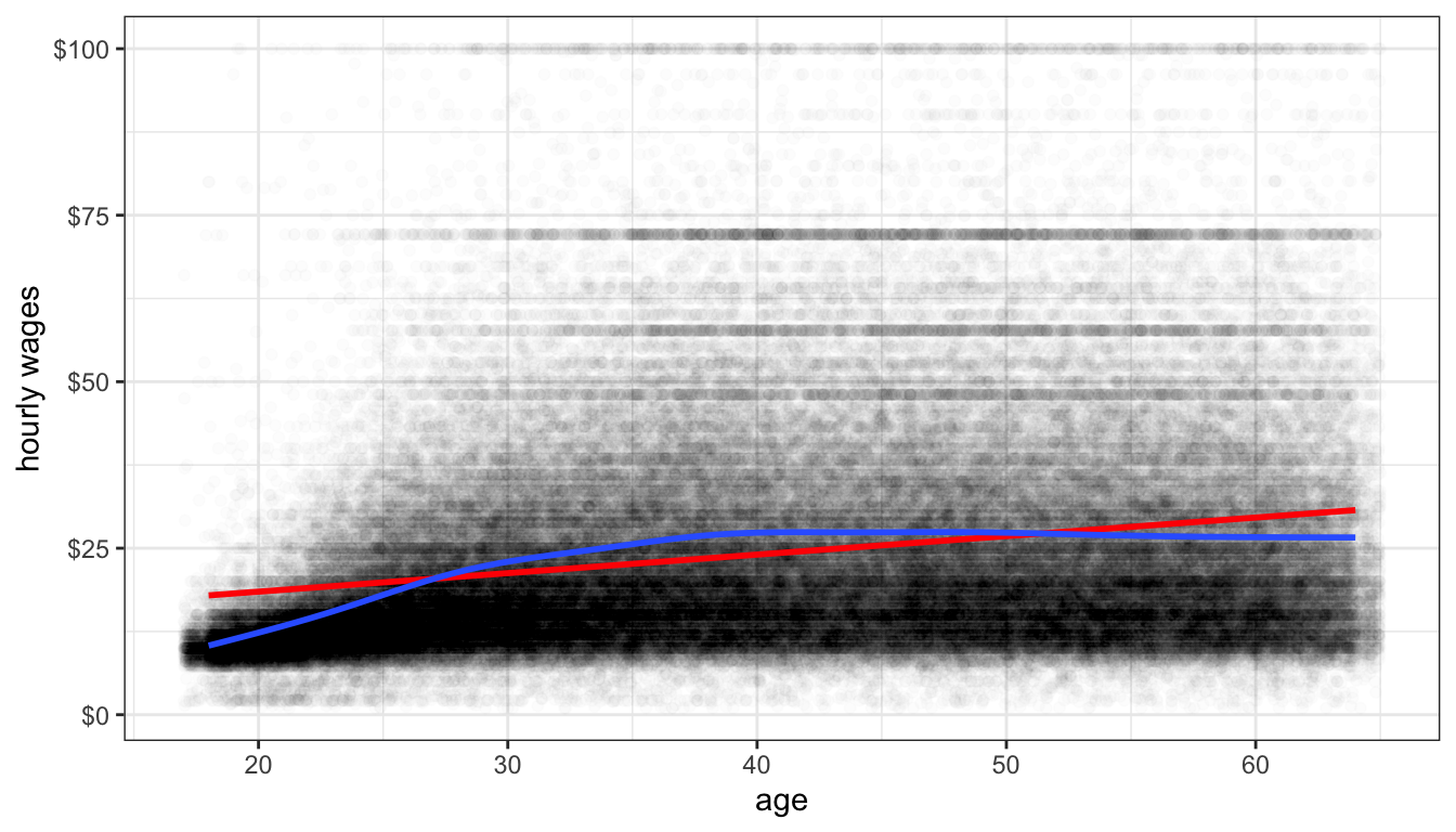
Figure 63: A GAM smoother (shown in blue) applied to the relationship between age and wages in the earnings data. A linear fit is shown in red.
Residual Plots
Another technique for detecting non-linearity is the to plot the fitted values of a model by the residuals. To demonstrate how this works, lets first calculate a model predicting life expectancy by GDP per capita from the gapminder data earlier.
If you type plot(model), you will get a series of model diagnostic plots in base R. The first of these plots is the residual vs. fitted values plot. We are going to make the same plot, but in ggplot. In order to do that, I need to introduce a new package called broom that has some nice features for summarizing results from your model. It is part of the Tidyverse set of packages. To install it type install.packages("broom"). You can then load it with library(broom). The broom package has only three commands:
tidywhich shows the key results from the model including coefficients, standard errors and the like.augmentwhich adds a variety of diagnostic information to the original data used to calculate the model. This includes residuals, cooks distance, fitted values, etc.glancewhich gives a summary of model level goodness of fit statistics.
At the moment, we want to use augment. Here is what the it looks like:
## # A tibble: 142 x 9
##    lifeExp gdpPercap .fitted .se.fit  .resid    .hat .sigma   .cooksd .std.resid
##      <dbl>     <dbl>   <dbl>   <dbl>   <dbl>   <dbl>  <dbl>     <dbl>      <dbl>
##  1    43.8      975.    60.2   0.973 -16.4   0.0120    8.82 0.0207       -1.85
##  2    76.4     5937.    63.3   0.818  13.1   0.00846   8.86 0.00928       1.48
##  3    72.3     6223.    63.5   0.812   8.77  0.00832   8.90 0.00411       0.990
##  4    42.7     4797.    62.6   0.848 -19.9   0.00907   8.77 0.0231       -2.25
##  5    75.3    12779.    67.7   0.750   7.61  0.00709   8.91 0.00263       0.858
##  6    81.2    34435.    81.5   1.52   -0.271 0.0292    8.93 0.0000144    -0.0309
##  7    79.8    36126.    82.6   1.61   -2.75  0.0327    8.93 0.00167      -0.315
##  8    75.6    29796.    78.5   1.29   -2.91  0.0211    8.93 0.00118      -0.331
##  9    64.1     1391.    60.5   0.958   3.61  0.0116    8.93 0.000975      0.408
## 10    79.4    33693.    81.0   1.48   -1.59  0.0278    8.93 0.000471     -0.181
## # … with 132 more rows
We can use the dataset returned here to build a plot of the fitted values (.fitted) by the residuals (.resid) like this:
ggplot(augment(model), aes(x=.fitted, y=.resid))+
  geom_point()+
  geom_hline(yintercept = 0, linetype=2)+
  geom_smooth(se=FALSE)+
  labs(x="fitted values of life expectancy", y="model residuals")+
  theme_bw()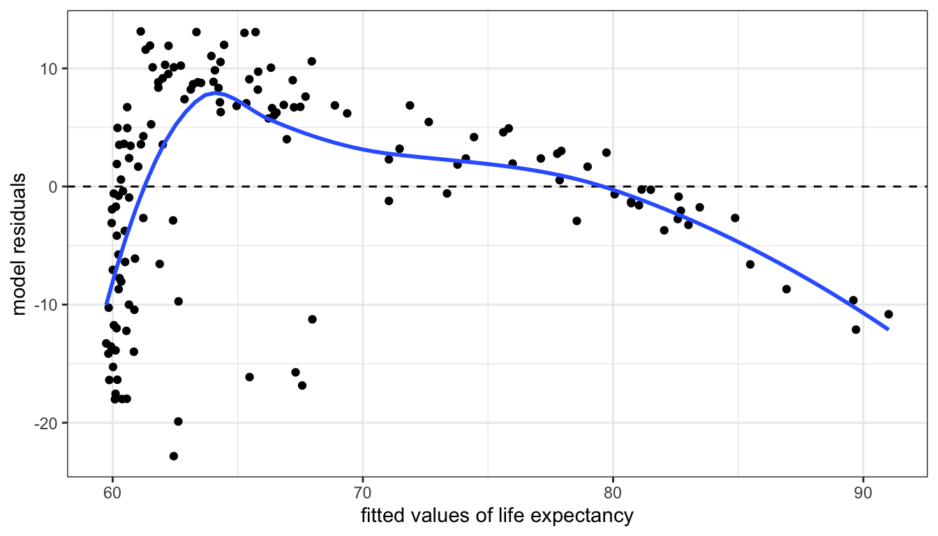
Figure 64: A residual vs. fitted values plot for a model predicting life expectancy by GDP per capita. Their is a clear trend here whigh signifies non-linearity.
If a linear model fitted the data well, then we would expect to see no evidence of a pattern in the scatterplot of 64. We should just see a cloud of points centered around the value of zero. The smoothing line helps us see patterns, but in this case the non-linearity is so strong that we would be able to detect it even without the smoothing. This clear pattern indicates that we non-linearity in our model and we should probably reconsider our approach.
Figures 65 and 66 show residual vs fitted value plots for the two other cases of movie box office returns and wages that we have been examining. In these cases, the patterns are somewhat less apparent without the smoothing. The movie case does not appear particularly problematic although there is some argument for exponential increase at very high values of tomato rating. The results for wages suggest a similar diminishing returns type problem.
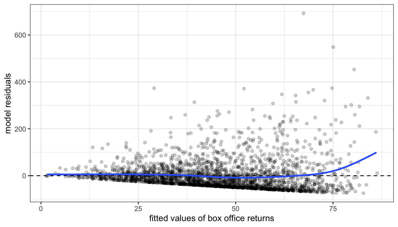
Figure 65: A residual vs. fitted values plot for a model predicting movie box office returns by tomato rating.
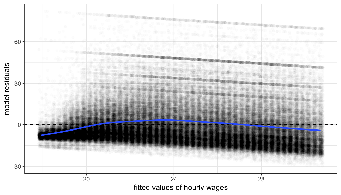
Figure 66: A residual vs. fitted values plot for a model predicting movie box office returns by tomato rating.
Both of these figures also reveal an additional problem unrelated to non-linearity. Both figures show something of a cone shape to the scatterplot in which the variance of the residuals gets larger at higher fitted values. This is the problem of heteroskedasticity that we will return to in the next section.
Now that we have diagnosed the problem of non-linearity, what can we do about it? There are several ways that we can make adjustments to our models to allow for non-linearity. The most common technique is to use transformations to change the relationship between independent and dependent variables. Another approach is to include polynomial terms into the model that can simulate a parabola. A third, less common, option is to create a spline term that allows for non-linearity at specific points. I cover each of these techniques below.
Transformations
You transform your data when you apply a mathematical function to a variable to transform its values into different values. There are a variety of different transformations that are commonly used in statistics, but we will focus on the one transformation that is most common in the social sciences: the log transformation.
Transformations can directly address issues of non-linearity. By definition if you transform the independent variable, the dependent variable, or both variables in your model, then the linear relationship assumed by the model between the transformed variables. On the original scale of the variables, the relationship is non-linear.
Transformations can also have additional side benefits besides fitting non-linear relationships. The log transformation, for example, will pull in extreme values and skewness in a distribution, reducing the potential for outliers to exert a strong influence on results. Take Figure 67 for example. This figure shows the distribution of hourly wages in the earnings data. This distribution is heavily right-skewed, despite the fact that wages have been top-coded at $100. Any model of wages is likely to be influenced considerably by the relatively small but still numerically substantial number of respondents with high wages.
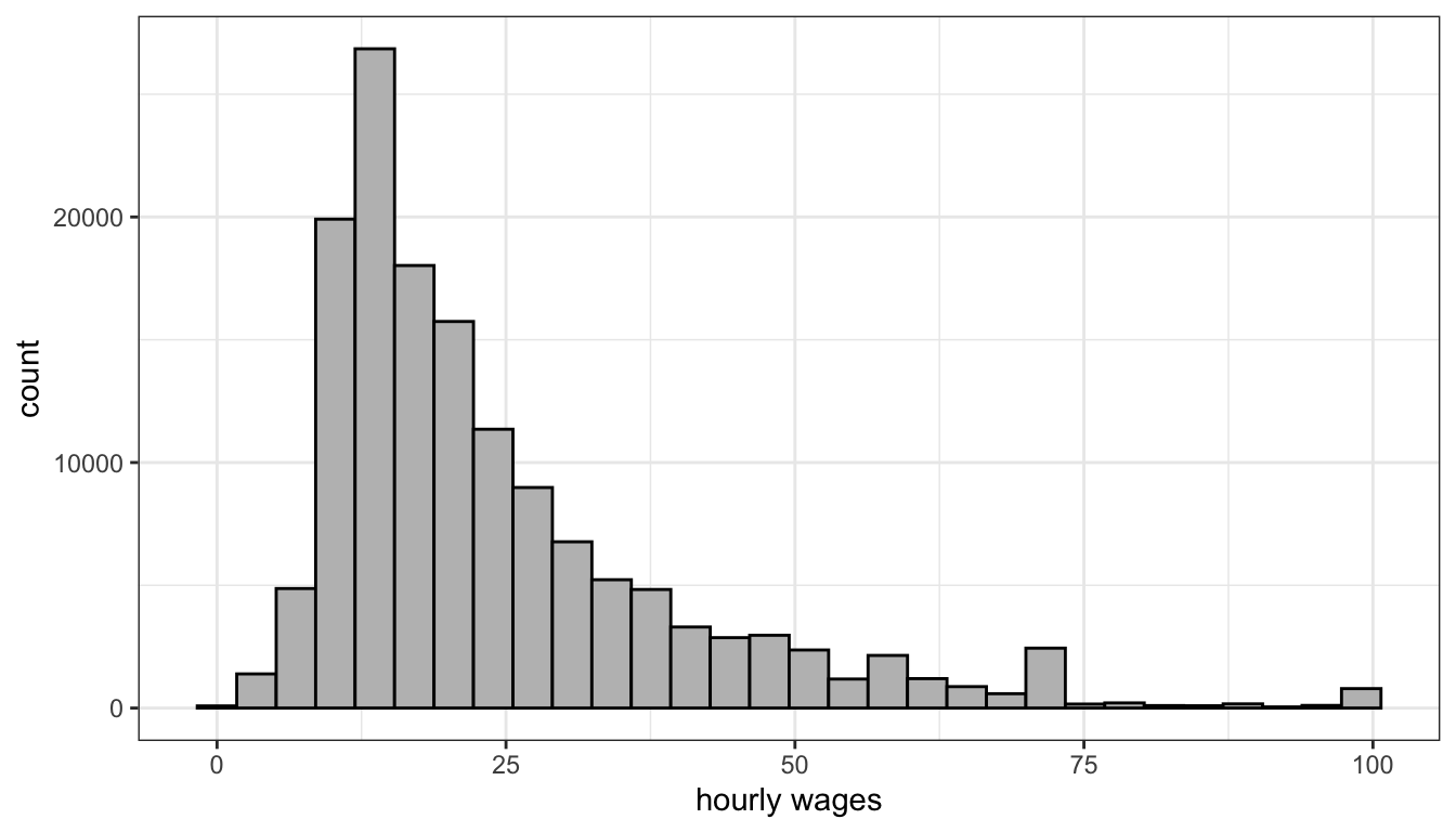
Figure 67: Hourly wages are heavily right skewed even after top-coding the data at a wage of $100.
Lets look at that distribution again, but this time on the log-scale. We will cover in more detail below what the mathematical log means, but for now you can just think of the log-scale as converting from an additive scale to a multiplicative scale. On the absolute scale, we want to have equally spaced intervals on the axes of our graph to represent a constant absolute amount difference. You can see in Figure 67 that the tick-marks for wages are at evenly spaced intervals of $25. On the log-scale we want evenly-spaced intervals on the axes of our graph to correspond to multiplicative changes. So on a log base 10 scale, we would want the numbers 1, 10, and 100, to be evenly spaced because each one represents a 10 fold increase multiplicative increase. In ggplot, you can change the axis to a log-scale with the argument scale_x_log10. Figure 68 shows the same distribution of hourly wages, but this time using the log-scale.
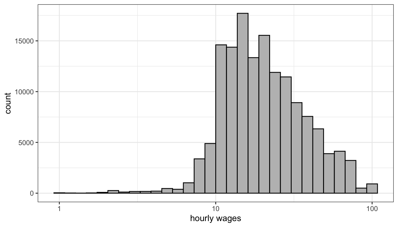
Figure 68: On the log-scale, hourly wages is less skewed, although now we have a slight problem of a left-skew
You can clearly see in Figure 68 that we have pulled in the extreme right tail of the distribution and have a somewhat more symmetric distribution. The transformation here hasn’t perfectly solved things, because now we have a slight left-skew for very low hourly wages. Nonetheless, even these values are closer in absolute value after the transformation and so will be less likely to substantially influence our model. This transformation can also help us with the cone-shaped residual issue we saw earlier (i.e. heteroskedasticity), but we will discuss that more in the next section.
Because transformations can often solve multiple problems at once, they are very popular. In fact, for some common analysis like estimating wages or CO2 emissions, log transformations are virtually universal. The difficult part about transformations is understanding exactly what kind of non-linear relationship you are estimating by transforming and how to interpret the results from models with transformed variables. We will develop this understanding using the natural log transformation on the examples we have been looking at in this section.
The log transformation
Before getting into the mathematical details of the log transformation, lets first demonstrate its power. Figure 69 shows the relationship between Rotten Tomatoes rating and box office returns in our movies data. However, this time I have applied a log-scale to box office returns. Although we still see some evidence of non-linearity in the LOESS estimator, the relationship looks much more clearly linear than before. But the big question is how do we interpret the slope and intercept for the linear model fit to this log-transformed data?
ggplot(movies, aes(x=TomatoRating, y=BoxOffice))+
  geom_jitter(alpha=0.2)+
  geom_smooth(method="lm", color="red", se=FALSE)+
  geom_smooth(se=FALSE, method="loess")+
  scale_y_log10(labels = scales::dollar)+
  labs(x="Rotten Tomatoes Rating", y="Box Office Returns (millions)")+
  theme_bw()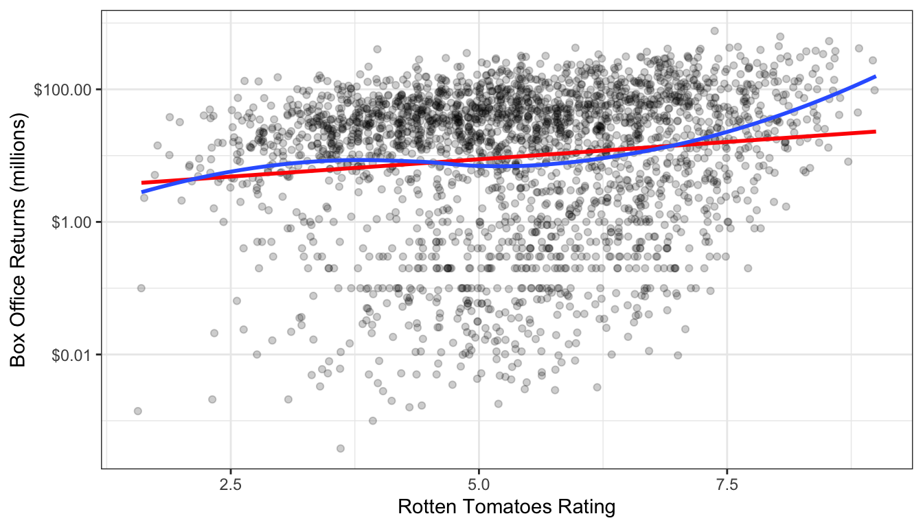
Figure 69: Scatterplot of the relationship between rotten tomatoes rating and box office returns, with a log-scale applied to box office returns.
In order to understand the model implied by this scatterplot, we need to delve a little more deeply into the math of the log transformation. In general, the log equation means converting some number into the exponential value of some base multiplier. So, if we wanted to know what the log base 10 value of 27 is, we need to know what exponential value applied to 10 would produce 27:
\[27=10^x\]
We can calculate this number easily in R:
## [1] 1.431364## [1] 27Log base 10 and log base 2 are both common values used in teaching log transformations, but the standard base we use in statistics is the mathematical constant \(e\) (2.718282). This number is of similar importance in mathematics as \(\pi\) and is based on the idea of what happens to compound interest as the period of interest accumulation approaches zero. This has a variety of applications from finance to population growth, but none of this concerns us directly. We are interested in \(e\) as a base for our log function because of certain other useful properties discussed further below that ease interpretation.
When we use \(e\) as the base for our log function, then we are using what is often called the “natural log.” We can ask the same question about 27 as before but now with the natural log:
## [1] 3.295837## [1] 27I didn’t have to specify a base here because R defaults to the natural log. The exp function calculates \(e^x\).
For our purposes, the most important characteristic of the log transformation is that it converts multiplicative relationships into additive relationships.This is because of a basic mathematical relationship where:
\[e^a*a^b=e^{a+b}\] \[log(x*y) = log(x)+log(y)\] You can try this out in R to see that it works:
## [1] 148.4132## [1] 148.4132## [1] 2.995732## [1] 2.995732We can use these mathematical relationships to help understand a model with log-transformed variables. First lets calculate the model implied by the scatterplot above. We can just use the log command to directly transform box office returns in the lm formula:
##  (Intercept) TomatoRating
##    0.9727622    0.2406026
OK, so what does that mean? It might be tempting to interpret the results here as you normally would. We can see that tomato rating has a positive effect on box office returns. So, a one point increase in tomato rating is associated with a 0.241 increase in … what? Remember that our dependent variable here is now the natural log of box office returns, not box office returns itself. We could literally say that it is a 0.241 increase in log box office returns, but that is not a very helpful or intuitive way to think about the result. Similarly the intercept gives us the predicted log box office returns when tomato rating is zero. That is not helpful for two reasons: its outside the scope of the data, and we don’t really know how to think about a log box office returns of 0.973.
In order to translate this into something meaningful, lets try looking at this in equation format. Here is what we have:
\[\hat{\log(y_i)}=0.973+0.241*x_i\]
What we really want is to be able to understand this equation back on the original scale of the dependent variable, which in this case is box office returns in millions of dollars. Keep in mind that taking \(e^{\log(y)}\) just gives us back \(y\). We can use that logic here. If we “exponentiate” (take \(e\) to the power of the values) the left-hand side of the equation, then we can get back to \(\hat{y}_i\). However, remember from algebra, that what we do to one side of the equation, we have to do to both sides. That means:
\[e^{\hat{\log(y_i)}}=e^{0.973+0.241*x_i}\] \[\hat{y}_i=(e^{0.971})*(e^{0.241})^{x_i}\] We now have quite a different looking equation for predicting box office returns. The good news is that we now just have our predicted box office returns back on the left-hand side of the equation. The bad news is that the right hand side looks a bit complex. Since \(e\) is just a constant value, we can go ahead and calculate the values in those parentheses (called “exponentiating”):
## [1] 2.640584## [1] 1.272521That means:
\[\hat{y}_i=(2.64)*(1.27)^{x_i}\] We now have a multiplicative relationship rather than an additive relationship. How does this changes our understanding of the results? To see, lets plug in some values for \(x_i\) and see how it changes our predicted income value. A tomato rating of zero is outside the scope of our data, but lets plug it in for instructional purposes anyway:
\[\hat{y}_i=(2.64)*(1,27)^{0}=(2.64)(1)=2.64\] So, the predicted box office returns when \(x\) is zero is just given by exponentiating the intercept. Lets try increasing tomato rating by one point:
\[\hat{y}_i=(2.64)*(1.27)^{1}=(2.64)(1.27)\] I could go ahead and finish that multiplication, but I want to leave it here to better show how to think about the change. A one point increase in tomato rating is associated with an increase in box office returns by a multiplicative factor of 1.27. In other words, a one point increase in tomato rating is associated with a 27% increase in income, on average. What happens if I add another point?
\[\hat{y}_i=(2.64)*(1.27)^{2}=(2.64)(1.27)(1.27)\] Each additional point leads to a 27% increase in predicted box office returns. This is what I mean by a multiplicative increase. We are no longer talking about the predicted change in box office returns in terms of absolute numbers of dollars, but rather in relative terms of percentage increase.
In general, in order to properly interpret your results when you log the dependent variable, you must exponentiate all of your slopes and the intercept. You can then interpret them as:
The model predicts that a one-unit increase in \(x_j\) is associated with a \(e^{b_j}\) multiplicative increase in \(y\), on average while holding all other independent variables constant. The model predicts that \(y\) will be \(e^{b_0}\) on average when all independent variables are zero.
Of course, just like all of our prior examples, you are responsible for converting this into sensible English.
Lets try a more complex model in which we predict log box office returns by tomato rating, runtime and movie maturity rating:
##  (Intercept) TomatoRating      Runtime     RatingPG  RatingPG-13      RatingR
##  -0.81318674   0.17783703   0.03863665  -0.75833147  -1.29892956  -2.96580424
We have a couple of added complexities here. We now have results for categorical variables as well as negative numbers to interpret. In all cases, we want to exponentiate to interpret correctly, so lets go ahead and do that:
##  (Intercept) TomatoRating      Runtime     RatingPG  RatingPG-13      RatingR
##   0.44344268   1.19463061   1.03939275   0.46844739   0.27282368   0.05151902
The tomato rating effect can be interpreted as before but now with control variables:
The model predicts that a one point increase in the tomato rating is associated with a 19% increase in box office returns, on average, holding constant movie runtime and maturity rating.
The runtime effect can be interpreted in a similar way.
The model predicts that a one minute increase in movie runtime is associated with a 3.9% increase in box office returns, on average, holding constant movie tomato rating and maturity rating.
In both of these cases, it makes sense to take the multiplicative effect and convert that into a percentage increase. If I multiply the predicted box office returns by 1.039, then I am increasing it by 3.9%. When effects get large, however, it sometimes makes more sense to just interpret it as a multiplicative factor. For example, if the exponentiated coefficient was 3, I could interpret this as a 200% increase. However, it probably makes more sense in this case to just say something along the lines of the “predicted value of \(y\) triples in size for a one point increase in \(x\).”
The categorical variables can be interpreted as we normally do in terms of the average difference between the indicated category and the reference category. However, now it is the multiplicative difference. So, taking the PG effect of 0.468, we could just say:
The model predicts that, controlling for tomato rating and runtime, PG-rated movies make 46.8% as much as G-rated movies at the box office, on average.
However, its also possible to talk about how much less a PG-rated movie makes than a G-rated movie. If a PG movie makes 46.8% as much, then it equivalently makes 52.2% less. We get this number by just subtracting the original percentage from 100. So I could have said:
The model predicts that, controlling for tomato rating and runtime, PG-rated movies make 52.2% less than G-rated movies, on average.
In general to convert any coefficient \(\beta_j\) from a model with a logged dependent variable to a percentage change scale we can follow this formula:
\[(e^{\beta_j}-1)*100\]
This will give us the percentage change and the correct direction of the relationship.
You may have noted that the effect of runtime in the model above before exponentiating was 0.0386 and after we exponentiated the result, we concluded that the effect of one minute increase in runtime was 3.9%. If you move over the decimal place two, those numbers are very similar. This is not a coincidence. It follows from what is known as the Taylors series expansion for the exponential:
\[e^x=1+x-\frac{x^2}{2!}+\frac{x^3}{3!}-\frac{x^4}{4!}+\ldots\] Any exponential value \(e^x\) can be calculated from this Taylor series expansion which continues indefinitely. However, when \(x\) is a small value less than one, note that you are squaring, cubing, and so forth, which results in an even smaller number that is divided by an increasingly large number. So for, small values of \(x\) the following approximation works reasonably well:
\[e^x\approx1+x\]
In the case I just noted where \(x=0.0386\), the actual value of \(e^{0.0386}\) is 1.0394 while the approximation gives us 1.0386. That is pretty close. This approximation starts to break down around \(x=0.2\). The actual value of \(e^{0.2}\) is 1.221 or about a 22.1% increase, whereas the approximation gives us 1.2 or a straight 20% increase.
You can use this approximation to get a ballpark estimate of the effect size in percentage change terms for coefficients that are not too large without having to exponentiate. So I can see that the coefficient of 0.177 for tomato rating is going to be roughly a 18-19% increase and the coefficient of 0.0386 is going to be a little under a 4% increase, all without having to exponentiate. Notice that this does not work at all well for the very large coefficients for movie maturity rating.
Logging the independent variable
The previous example showed how to interpret results when you log the dependent variables. Logging the dependent variable will help address exponential type relationships. However in cases of a diminishing returns type relationship, we instead need to log the independent variable. Figure 70 shows the GDP per capita by life expectancy scatterplot from before but now with GDP per capita on a log scale.
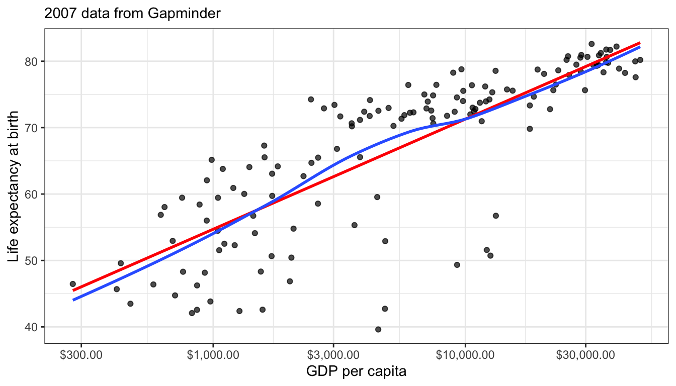
Figure 70: Scatterplot of life expectancy by GDP per capita, with a log-scale applied to GDP per capita. Look how much more linear the relationship looks.
It is really quite impressive how this simple transformation straightened out that very clear diminishing returns type relationship we observed before. This is because on the log-scale a one unit increase means a multiplicative change so, you have to make a much larger absolute change when you are already high in GDP per capita to get the same return in life expectancy.
Models with logged independent variables are a little trickier to interpret. To understand how it works, lets go ahead and calculate the model:
##    (Intercept) log(gdpPercap)
##        4.94961        7.20280
So our model is:
\[\hat{y}_i=4.9+7.2\log{x_i}\]
Because the log transformation is on the right hand side we can no longer use the trick of exponentiating its value because that would just give us \(e^{\hat{y}_i}\) on the left hand side. It would also be impractical if we added other independent variables to the model.
Instead, we can interpret our slope by thinking about how a 1% increase in \(x\) would change the predicted value of \(y\). For ease of interpretation, lets start with \(x=1\). The log of 1 is always zero, so:
\[\hat{y}_i=4.9+7.2\log{1}=4.9+7.2*0=\beta_0\]
So, the intercept here is actually the predicted value of life expectancy when GDP per capita is $1. This is not a terribly realistic value for GDP per capita where the lowest value in the dataset is $241, so its not surprising that we get an unrealistically low life expectancy value.
Now what happens if we raise GDP per capita by 1%? A 1% increase from a value of 1 would give us a value of 1.01. So:
\[\hat{y}_i=4.9+7.2\log{1.01}\]
From the Taylor series above, we can deduce that the \(\log{1.01}\) is roughly equal to 0.01. So:
\[\hat{y}_i=4.9+7.2*0.01=4.9+0.072\]
This same logic will apply to any 1% increase in GDP per capita. So, the model predicts that a 1% increase in GDP per capita is associated with a 0.072 year increase in the life expectancy.
In general, you can interpret any coefficient \(\beta_j\) with a logged independent variable but not logged dependent variable as:
The model predicts that a a 1% increase in x is associated with a \(\beta_j/100\) unit increase in y.
One easy way to remember what the log transformation does is that it makes your measure of change relative rather than absolute for the variable transformed. When we logged the dependent variable before then our slope could be interpreted as the percentage change in the dependent variable (relative) for a one unit increase (absolute) in the independent variable. When we log the independent variable, the slope can be interpreted as the unit change in the dependent variable (absolute) for a 1% increase (relative) in the independent variable.
Logging both independent and dependent variables: The elasticity model
If logging the dependent variable will make change in the dependent variable relative, and logging the independent variable will make change in the independent variable relative, then what happens if you log transform both. Then you get a model which predicts relative change by relative change. This model is often called an “elasticity” model because the predicted slopes are equivalent to the concept of elasticity in economics: how much does of a percent change in \(y\) results from a 1% increase in \(x\).
The relationship between age and wages may benefit from logging both variables. We have already seen a diminishing returns type relationship which suggests logging the independent variable. We also know that wages are highly right-skewed and so might also benefit from being logged.
ggplot(earnings, aes(x=age, y=wages))+
  geom_jitter(alpha=0.01, width=0.1)+
  geom_smooth(se=FALSE, method="lm", color="red")+
  geom_smooth(se=FALSE)+
  scale_y_log10(labels = scales::dollar)+
  scale_x_log10()+
  labs(x="age", y="hourly wages")+
  theme_bw()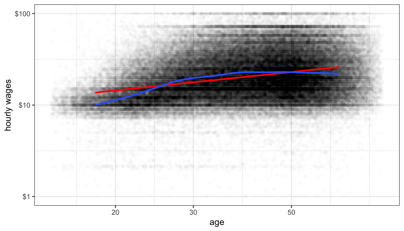
Figure 71: Is the relationship between age and hourly wage non-linear?
Figure 71 shows the relationship between age and wages when we apply a log scale to both variables. It looks a little better although there is still some evidence of diminishing returns even on this scale. Lets go with it for now though.
Lets take a look at the coefficients from this model:
## (Intercept)    log(age)
##   1.1558386   0.5055849
One of the advantages of the elasticity model is that slopes can be easily interpreted. We can use the same techniques when logging independent variables to divide our slope by 100 to see that a one percent increase in age is associated with a 0.0051 increase in the dependent variable. However this dependent variable is the log of wages. T interpret the effect on wages, we need to exponentiate this value, subtract 1, and multiply by 100. However since the value is small, we know that this is going to be roughly a 0.51% increase. So:
The model predicts that a one percent increase in age is associated with a 0.51% increase in wages, on average.
In other words, we don’t have to make any changes at all. The slope is already the expected percent change in \(y\) for a one percent increase in \(x\).
The STRIPAT model that Richard York helped to develop is an example of an elasticity model that is popular in environmental sociology. In this model, the dependent variable is some measure of environmental degradation, such as CO2 emissions. The independent variable can be things like GDP per capita, population size and growth, etc. All variables are logged so that model parameters can be interpreted as elasticities.
The square root transformation
The log transformation is very flexible and solves multiple problems at once (non-linearity, outliers, skewness), which explains its popularity. But it breaks down in one important situation: you cannot log a variable that has zero or negative values. The negative case is generally not as important although there are some exceptions (like net worth). On the other hand, there are numerous cases where a quantitative variable can be zero as well as positive. Lets run an elasticity model on box office returns, but this time lets predict returns by the Tomato Meter rather than the Tomato Rating.
## Error in lm.fit(x, y, offset = offset, singular.ok = singular.ok, ...): NA/NaN/Inf in 'x'Oh no! We got an error. The problem is that the Tomato Meter has a few cases of zero values (when a movie received zero positive reviews). The log of zero is negative infinity and that simply won’t work when fitting a linear model. What can you do?
It turns out that the square root transformation can do much the same work as the natural logarithm. It will pull in skewness and can make non-linear relationships more linear. Since the square root of zero is a real number (zero to be precise), it will also work on variables that have legitimate zero values. Figure 72 shows a scatterplot of tomato meter by box office returns with both variables on the log scale. Movies with a tomato meter of zero have been removed. Figure 73 shows the same figure but now with Tomato Meter on the square root scale. The figures looks pretty similar and fit a similar trend but the square root transformation can also include the zero values.
ggplot(subset(movies, TomatoMeter>0), aes(x=TomatoMeter, y=BoxOffice))+
  geom_vline(xintercept = 0, linetype=2)+
  geom_jitter(alpha=0.5)+
  scale_y_log10()+
  scale_x_log10()+
  geom_smooth(se=FALSE)+
  labs(x="Tomato Meter (square root scale)", y="Box Office Returns (log scale)")+
  theme_bw()
## Warning: Transformation introduced infinite values in continuous x-axis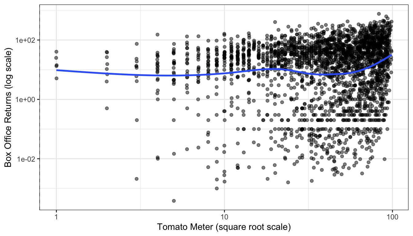
Figure 72: Scatterplot of tomato meter by box office returns, using a log transformation of tomato meter ratings.
ggplot(movies, aes(x=TomatoMeter, y=BoxOffice))+
  geom_vline(xintercept = 0, linetype=2)+
  geom_jitter(alpha=0.5)+
  scale_y_log10()+
  scale_x_sqrt()+
  geom_smooth(se=FALSE)+
  labs(x="Tomato Meter (square root scale)", y="Box Office Returns (log scale)")+
  theme_bw()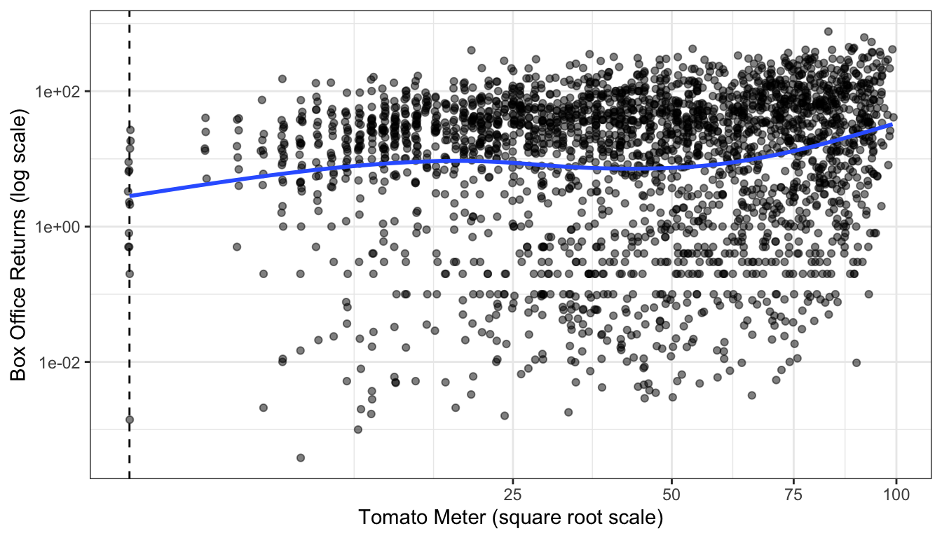
Figure 73: Scatterplot of tomato meter by box office returns, using a square root transformation of tomato meter ratings. The dotted vertical line shows cases with a zero tomato meter.
We can estimate this model easily enough in R:
##       (Intercept) sqrt(TomatoMeter)
##         1.4376939         0.1274002
There is one big downside to this transformation. Unlike log transformations, there is no clear and easy interpretation of how to intepret this effect. Since we know that the square root transformation is doing something close to a log transformation, we can think of this result as loosely close to an elasticity in this case, but that is only a loose approximation and may deteriorate as you get larger and larger values of the independent variable.
Polynomial Models
Another method that can be used to fit non-linear relationships is to fit polynomial terms. You may recall the the following formula from basic algebra:
\[y=a+bx+cx^2\]
This formula defines a parabola which fits not a straight line but a curve with one point of inflection. We can fit this curve in a linear model by simply including the square of a given independent variable as an additional variable in the model. Before we do this it is usually a good idea to re-center the original variable somewhere around the mean because this will reduce the correlation between the original term and its square.
For example, I could fit the relationship between age and wages using polynomial terms:
##     (Intercept)     I(age - 40) I((age - 40)^2)
##     26.92134254      0.31711167     -0.01783204
The coefficients for such a model are a little hard to interpret directly. This is a case where marginal effects can help us understand what is going on.
The marginal effect can be calculated by taking the partial derivative using calculus of the model equation with respect to \(x\). I don’t expect you to know how to do this, so I will just tell how it turns out. In a model with a squared term:
\[\hat{y}=\beta_0+\beta_1x+\beta_2x^2\]
The marginal effect (or slope) is given by:
\[\beta_1+2\beta_2x\]
Note that the slope of \(x\) is itself partially determined by the value of \(x\). This is what drives the non-linearity. If we plug in the values for the model above, the relationship will be clearer:
\[0.3171+2(-0.0178)x=0.3171-0.0356x\]
So when \(x=0\), which in this case means age 40, a one year increase in age is associated with a $0.32 increase in hourly wage, on average. For every increase in the year of age past 40, that effect of a one year increase in age on wages decreases in size by $0.035. For every year below age 40, the effect increases by $0.035.
Because \(\beta_1\) is positive and \(\beta_2\) is negative in this case it corresponds to a diminishing returns kind of relationship. Unlike the log transformation however, the relationship can ultimately reverse direction from positive to negative. I can figure out the inflection point at which it will transition from a positive to a negative relationship. I won’t delve into the details here, but this point is given by setting the derivative of this equation with respect to age equal to zero and solving for age. In general, this will give me:
\[\beta_j/(-2*\beta_{sq})\]
Where \(\beta_j\) is the coefficient for the linear effect of the variable (in this case, age), and \(\beta_{sq}\) is the coefficient for the squared effect. In my case, I get:
\[0.3171/(-2*-0.0178)=0.3171/0.0356=8.91\]
Remember that we re-centered age at 40, so this means that the model predict that age will switch from a positive to a negative relationship with wages at age 48.91.
Often, the easiest way to really get a sense of the parabolic relationship we are modeling is to graph it. This can be done easily with ggplot by using the geom_smooth function. In the geom_smooth function you specify lm as the method, but also specify a formula argument that specifies this linear model should be fit as a parabola rather than a straight line.
ggplot(earnings, aes(x=age, y=wages))+
  geom_jitter(alpha=0.01, width=1)+
  scale_y_continuous(labels = scales::dollar)+
  labs(x="age", y="hourly wages")+
  geom_smooth(se=FALSE, method="lm", formula=y~x+I(x^2))+
  geom_vline(xintercept = 48.91, linetype=2, color="red")+
  theme_bw()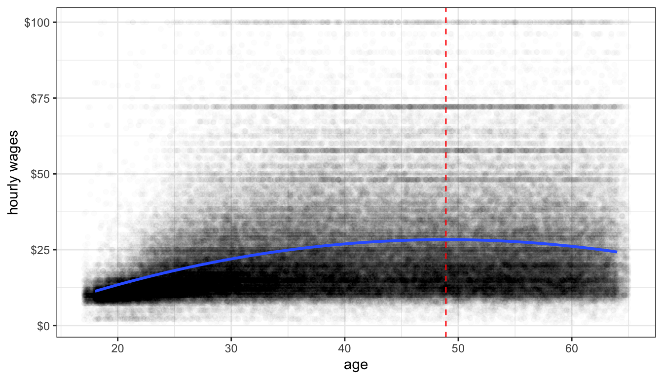
Figure 74: A parabolic model fit to the relationship between age and wages. The dotted red line shows the maximum value of the curve where the relationship between wages and age goes from positive to negative
Figure 74 shows the relationship between age and wages after adding a squared term to our linear model. I have also added a dashed line to indicate the inflection point at which the relationship shifts from positive to negative.
Polynomial models do not need to stop at a squared term. You can also add a cubic term and so on. The more polynomial terms you add, the more inflection points you are allowing for in the data, but also the more complex it will be to interpret. Figure 75 shows the predicted relationship between GDP per capita and life expectancy in the gapminder data when using a squared and cubic term in the model. You can see two different inflection points in the data that allow for more complex curves than one could get using transformations.
ggplot(subset(gapminder, year==2007), aes(x=gdpPercap, y=lifeExp))+
  geom_point()+
  labs(x="GDP per capita", y="life expectancy")+
  geom_smooth(se=FALSE, method="lm", formula=y~x+I(x^2)+I(x^3))+
  theme_bw()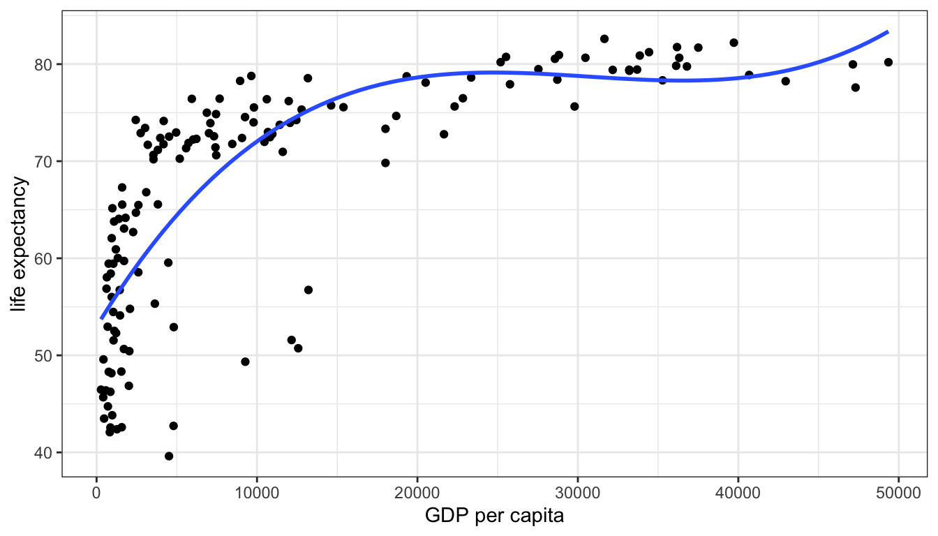
Figure 75: A model predicting life expectancy from GDP per capita with squared and cubic terms.
Splines
Another approach to fitting non-linearity is to fit a spline. Splines can become quite complex, but I will focus here on a very simple spline. In a basic spline model, you allow the slope of a variable to have a different linear effect at different cutpoints or “hinge” values of \(x\). Within each segment defined by the cutpoints, we simply estimate a linear model (although more complex spline models allow for non-linear effects within segments).
Looking at the diminishing returns to wages from age in the earnings data, it might be reasonable to fit this effect with a spline model. It looks like age 35 might be a reasonable value for the hinge.
In order to fit the spline model, we need to add a spline term. This spline term will be equal to zero for all values where age is equal to or below 35 and will be equal to age minus 35 for all values where age is greater than 35. We then add this variable to the model. I fit this model below.
earnings$age.spline <- ifelse(earnings$age<35, 0, earnings$age-35)
model <- lm(wages~age+age.spline, data=earnings)
pander(tidy(model))| term | estimate | std.error | statistic | p.value |
|---|---|---|---|---|
| (Intercept) | -6.039 | 0.3107 | -19.44 | 4.723e-84 |
| age | 0.9472 | 0.01035 | 91.52 | 0 |
| age.spline | -0.9549 | 0.01405 | -67.98 | 0 |
This spline will produce two different slopes. For individuals 35 years of age or younger, the predicted change in wages for a one year increase will be given by the main effect of age, because the spline term will be zero. For individuals over 35 years of age, a one year increase in age will produce both the main age effect and the spline effect, so the total effect is given by adding the two together. So in this case, I would say the following:
The model predicts that for individuals 35 years of age and younger, a one year increase in age is associated with a $0.95 increase in wages on average. The model predicts that for individuals over 35 years of age, a one year increase in age is associated with a $0.0077 (0.9742-0.9549).
We can also graph this spline model, but we cannot do it simply through the formula argument in geom_smooth. In order to do that, you will need to learn a new command. The predict command can be used to get predicted values from a model for a different dataset. The predict command needs at least two arguments: (1) the model object for the model you want to predict, and (2) a data.frame that has the same variables as those used in the model. In this case, we can create a simple “toy” dataset that just has one person of every age from 18 to 65, with only the variables of age and age.spline. We can then use the predict command to get predicted wages for these individuals and add that as a variable to our new dataset. We can than plot these predicted values as a line in ggplot by feeding in the new data into the geom_line command. The r code chunk below does all of this to produce Figure 76. The spline model seems to fit pretty well here and is quite close to the smoothed line. This kind of model is sometimes called a “broken arrow” model because the two different slopes produce a visual effect much like an arrow broken at the hinge point.
predict_df <- data.frame(age=18:65)
predict_df$age.spline <- ifelse(predict_df$age<35, 0, predict_df$age-35)
predict_df$wages <- predict(model, newdata=predict_df)
ggplot(earnings, aes(x=age, y=wages))+
  geom_jitter(alpha=0.01, width = 1)+
  geom_smooth(se=FALSE)+
  geom_line(data=predict_df, color="red", size=1.5, alpha=0.75)+
  theme_bw()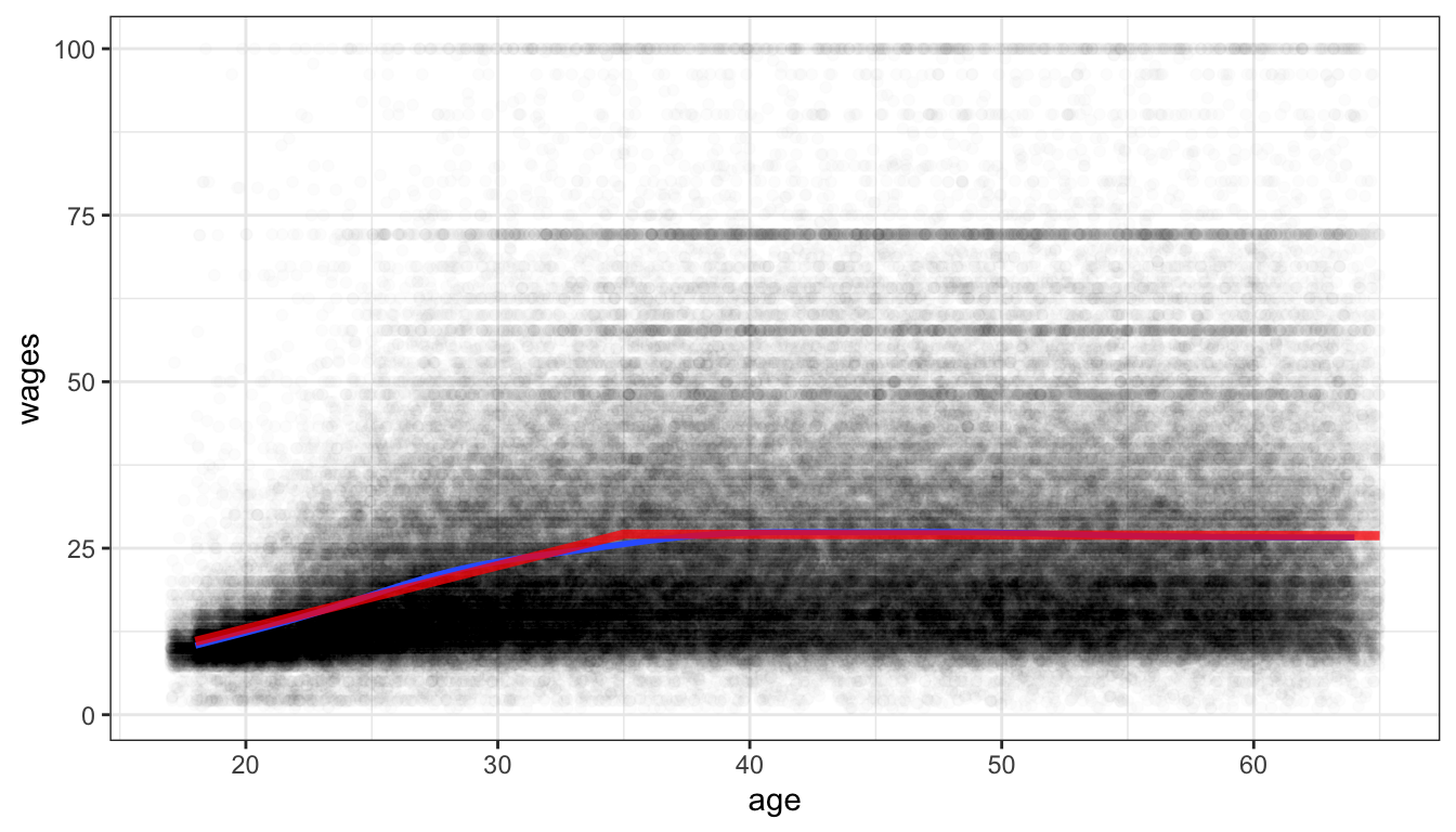
Figure 76: Scatterplot of age and hourly wages, with a spline fit hinged on age 35 shown in red. A smoothing line is also shown in blue.