Scatterplot and Correlation Coefficient
The techniques for looking at the association between two quantitative variables are more developed than the other two cases, so we will spend more time on this topic. Additionally, the major approach here of ordinary least squares regression turns out to be a very flexible, extendable method that we will build on later in the term.
When examining the association between two quantitative variables, we usually distinguish the two variables by referring to one variable as the dependent variable and the other variable as the independent variable. The dependent variable is the variable whose outcome we are interested in predicting. The independent variable is the variable that we treat as the predictor of the dependent variable. For example, lets say we were interested in the relationship between income inequality and life expectancy. We are interested in predicting life expectancy by income inequality, so the dependent variable is life expectancy and the independent variable is income inequality.
The language of dependent vs. independent variable is causal, but its important to remember that we are only measuring the association. That association is the same regardless of which variable we set as the dependent and which we set as the independent. Thus, the selection of the dependent and independent variable is more about which way it more intuitively makes sense to interpret our results.
The scatterplot
We can examine the relationship between two quantitative variables by constructing a scatterplot. A scatterplot is a two-dimensional graph. We put the independent variable on the x-axis and the dependent variable on the y-axis. For this reason, we often refer generically to the independent variable as x and the dependent variable generically as y.
To construct the scatterplot, we plot each observation as a point, based on the value of its independent and dependent variable. For example, lets say we are interested in the relationship between the median age of the state population and violent crime in our crime data. Our first observation, Alabama, has a median age of 37.8 and a violent crime rate of 378 crimes per 100,000. this is plotted in 23 below.
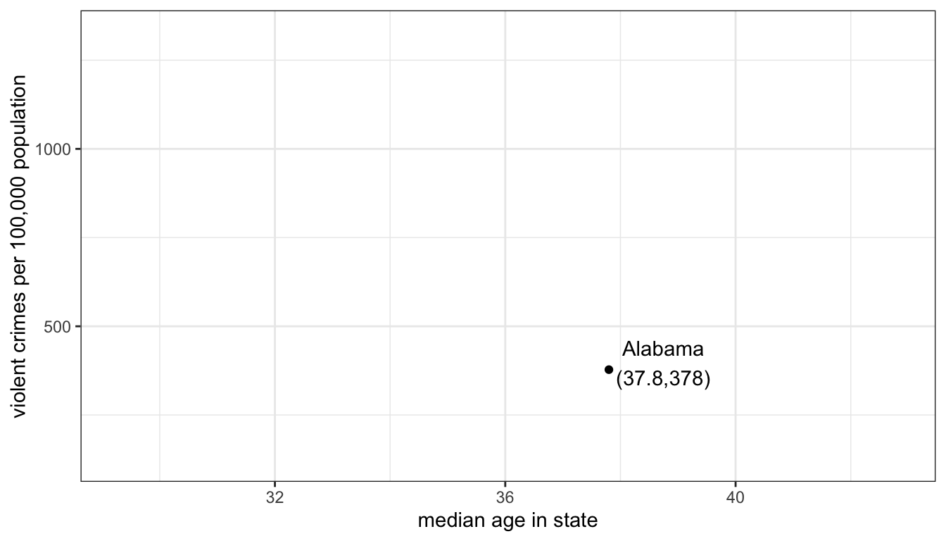
Figure 23: Starting a scatterplot by plotting the firest observation
If I repeat that process for all of my observations, I will get a scatterplot that looks like:
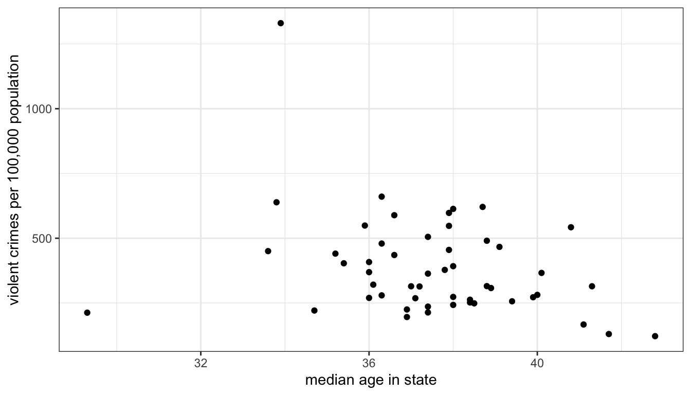
Figure 24: Scatterplot of median age by the violent crime rate for all US states
What are we looking for when we look at a scatterplot? There are four important questions we can ask of the scatterplot. First, what is the direction of the relationship. We refer to a relationship as positive if both variables move in the same direction. if y tends to be higher when x is higher and y tends to be lower when x is lower, then we have a positive relationship. On the other hand, if the variables move in opposite directions, then we have a negative relationship. If y tends to be lower when x is higher and y tends to be higher when x is lower, then we have a negative relationship. In the case above, it seems like we have a generally negative relationship. States with higher median age tend to have lower violent crime rates.
Second, is the relationship linear? I don’t mean here that the points fall exactly on a straight line (which is part of the next question) but rather does the general shape of the points appear to have any “curve” to it. If it has a curve to it, then the relationship would be non-linear. This issue will become important later, because our two primary measures of association are based on the assumption of a linear relationship. In this case, there is no evidence that the relationship is non-linear.
Third, what is the strength of the relationship. If all the points fall exactly on a straight line, then we have a very strong relationship. On the other hand, if the points form a broad elliptical cloud, then we have a weak relationship. In practice, in the social sciences, we never expect our data to conform very closely to a straight line. Judging the strength of a relationship often takes practice. I would say the relationship above is of moderate strength.
Fourth, are there outliers? We are particularly concerned about outliers that go against the general trend of the data, because these may exert a strong influence on our later measurements of association. In this case, there are two clear outliers, Washington DC and Utah. Washington DC is an outlier because it has an extremely high level of violent crime relative to the rest of the data. Its median age tends to be on the younger side, so its placement is not inconsistent with the general trend. Utah is an outlier that goes directly against the general trend because it has one of the lowest violent crime rates and the youngest populations. This is, of course, driven by Utah’s heavily Mormon population, who both have high rates of fertility (leading to a young population) and whose church communities are able to exert a remarkable degree of social control over these young populations.
Constructing scatterplots in R
You can construct scatterplots in ggplot by using the geom_point geometry. You just need to define the aesthetics for x (on the x-axis) and y (on the y-axis).
ggplot(crimes, aes(x=Poverty, y=Property))+
  geom_point()+
  labs(x="poverty rate", y="property crimes per 100,000 population")+
  theme_bw()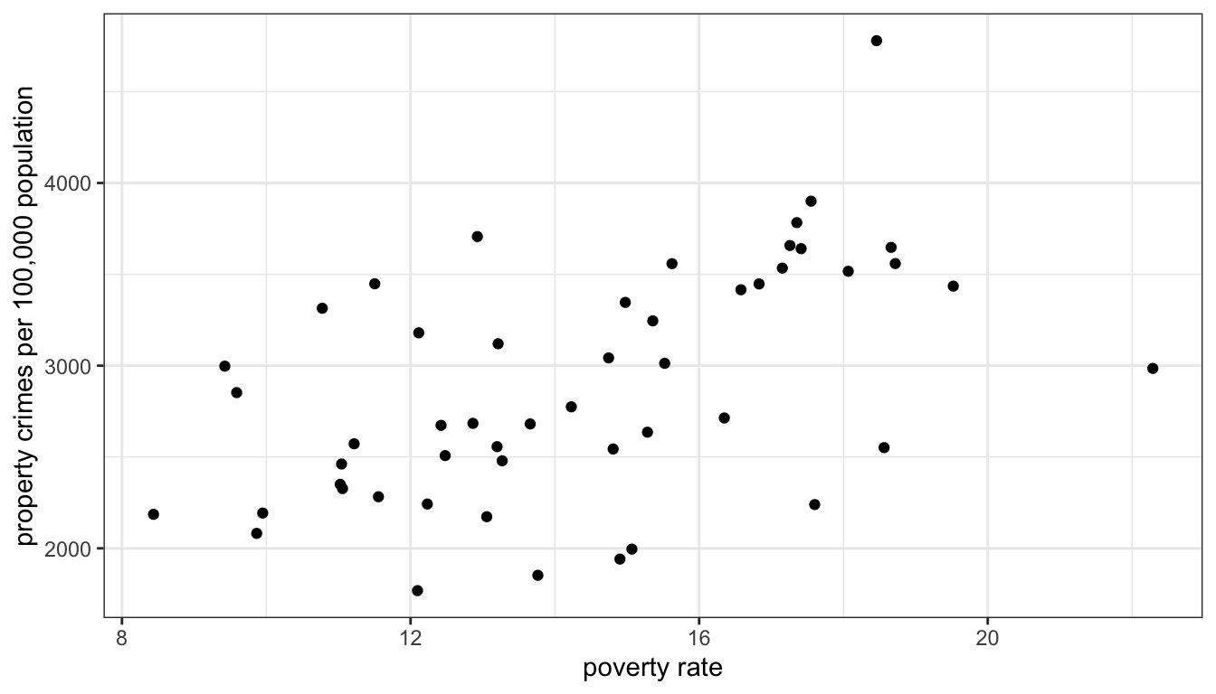
Figure 25: Scatterplot of a state’s poverty rate by property crime rate, for all US states
Sometimes with large datasets, scatterplots can be difficult to read because of the problem of overplotting. This happens when many data points overlap, so that its difficult to see how many points are showing. For example:
ggplot(movies, aes(x=Runtime, y=TomatoMeter))+
  geom_point()+
  labs(x="movie runtime in minutes", y="Percent of reviews that are positive")+
  theme_bw()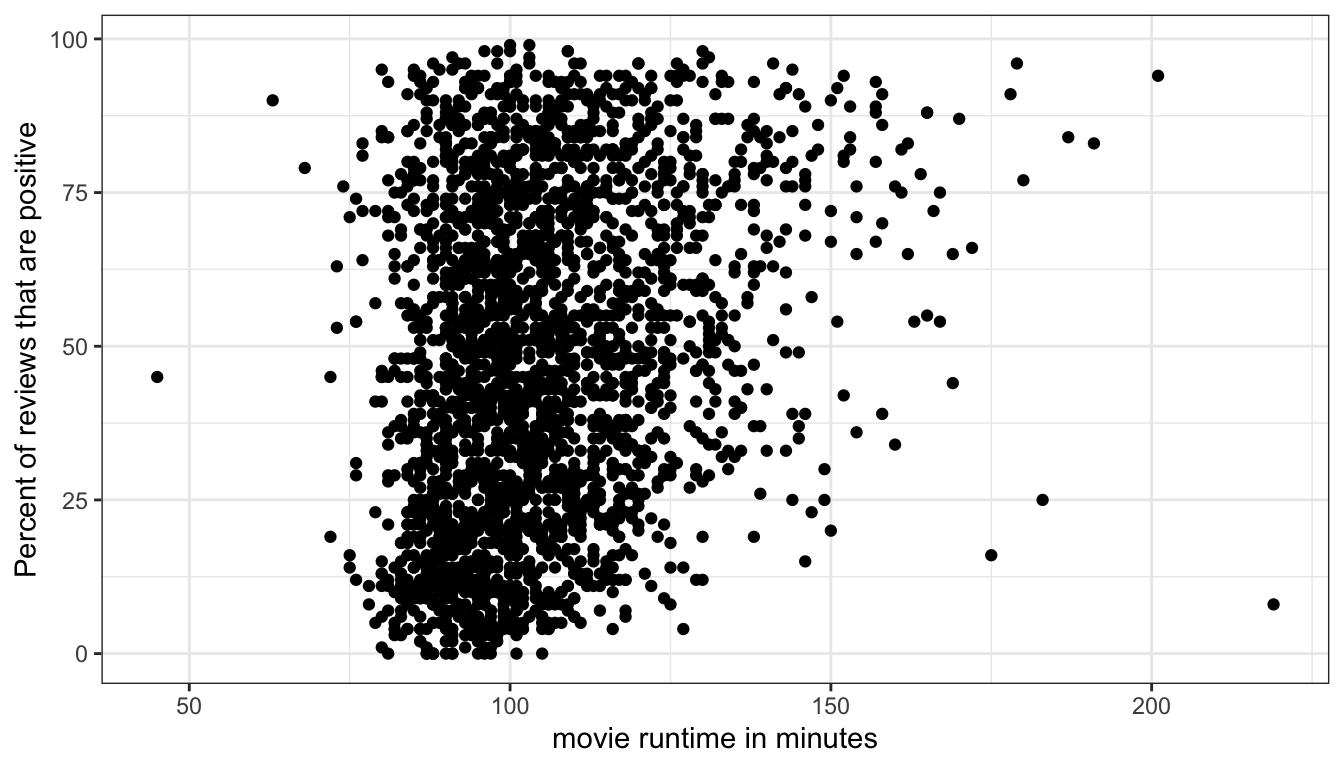
Figure 26: An example of the problem of overplotting where points are being plotted on top of each other
Because so many movies are in the 90-120 minute range, it is difficult to see the density of points in this range and thus difficult to understand the relationship.
One way to address this is to allow the points to be semi-transparent, so that as more and more points are plotted in the same place, the shading will become darker. We can do this in geom_point by setting the alpha argument to something less than one but greater than zero:
ggplot(movies, aes(x=Runtime, y=TomatoMeter))+
  geom_point(alpha=0.3)+
  labs(x="movie runtime in minutes", y="Percent of reviews that are positive")+
  theme_bw()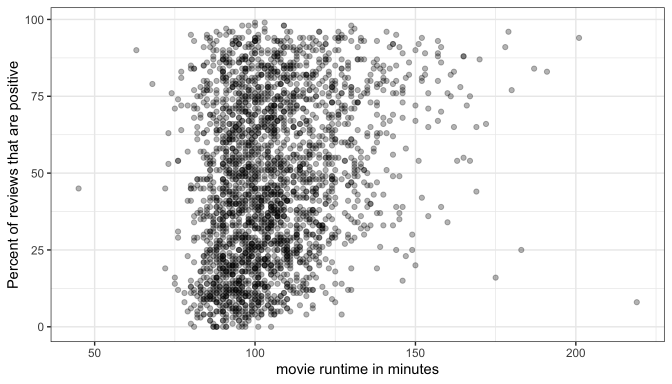
Figure 27: Using a semi-transparent point will help us see areas where there is a dense tangle of points
Overplotting can also be a problem with discrete variables because these variables can only take on certain values which will then exactly overlap with one another. This can be seen in Figure 28 which shows the relationship between age and wages in the earnings data.
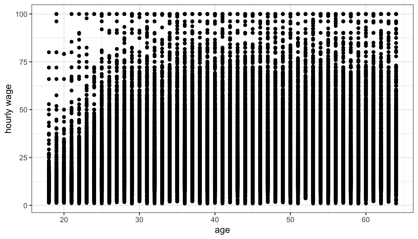
Figure 28: Age is discrete so the scatterplot looks like a bunch of vertical lines of dots and is very hard to understand
Because age is discrete all points are stacked up in vertical bars making it difficult to understand what is going on. One solution for this problem is to “jitter” each point a little bit by adding a small amount of randomness to the x and y values. The randomness added won’t affect our sense of the relationship but will reduce the issue of overplotting. We can do this simply in ggplot by replacing the geom_point command with geom_jitter.
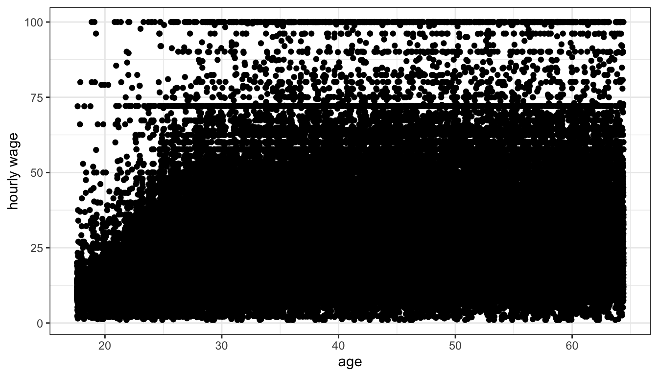
Figure 29: Jittering helps with overplotting but its still difficult to see how dense points are for most of the plot
Jittering helped get rid of those vertical lines, but there are so many observations that we still have problems of understanding the density of points for most of the plot. If we add an alpha parameter to the geom_jitter command, we should be better able to understand the scatterplot.
ggplot(earnings, aes(x=age, y=wages))+
  geom_jitter(alpha=0.01)+
  labs(x="age", y="hourly wage")+
  theme_bw()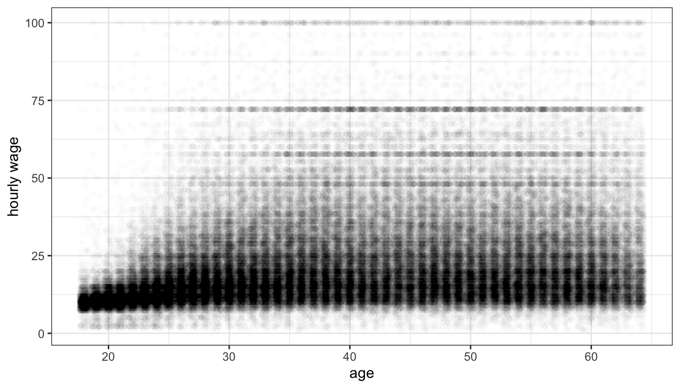
Figure 30: Jittering and transparency help us to make sense of the relationship between age and wages
The correlation coefficient
We can measure the association between two quantitative variables with the correlation coefficient, r. The formula for the correlation coefficient is:
\[r=\frac{1}{n-1}\sum_{i=1}^n (\frac{x_i-\bar{x}}{s_x}*\frac{y_i-\bar{y}}{s_y})\]
That looks complicated, but lets break it down step by step. We will use the association between median age and violent crimes as our example.
The first step is to subtract the means from each of our x and y variables. This will give us the distance above or below the mean for each variable.
The second step is to divide these differences from the mean of x and y by the standard deviation of x and y, respectively.
Now each of your x and y values have been converted from their original form into the number of standard deviations above or below the mean. This is often called standarization. By doing this, we have put both variables on the same scale and have removed whatever original units they were measured in (in our case, years of age and crimes per 100,000).
The third step is to to multiply each converted value of x by each converted value of y.
Why do we do this? First consider this scatterplot of our standardized x and y:
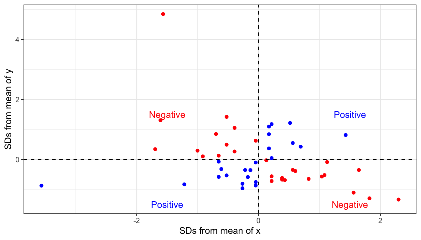
Figure 31: Where a point falls in the four quadrants of this scatterplot indicate whether it provides evidence for a positive or negative relationship
Points shown in blue have either both positive or both negative x and y values. When you take the product of these two numbers, you will get a positive product. This is evidence of a positive relationship. Points shown in red have one positive and one negative x and y value. When you take the product of these two numbers, you will get a negative product. This is evidence of a negative relationship.
The final step is to add up all this evidence of a positive and negative relationship and divide by the number of observations (minus one).
## [1] -0.3015232This final value is our correlation coefficient. We could have also calculated it by using the cor command:
## [1] -0.3015232How do we interpret this correlation coefficient? It turns out the correlation coefficient r has some really nice properties. First, the sign of r indicates the direction of the relationship. If r is positive, the association is positive. If r is negative, the association is negative. if r is zero, there is no association.
Second, r has a maximum value of 1 and a minimum value of -1. These cases will only happen if the points line up exactly on a straight line, which never happens with social science data. However, it gives us some benchmark to measure the strength of our relationship. Figure 32 shows simulated scatterplots with different r in order to help you get a sense of the strength of association for different values of r.
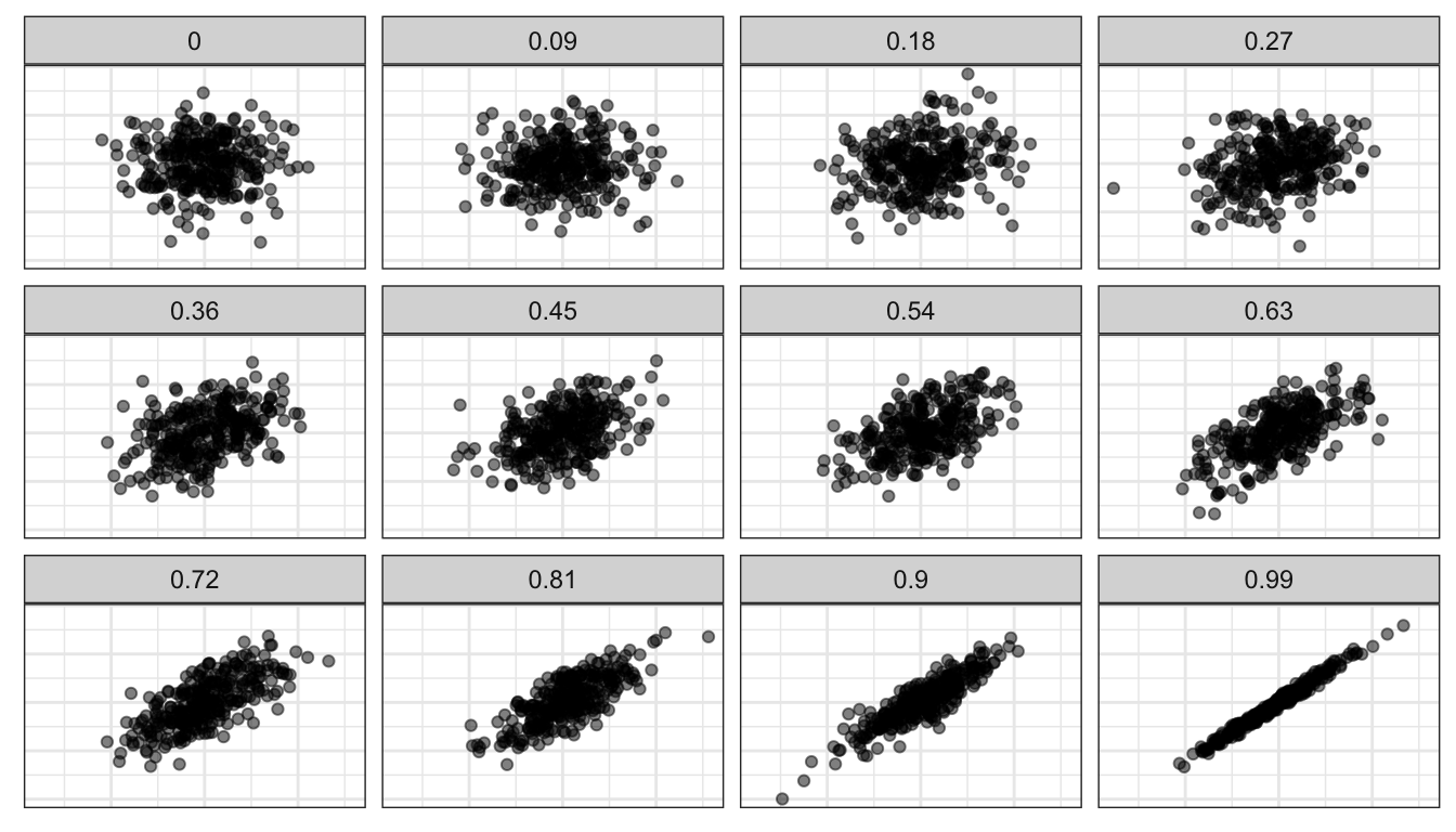
Figure 32: Strength of association for various values of the correlation coefficient, based on simulated data
Third, r is a unitless measure of association. It can be compared across different variables and different datasets in order to make a comparison of the strength of association. For example, the correlation coefficient between unemployment and violent crimes is 0.45. Thus, violent crimes are more strongly correlated with unemployment than with median age (0.44>0.30). The association between median age and property crimes is -0.36, so median age is more strongly related to property crimes than violent crimes (0.36>0.30).
There are some important cautions when using the correlation coefficient. First, the correlation coefficient will only give a proper measure of association when the underlying relationship is linear. if there is a non-linear (curved) relationship, then r will not correctly estimate the association. Second, the correlation coefficient can be affected by outliers. We will explore this issue of outliers and influential points more in later sections.