Measuring the Spread of a Distribution
The second most important measure of a distribution is its spread. Spread indicates how far individual values tend to fall from the center of the distribution. As Figure 14 below shows, two distributions can have the same center and general shape (in this case, a bell curve) but have very different spreads.
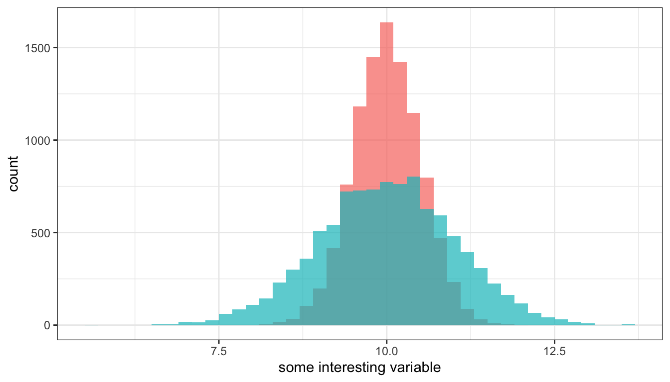
Figure 14: Two different distributions with the same mean but very different spreads, based on simulated data.
Range and interquartile range
One of the simplest measures of spread is to calculate the range. The range is the distance between the highest and lowest value. Lets take a look at the range in the fare paid (in British pounds) for tickets on the Titanic. The summary command, will give us the information we need:
##    Min. 1st Qu.  Median    Mean 3rd Qu.    Max.
##   0.000   7.896  14.454  33.276  31.275 512.329
Note that at least one person made it on the Titanic for free. The highest fare paid was 512.3 pounds. So the range is easy to calculate 512.3 - 0 = 512.3. The difference between the highest and lowest paying passenger was about 512 pounds.
This example also reveals the shortcoming of the range as a measure of spread. If there are any outliers in the data, they are going to show up in the range and so the range may give you a misleading idea of how spread out the values are. Note that the 75th percentile here is only 31.28 pounds, which would suggest that the 512.3 maximum is a pretty high outlier. We can check this by graphing a boxplot, as I have done in Figure 15.
ggplot(titanic, aes(x="", y=fare))+
  geom_boxplot(fill="seagreen", outlier.color = "red")+
  labs(x=NULL, y="fare paid in British pounds")+
  theme_bw()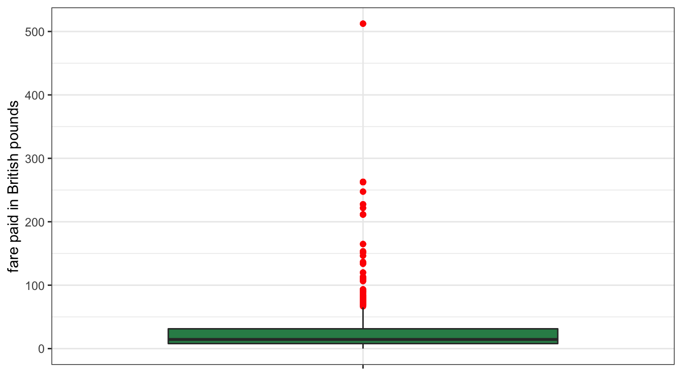
Figure 15: Boxplot of fare paid on the Titanic
The maximum value is such an outlier that the rest of the boxplot has to be “scrunched” in order to fit it all into the graph. Clearly this is not a good indicator of spread. However, we have already seen a better measure of spread using a similar idea: the interquartile range or IQR. The IQR is just the range between the 25th and 75th percentile. We already have these numbers from the output above, so the IQR = 31.28-7.90=23.38. So, the difference in fare between the 25th and 75th percentile (the middle 50% of the data) was 23.4 pounds. That result suggests a much smaller spread of fares.
You can also use the IQR command in R to directly calculate the IQR.
## [1] 23.3792Variance and standard deviation
The most common measure of spread is the variance and its derivative measurement, the standard deviation. It is so common in fact, that most people simply refer to the concept of “spread” as “variance.” The variance can be defined as the “average squared distance to the mean.” Of course, “squared distance” is a bit hard to think about, so we more commonly take the square root of the variance to get the standard deviation which gives us the “average distance to the mean.” Imagine if you were to randomly pick one observation from your dataset and guess how far it would be from the mean. Your best guess would be the standard deviation.
The calculation for the variance and standard deviation is a bit intimidating but we will break it down into steps to show it is not that hard. At the same time, I will show you to calculate the parts in R using the fare variable from the Titanic data.
The overall formula for the variance (which is represented as \(s^2\)) is:
\[s^2=\frac{\sum_{i=1}^n (x_i-\bar{x})^2}{n-1}\]
That looks tough, but lets break it down. The first step is this:
\[(x_i-\bar{x})\]
You take each value of your variable \(x\) and subtract the mean from it. This can be done in R easily:
This measure gives us a description of how far each observation is from the mean which is already kind of a measure of spread, but we can’t do much with it yet because some differences are positive (higher than the mean) and some are negative (lower than the mean). In fact, if we take the mean of these differences, it will be zero by definition because this is what it means for the mean to be the balancing point of the distribution.
## [1] 0The next step is:
\[(x_i-\bar{x})^2\]
We just need to square the differences. This will get rid of our negative/positive problem, because the squared values will all be positive.
The next step is:
\[\sum_{i=1}^n (x_i-\bar{x})^2\]
We need to sum up all of our values. This value is sometimes called the sum of squared X or SSX for short. It is already pretty close to a measure of variance already.
The more distance there is from the mean on average, the larger this value will be. However, it also gets larger when we have more values because we are just taking a sum. To get a number that is comparable across different number of observations, we need to do the final step:
\[s^2=\frac{\sum_{i=1}^n (x_i-\bar{x})^2}{n-1}\]
We are going to divide our SSX value by the number of observations minus one. The “minus one” thing is a bit tricky and I don’t want to get into the details of why we do it here. When n is large, this will have little effect and basically you are taking an average of the squared distance from the mean.
## [1] 2677.398So the average squared distance from the mean fare is 2677.39 pounds squared. Of course, this isn’t a very interpretable number, so its probably better to square root it and get the standard deviation:
## [1] 51.74358So, the average distance from the mean fare is 51.74 pounds.
Note that I could have used the power of R to do this entire calculation in one line:
## [1] 51.74358Alternatively, I could have just used the sd command to have R do all the heavy lifting:
## [1] 51.74358